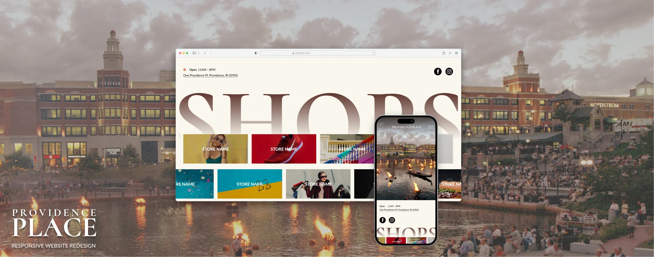
Providence Place
Responsive Redesign
Context
Providence Place is a shopping mall in Providence, Rhode Island. The mall is the go-to place for local shoppers, however, its website has multiple design issues regarding interaction, visuals, and accessibility. To improve the website’s user experience, I will first identify the key issues, and then provide a design solution as well as a website mockup to demonstrate and highlight the important changes.
My Role
UX Research
UI/UX Design
Frontend Development
Original Website
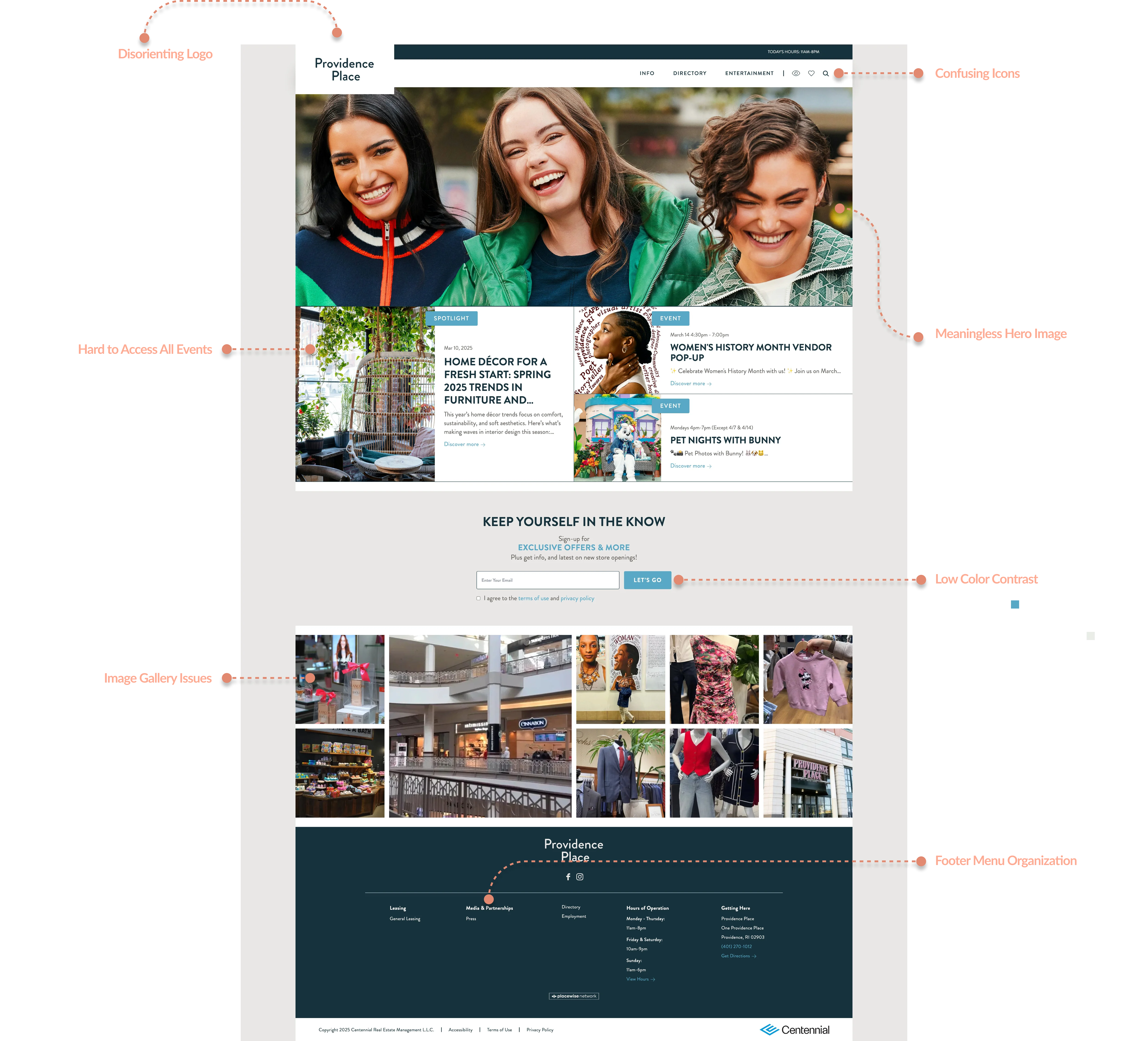
Overall Issues
The purpose of a shopping mall’s website is to attract potential shoppers to visit the mall. Therefore, it is important for the website to establish a strong visual appeal that attracts shoppers while also providing essential information in an easily accessible way, reducing friction between visiting the site and going to the mall.
The original website initially failed to establish an appealing visual language. The use of a pointy font, light blue accent color, and hero image conveys a 'young, back-to-school' feeling, which is not the intended message for a shopping mall.
Additionally, the website's information organization, content choices, and icon usage present issues that may lead to user drop-offs. In the following graph, I will highlight some of these problems
Prototyping
To redesign the website, I first used a low-fidelity prototype to plan the overall layout and structure for three screen sizes: desktop, tablet, and mobile.
LOW-FIDELITY
After designing the low-fidelity prototype and the design system, I proceed to add color and images to my prototype to make it as close to the final live website as possible.
High-FIDELITY
Design System
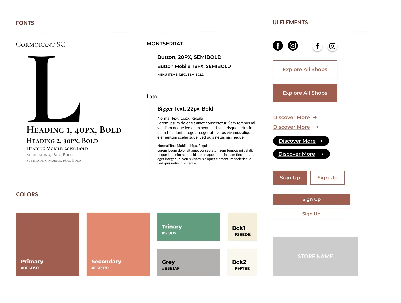
Font Pairing
Cormorant SC
This elegant serif font is used for the headers, as it creates a sense of luxury and sophistication—fitting for Providence Place, the largest mall in downtown Providence. However, due to its readability limitations, it is only used for headers.
Montserrat
This is a wide sans-serif font that is used for all the interactive elements. This font is easy to read but also stylish in comparison to regular sans-serif fonts, making it the ideal choice for interactive element which requires to be easy to read and calls attention to itself.
Lato
This sans-serif font is used for paragraph elements. I chose it for its readability, and it provides a good contrast to the serif header font, Cormorant SC.
Color Pairing
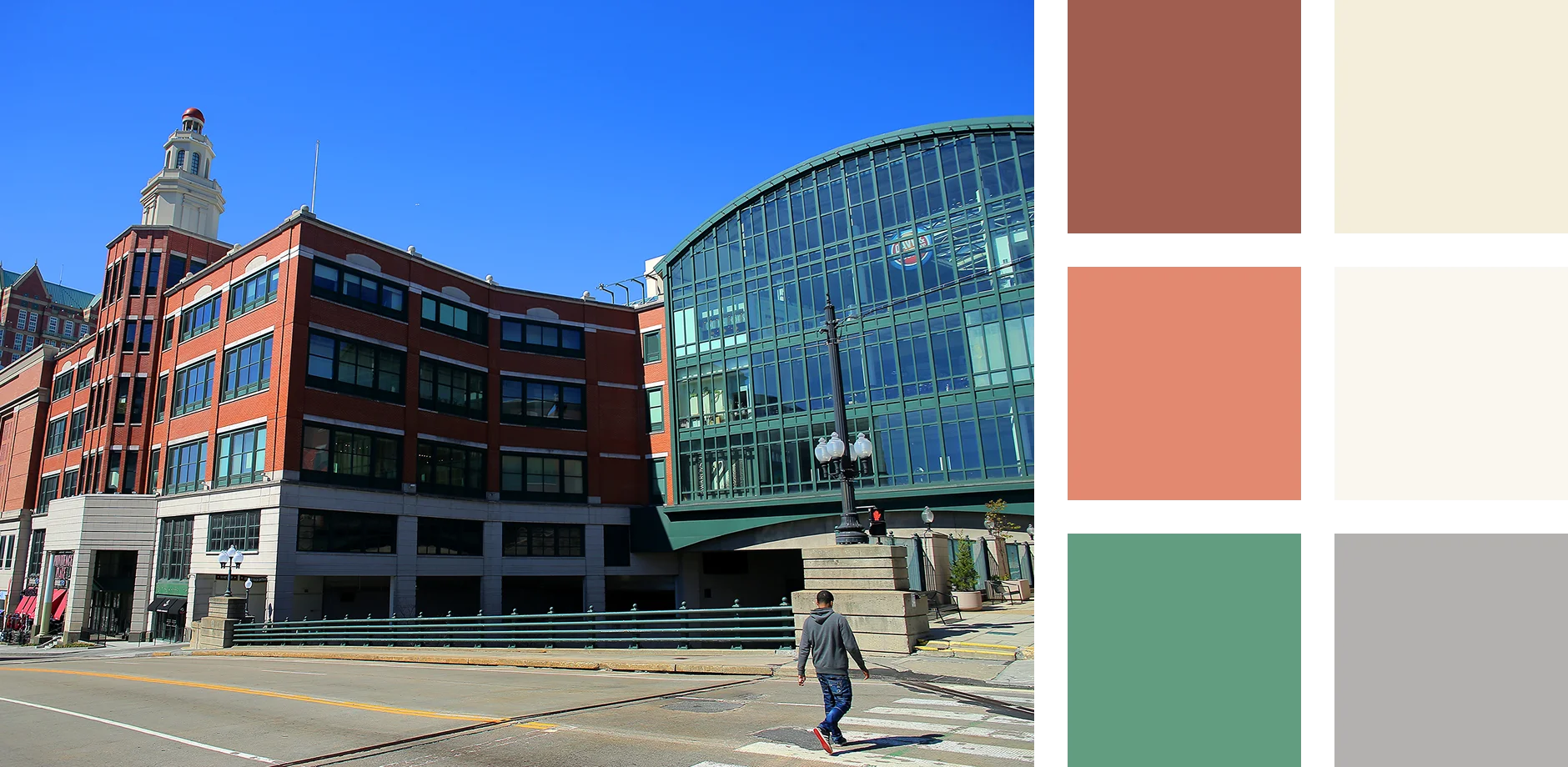
Visual Connection To the Mall
The color palette is inspired by the actual colors of the mall. I aimed to use color to bridge the digital experience of the website with the physical mall, helping users more easily associate the two. Additionally, maintaining a consistent color scheme strengthens the brand identity.
Accessibility
The big header text with color ■ #9F5D50 on ■ #F9F7EE background has a high contrast ratio of 4.7:1, which passes both WCAG AA and WCAG AAA.
Redesign Breakdown
To establish a strong visual identity that appeals to shoppers while also providing essential information in an easily accessible way, I made several design decisions while redesigning this website. Here is a detailed breakdown of some of the key changes.
I have also annotated my design with sudo CSS code while designing to make sure it is easier to code when it comes to implementation
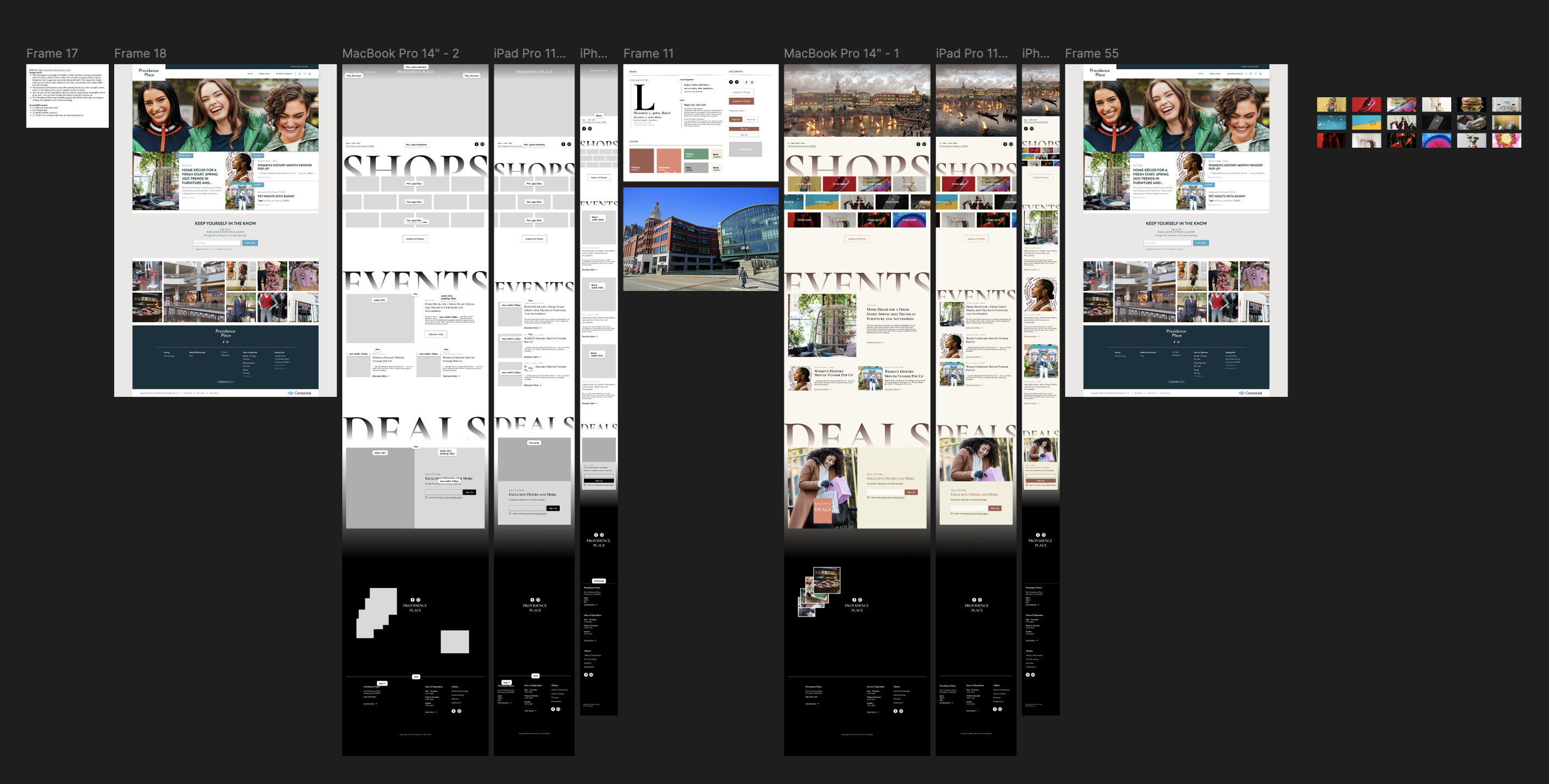
Responsive Showcase
NAVIGATION
EVENTS
DEALS
Final Deliverables
After finalizing my prototypes, I have implemented my design into a website demo with HTML and CSS, please click the buttons below to view the website and my Figma design file.
More Projects
User Research
Vending Machine
Explore common issues a user may encountered when using the vending machine
Accessibility
Accordion
An accessible nested accordion UI component that enables users to navigate two layers of information
UI/UX Design & Dev.
Others
From class projects to professional works, I have created a wide variety of designs