
Accordion
Accessible Component
Context
This project focuses on designing an accessible nested accordion UI component that enables users to navigate two layers of information efficiently. In this project, I will analysis the interactions supported by three existing accordion examples. Then used the insights I gained from the analysis to design the state models as well as the high-fidelity prototype of my accordion component.
My Role
User Interface Design
User Experience Design
UX Research
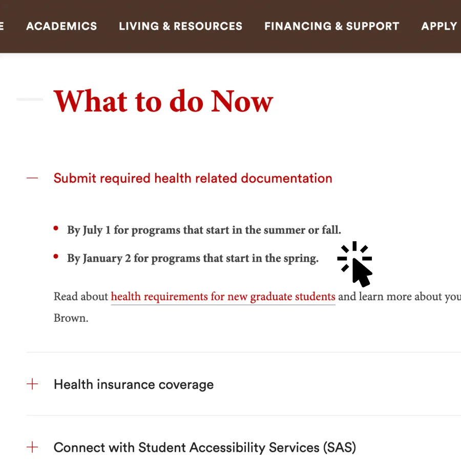
01-1 Interaction Analysis
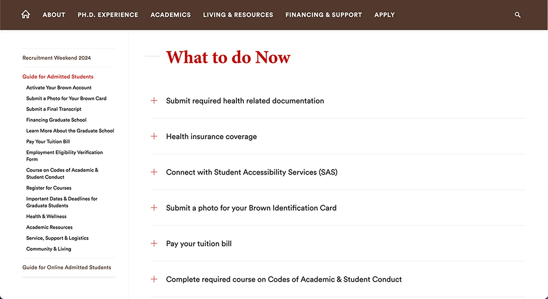
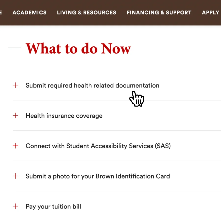
Mouse - Hover
User Inputs
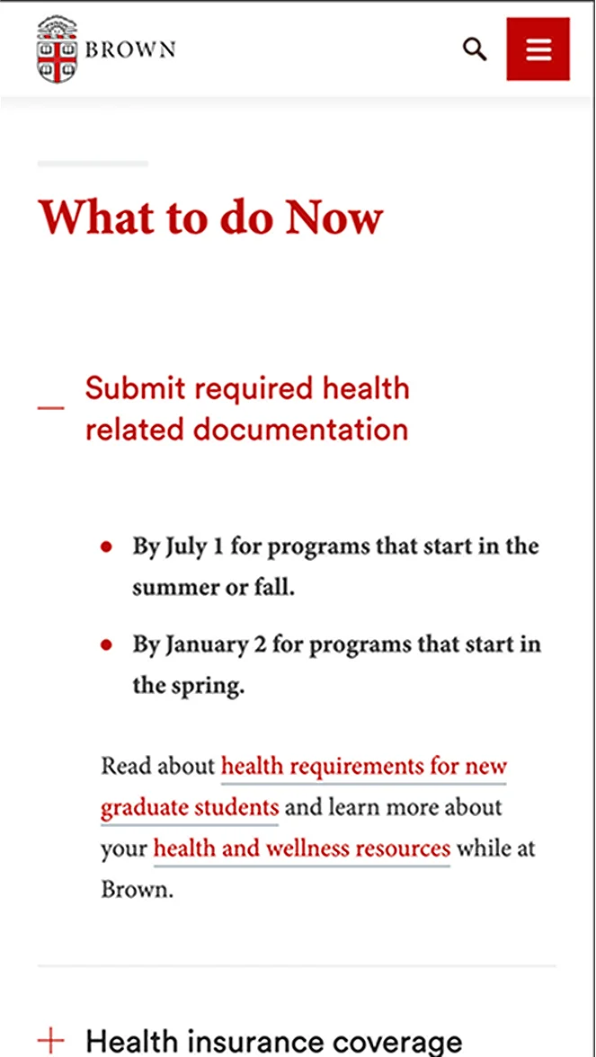
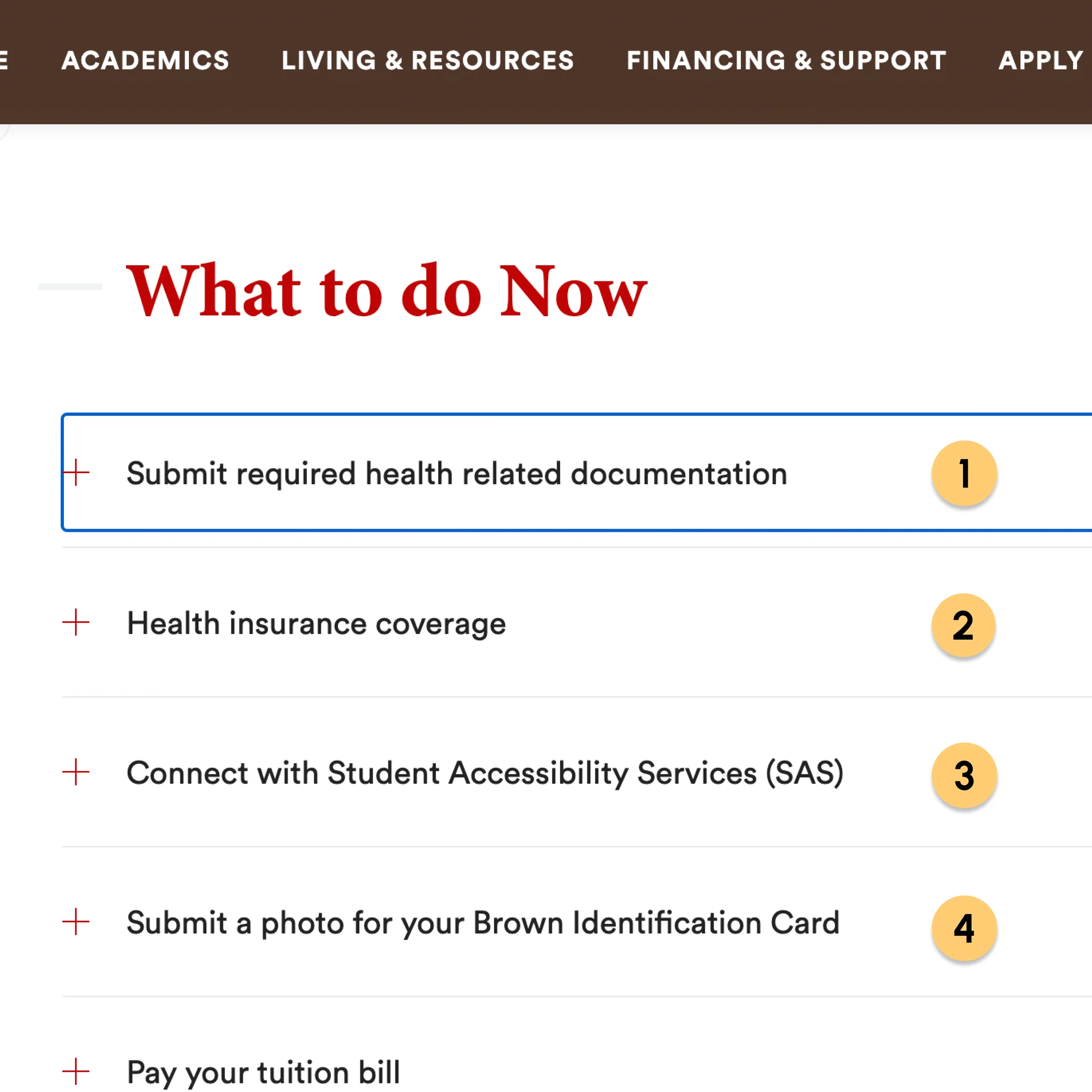
Mouse hover on an accordion item.
System Outputs
The cursor icon will change to a pointer. When mouse leave, it will change back to normal cursor.
User Inputs
Mouse hover on an accordion item for a couple seconds.
System Outputs
It will show a tool tip revealing title attribute content associated with this accordion item.
+ Positives
- On hover, the cursor icon changes to a pointer, suggesting that this UI element could be clicked.
- After the cursor is hovered for a while, a tooltip will tell users how to interact with it. Great for learnability.
- Negative
- The cursor icon changes might be a bit too subtle, so there will be a small chance of user not noticing it.
- The cursor icon is the only change on hover, what if the user uses a customized cursor, then there is no other way to show the on-hover state. Bad discoverability.
- The tooltip will only show up after it is hovered for a while, it is a feature that is not easy to be discovered.
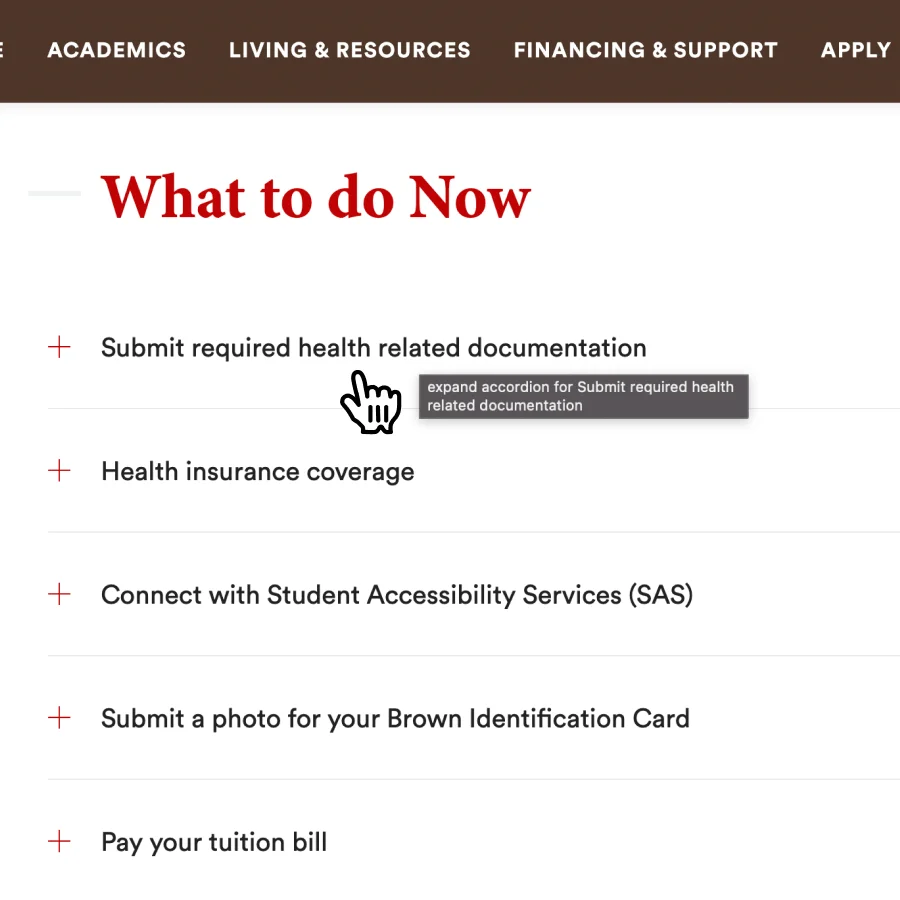
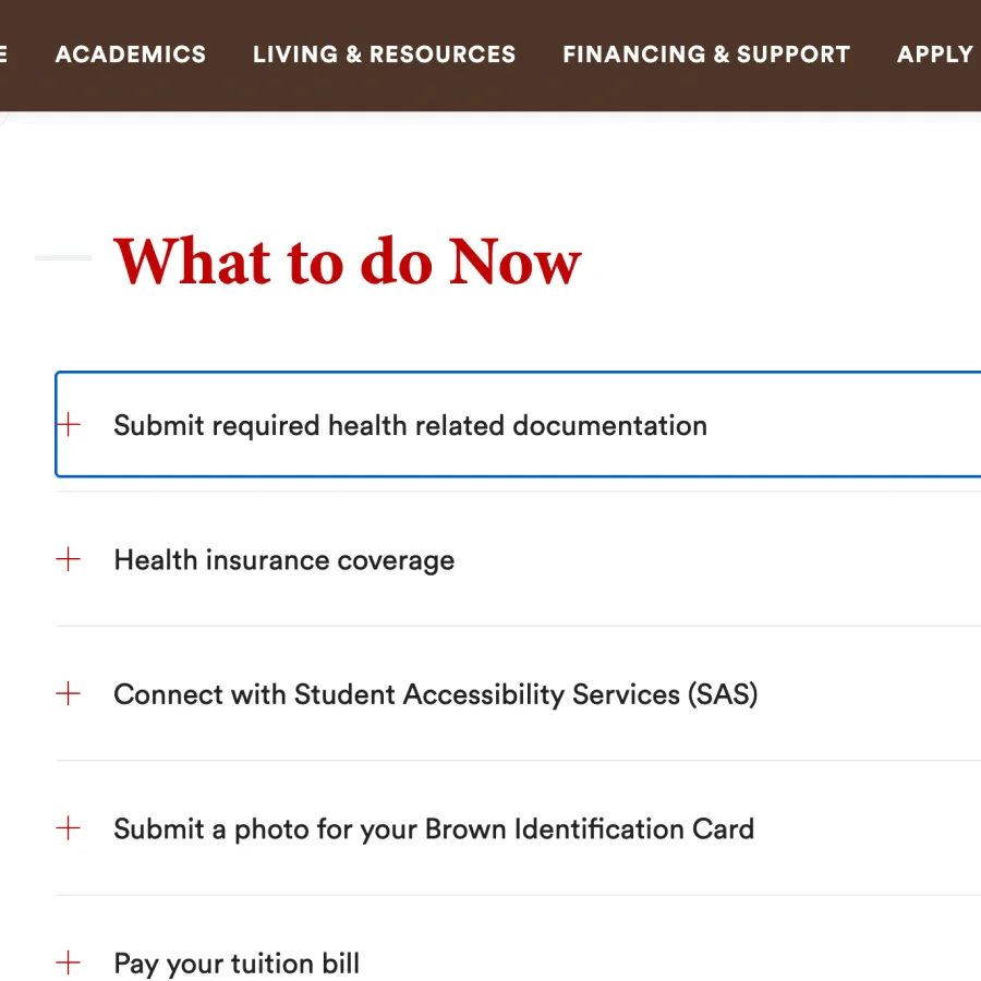
Mouse - Click
User Inputs
Click on the entire accordion item. (Plus icon and the text cannot be clicked separately)
System Outputs
If the accordion body is collapsed, then its text color will change to red, the plus icon will turn into a minus icon and reveal the accordion body content with a smooth expanding animation. If it is expanded, then it will revert back to its collapsed default state.
User Inputs
Click on the accordion body content
System Outputs
No output.
+ Positives
- On click, the header text color changes to red, which indicates this accordion item is currently activated.
- Also on click, the plus icon turns into a minus icon which suggests that clicking it again will instead collapse the content.
- Animation makes the expanding and collapsing feel smooth and not jumpy like most of the other accordions.
- Unlike some of the other accordions, clicking the content of the accordion will not collapse it, which sacrifices some efficiency to prevent mis-inputs.
- Negative
- Clicking the content part of the accordion does nothing that could sacrifice some efficiency.
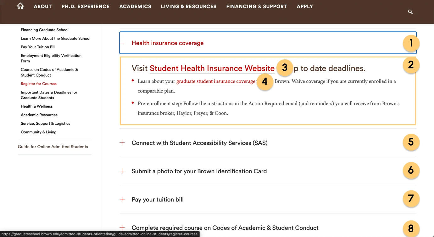
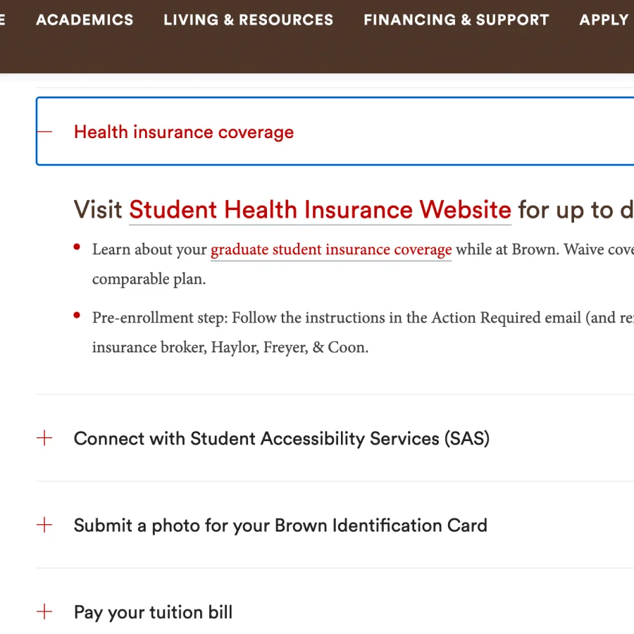
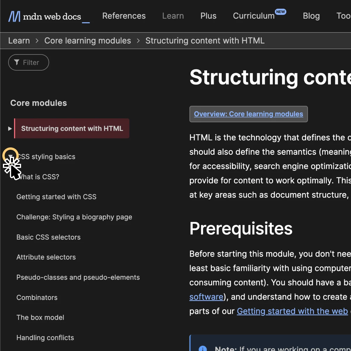
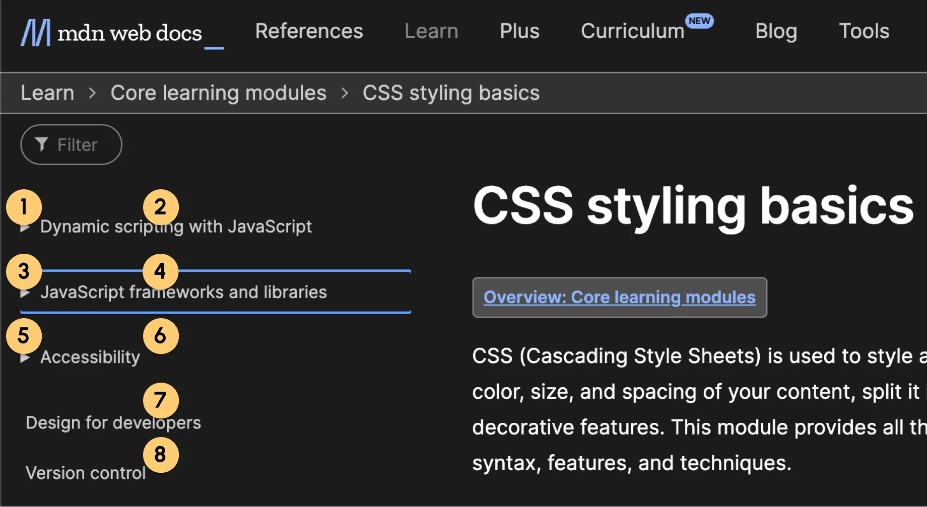
Keyboard - Tab
User Inputs
Tab key on press.
System Outputs
Visual - Focus on the first accordion item. The focused item will have a thin blue border. If the focused item is outside of the screen, the screen will scroll up or down accordingly.
Auditory - “Submit required health-related documentation, button, group.” “Expand accordion for Submit required health-related documentation, You are currently on a button, group. To click this button, press Control Option Space” Clicking the content part of the accordion does nothing that could sacrifice some efficiency.
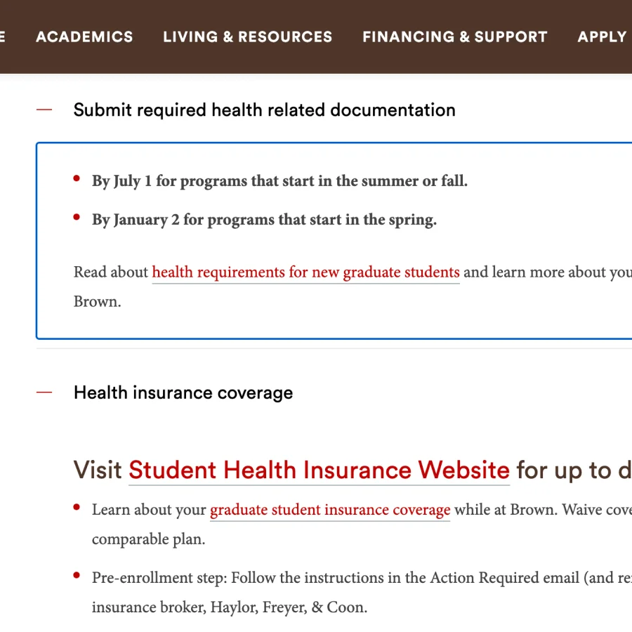
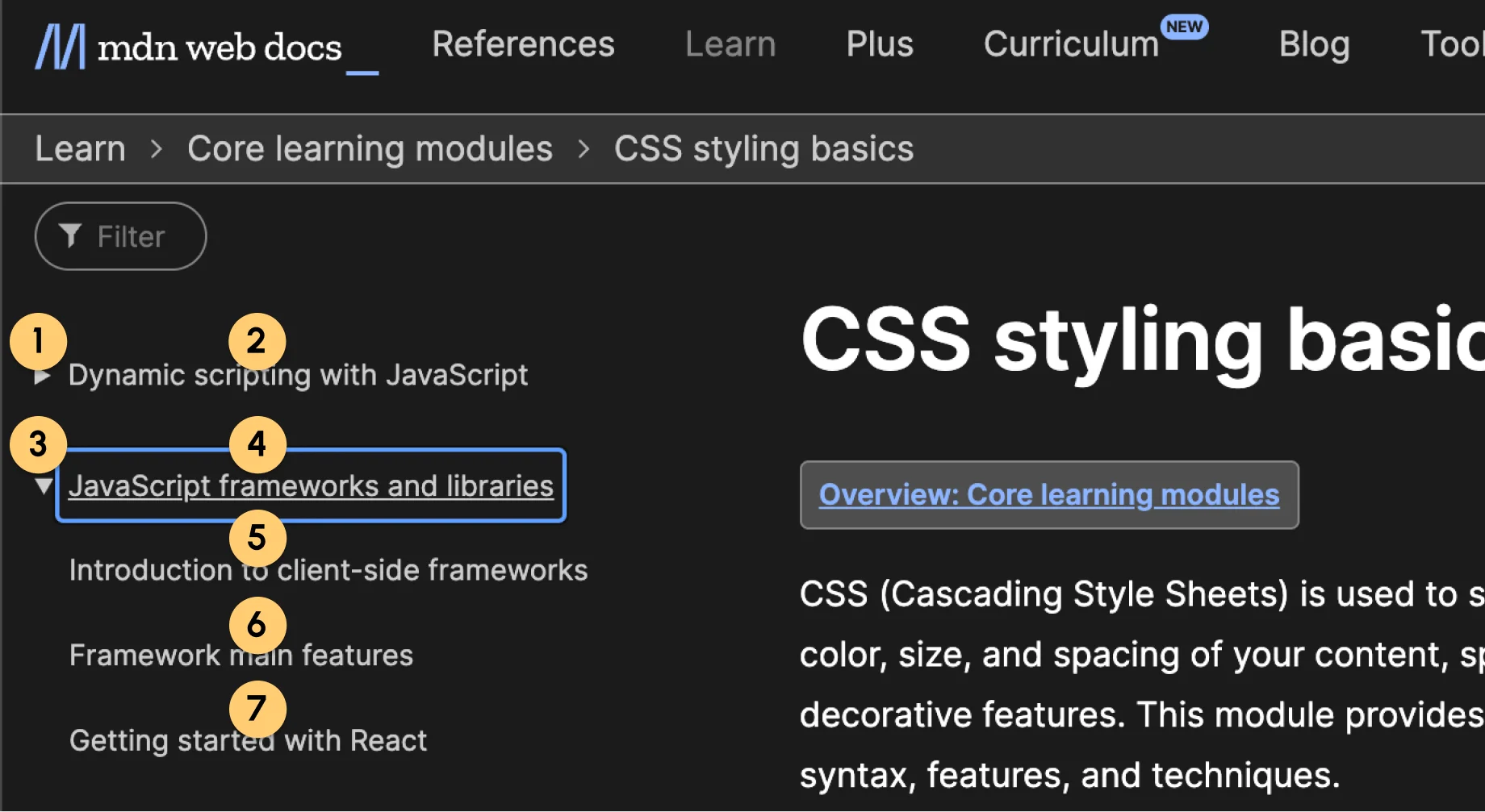
User Inputs
When a accordion item is expanded, tab key on press.
System Outputs
Visual - The body content will be the focus, showing the thin blue boarder.
Auditory - “By July 1 for programs that start in the summer or fall. By January 2 for programs that start in the spring. Read about health requirements for new graduate students and learn more about your health and wellness resources while at Brown.” “You are currently in a group ”
+ Positives
- On press, it will focus on the first accordion item and visualize it with a blue border box, which meets the expected behavior making it more familiar to the users.
- When a focused item is outside of the screen, the screen will scroll up or down accordingly. A great usability addition that saves the user’s effort to manually scroll the page.
- The Auditory announcements are a bit lengthy, but very descriptive and clear.
- The focus order goes from top to bottom, intuitive to use.
- Negative
- The body content of the accordion can be focused, but not interacted with. It is a bit deceptive and could cause users to be confused.
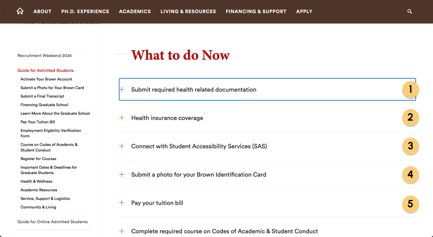
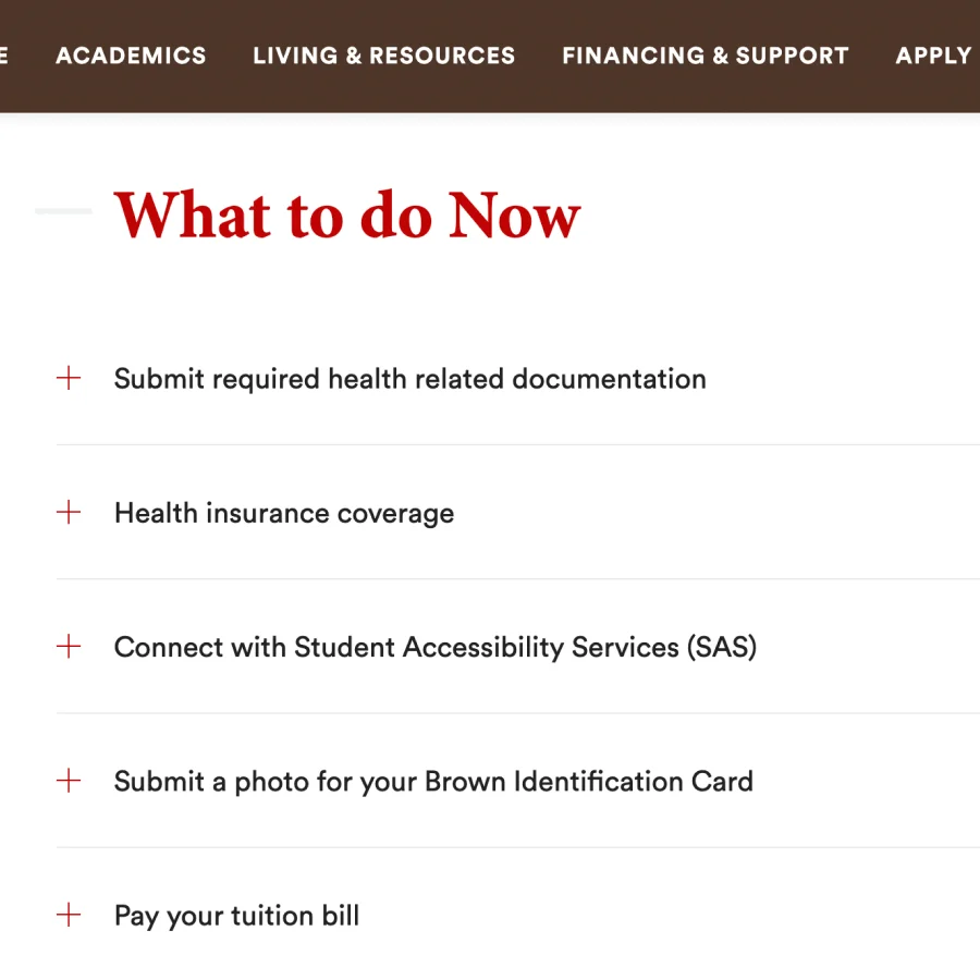
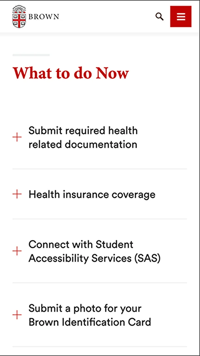
Focus order on collapsed accordion
Focus order on expanded accordion
Keyboard - Enter/Space
User Inputs
When an accordion element is focused, enter or space key on press.
System Outputs
Visual - If the accordion body is currently collapsed, then its text color will change from black to red, and the plus icon will turn into a minus icon and reveal the accordion body content. If it is already expanded, then its text color will change back to black, and the minus icon will revert to the plus icon and collapse the body content.
Auditory - No Outputs
Keyboard - Arrow Key
User Inputs
Pressing up or down arrow key.
System Outputs
Visual - The entire page scrolls up and down.
Auditory - No Outputs
+ Positives
- The accordion is triggered by the tab key on press (not on release). This makes the controls more responsive and more efficient, which is usually what a user is looking for when they choose to use the keyboard to navigate the page.
- The up and down arrow keys correspond to scroll up and down, which is a familiar control mapping to many of the keyboard users.
- Negative
- When an accordion item is focused and the enter/space key is held, the content will expand and collapse repeatedly (possibly a technical bug).
- Some people might be more familiar with navigating an accordion with up and down arrows. So they might expect the up arrow will focus on the previous item and the down arrow will focus on the next item.
Touch - Tap
User Inputs
Tap on release the accordion item will expand the body content.
System Outputs
If the accordion body is currently collapsed, then its text color will change from black to red, and the plus icon will turn into a minus icon and reveal the accordion body content. If it is already expanded, then its text color will change back to black, and the minus icon will revert to the plus icon and collapse the body content.
+ Positives
- The accordion is only triggered on release, which prevents mis-inputs.
- The touch area is big, so it is easy to tap open the accordion item that the user wishes to expand.
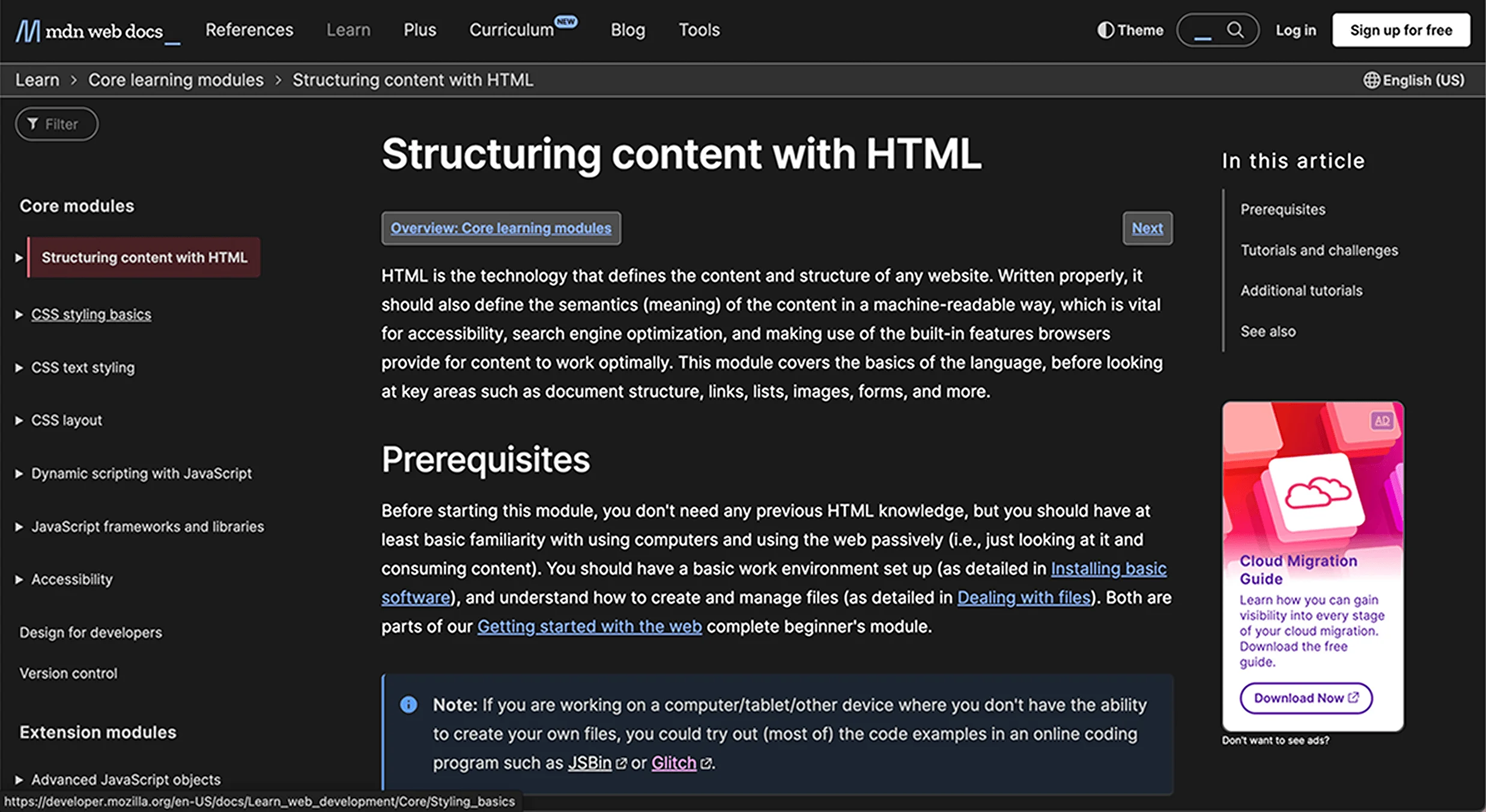
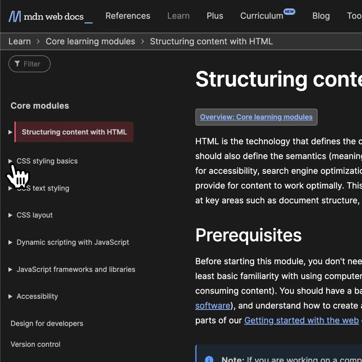
01-2 Interaction Analysis
Mouse - Hover
User Inputs
Mouse hover on an accordion item.
System Outputs
The cursor icon will change to a pointer. When mouse leave, it will change back to normal cursor.
User Inputs
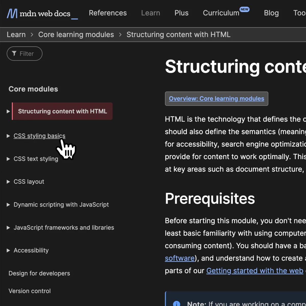
Mouse hover on the menu item’s hyperlink text.
System Outputs
The cursor icon will change to a pointer, and the accordion’s text will be underlined.
+ Positives
- On hover, the cursor icon changes to a pointer, suggesting that this UI element could be clicked.
- When the text of the accordion is hovered, it will be underlined, which tells users that this is a hyperlink that will lead them to another page.
- Negative
- The cursor icon changes might be a bit too subtle to suggest that the chevron icon and the text can be clicked separately.
- The cursor icon is the only change on hover, if the user uses a customized cursor, then there is no other way to show the on-hover state. Bad discoverability.
Mouse - Click
User Inputs
Click on menu item’s chevron icon.
System Outputs
If the sub-menu collapses, the chevron icon will turn 90 degrees to point downwards and reveal the sub-menu. If it is expanded, then it will revert back to its collapsed default state.
User Inputs
Click on the accordion's header text.
System Outputs
Navigate to the corresponding page. The clicked menu item will have a transparent colored background and a colored left border.
+ Positives
- Separating one accordion header into 2 parts supports usability. If the user only wants to browse the menu content they can just click on the icon to avoid navigating to another page.
- When the chevron icon is clicked, the icon will turn to point down, indicating this accordion’s content is expanded.
- When the text is clicked, the colored background and a thickened left border tell users that this is the topic they are currently looking at.
- Negative
- The nested content of an accordion lacks indentation or other visual distinctions, making the nested content appear to be on the same hierarchy level as the outer layer accordion items. This could be confusing to the users.
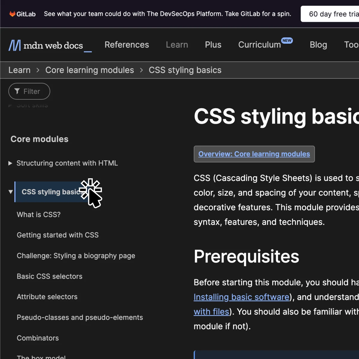
Keyboard - Tab
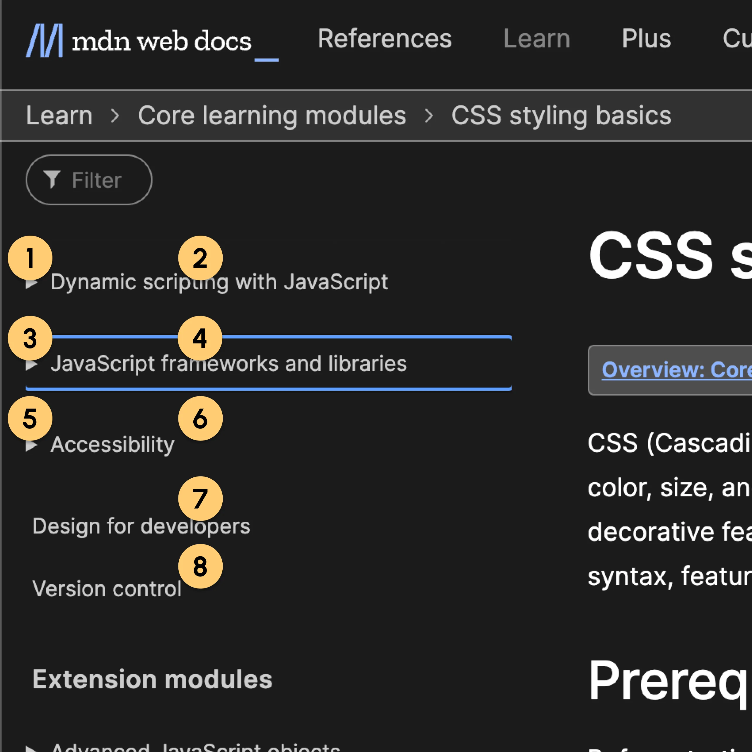
User Inputs
Tab key on press.
System Outputs
Visual - Focus on the first accordion item. The focused item will have a thin blue border. If the focused item is outside of the screen, the screen will scroll up or down accordingly.
Auditory - “Submit required health-related documentation, button, group.”
“Expand accordion for Submit required health-related documentation, You are currently on a button, group. To click this button, press Control Option Space” Clicking the content part of the accordion does nothing that could sacrifice some efficiency.
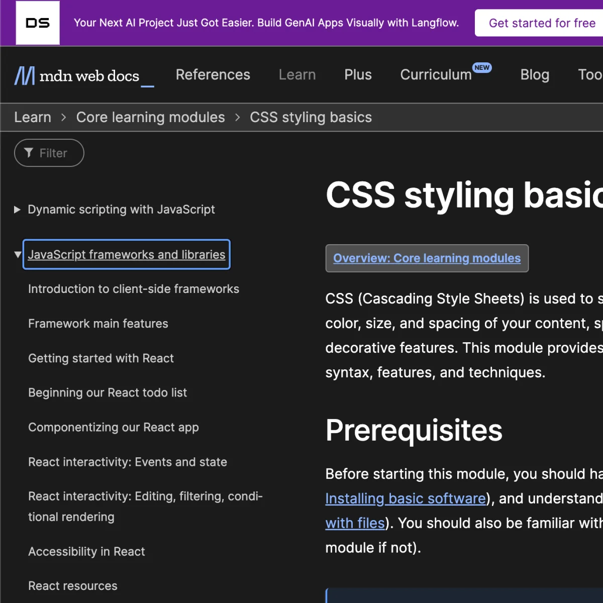
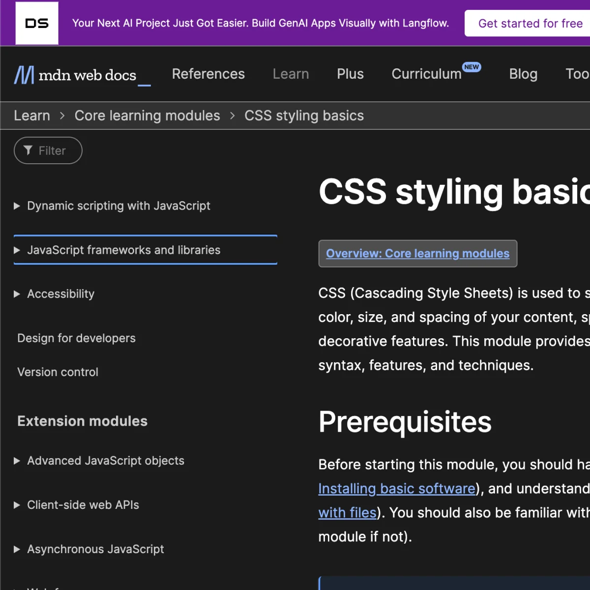
User Inputs
When the outer element is focused, hit the tab key again.
System Outputs
Visual - The inner text of the accordion will be focused, it will have a blue outline border-box, and the text itself will be underlined.
Auditory - “Visited, link, JavaScript frameworks and libraries”
“You are currently on a disclosure triangle, group. To click this button, press Control Option Space”
+ Positives
- On press, it will focus on the first accordion item and visualize it with a blue border box, which meets the expected behavior making it more familiar to the users.
- The Auditory announcements are clear and informative of what the focused element can do.
- The focus order goes from the outer layer to the nested inner layer, from top to bottom, intuitive to use.
- Negative
- When a longer accordion item is focused, the left and right sides of the blue box will be cut off, creating visual inconsistency.
Focus order on collapsed accordion
Focus order on expanded accordion
Keyboard - Enter/Space

User Inputs
When an accordion element is focused, enter or space key on press.
System Outputs
Visual - If the sub-menu collapses, the chevron icon will turn 90 degrees to point downwards and reveal the sub-menu. If it is expanded, then it will revert back to its collapsed default state. When the outer element is focused, hit the enter key.
Auditory - No Outputs
User Inputs
Pressing up or down arrow key.
System Outputs
Visual - Navigate to a new page. The clicked menu item will have a transparent colored background and a colored left border. It indicates this is the page you are on.
Auditory - No Outputs
+ Positives
- The accordion is triggered on tab key pressed (not on release). This makes the controls more responsive and more efficient which is usually what a user is looking for when they choose to use the keyboard to navigate the page.
- Negative
- After the user hits enter and navigates to another page there is no auditory output for that action. This may lead to users being confused about their current location on the website.
Keyboard - Arrow Key
User Inputs
When an item in the menu list is focused, press the up or down arrow key.
System Outputs
Visual - The sidebar menu list will scroll up and down.
Auditory - No Outputs
+ Positives
- Allows easy scrolling for users who use both keyboard and mouse to navigate.
- Negative
- Does not help the keyboard only users to navigate the menu with the arrow keys.
Touch - Tap
User Inputs
Tap on the menu item’s chevron icon, and tap on the menu item’s text.
System Outputs
When tapping on the chevron icon, If the sub-menu is collapsed, the chevron icon will turn 90 degrees to point downwards and reveal the sub-menu. If it is expanded, then it will revert back to its collapsed default state.
When tapping on the text, it will bring the user to a new page. The clicked item will have a transparent colored background and a colored left border.
- Negative
- The touch area for the chevron icon is too small, making it easy to mis-click.
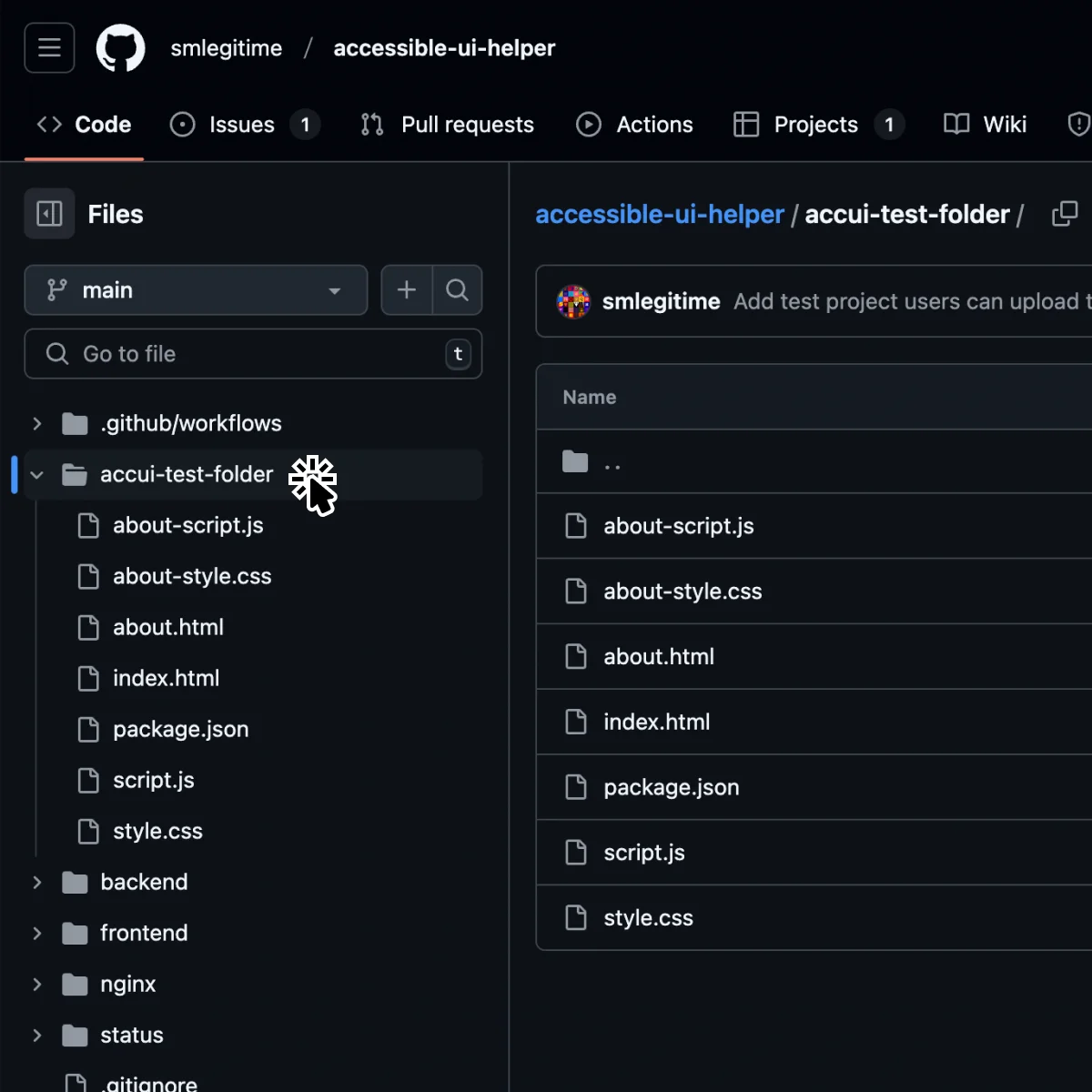
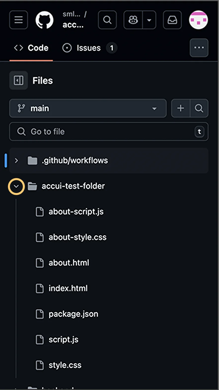
01-3 Interaction Analysis
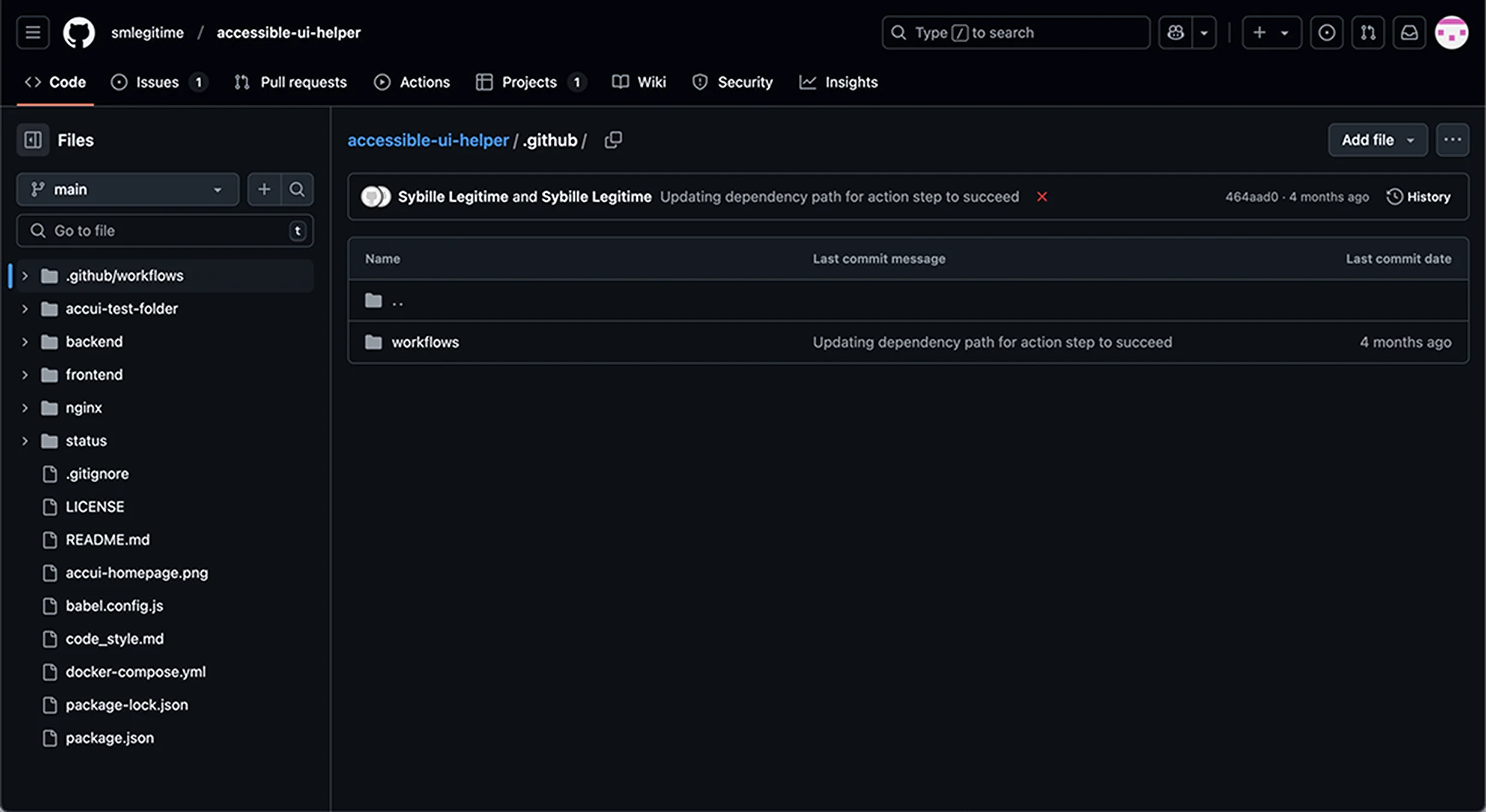
Mouse - Hover
User Inputs
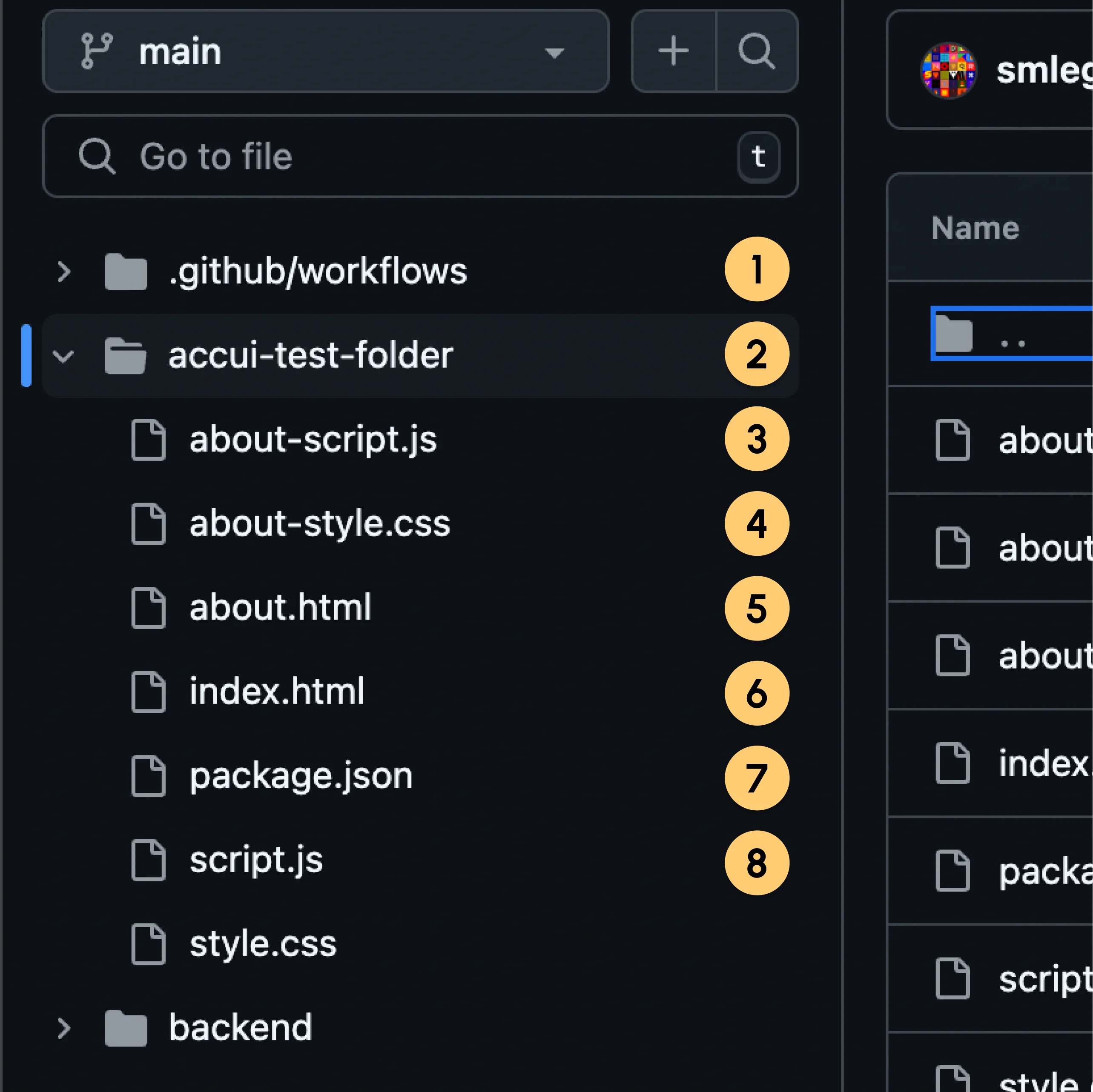
Mouse hover on the file item.
System Outputs
The cursor icon will change to a pointer. The file item’s background changes to a brighter gray color.
User Inputs
Mouse hover on menu item’s Mouse hover on menu item’s chevron icon text.
System Outputs
The cursor icon will change to a pointer. The file item’s background changes to a brighter gray color. The chevron icon background changes to an even brighter gray color.
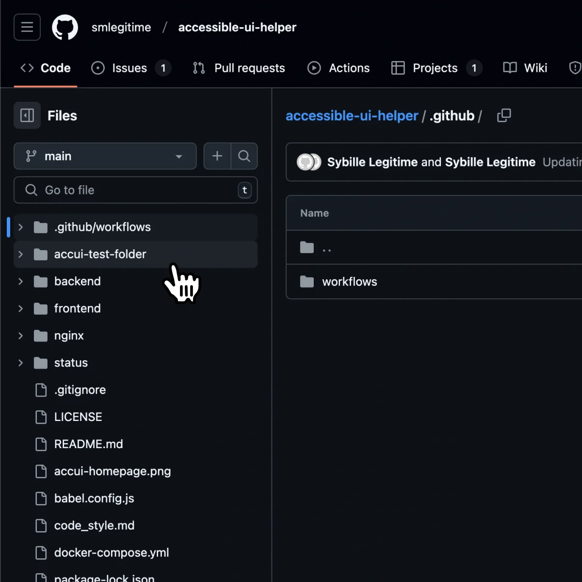
+ Positives
- On hover, both the cursor and the background color will be changed. By using 2 visual indicators at the same time, this design makes it very clear that this accordion menu item has been hovered.
- The on-hover background colors for the chevron icon and the text are different. It effectively tells users that these two elements can be interacted separately.
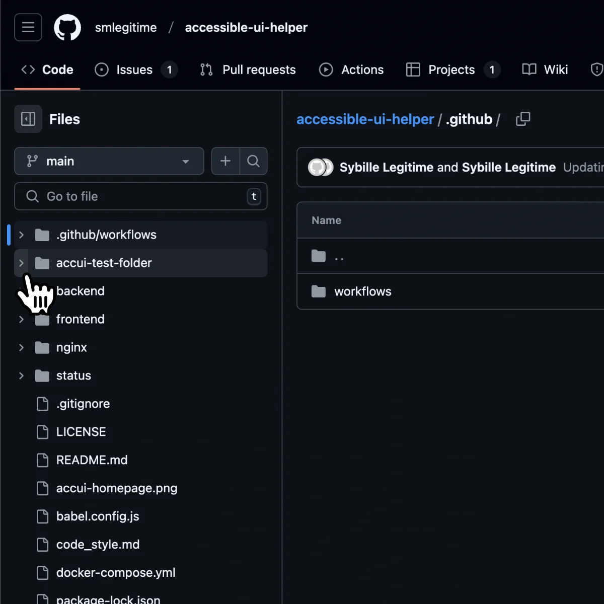
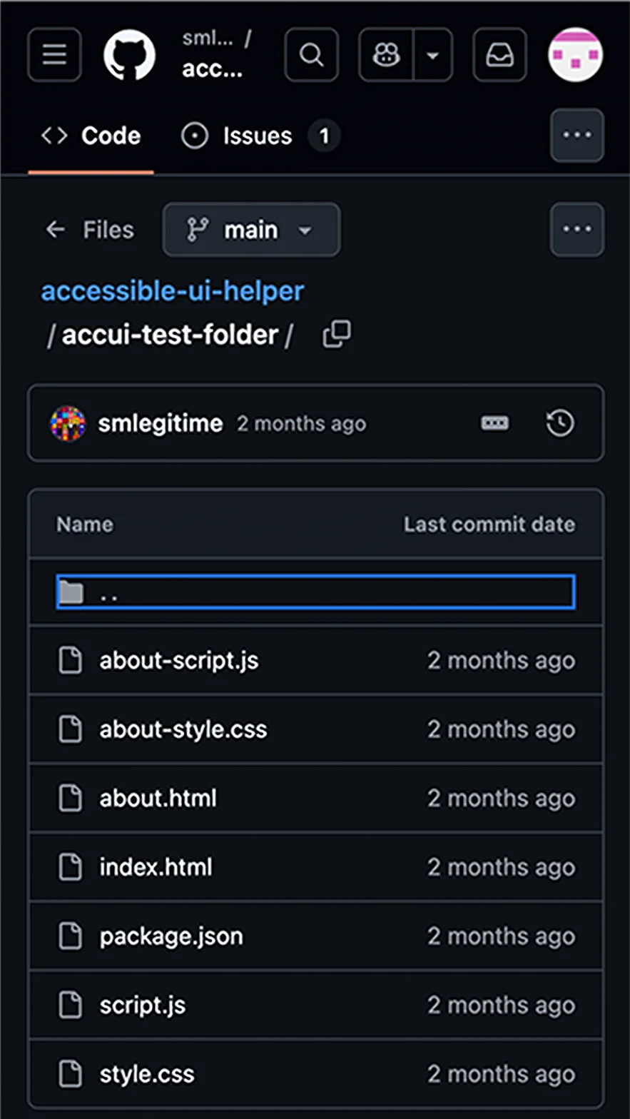
Mouse - Click
User Inputs
Click on a folder item.
System Outputs
Navigate to the clicked folder page. The chevron icon will turn 90 degrees to point downwards and reveal the sub-menu. The clicked file item will have a transparent gray background and a colored left border.
User Inputs
Click on menu item’s chevron icon.
System Outputs
If the submenu is collapsed, the chevron icon will turn 90 degrees to point downwards and reveal the subfile tree will be shown. If the subfile tree is shown, then clicking on it will turn the chevron icon to point toward the right and collapse the sub-file tree.
+ Positives
- Separating one accordion header into 2 parts supports usability. If the user only wants to browse the menu content they can just click on the icon to avoid navigating to another page.
- When the chevron icon is clicked, the icon will turn to point down, indicating this accordion’s content is expanded.
- When the text is clicked, the colored background and a thickened left border tell users that this is the topic they are currently looking at.
- The nest content is indented indicating it belongs to a lower level. The vertical guiding line on the left emphasizes that the from this accordion item to the next are on the same hierarchical level. With these 2 visual cues, the hierarchy of this accordion is clearly conveyed.
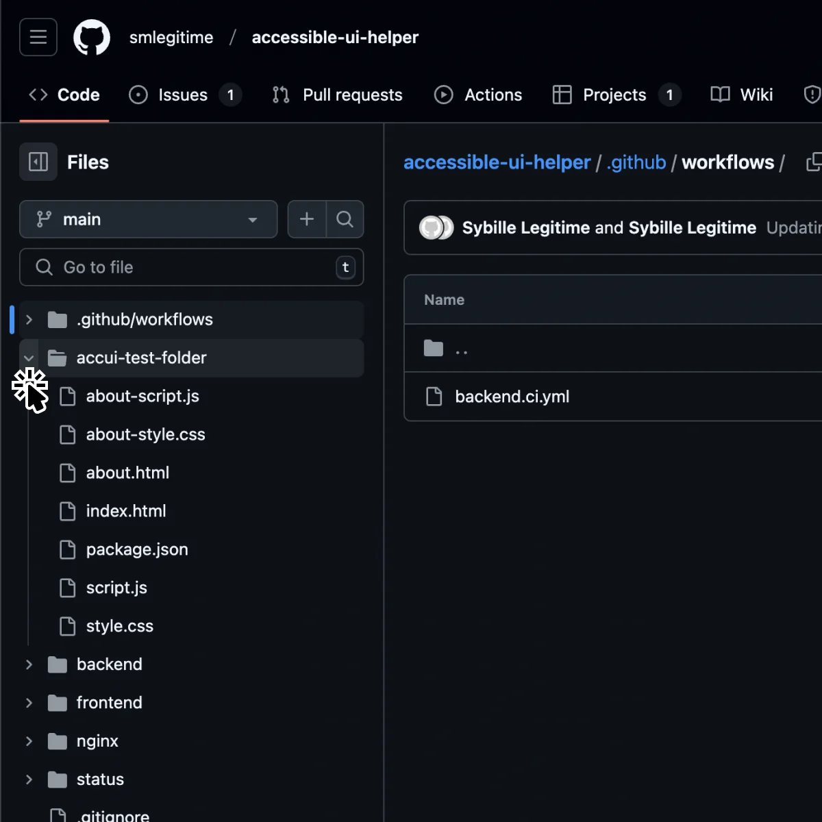
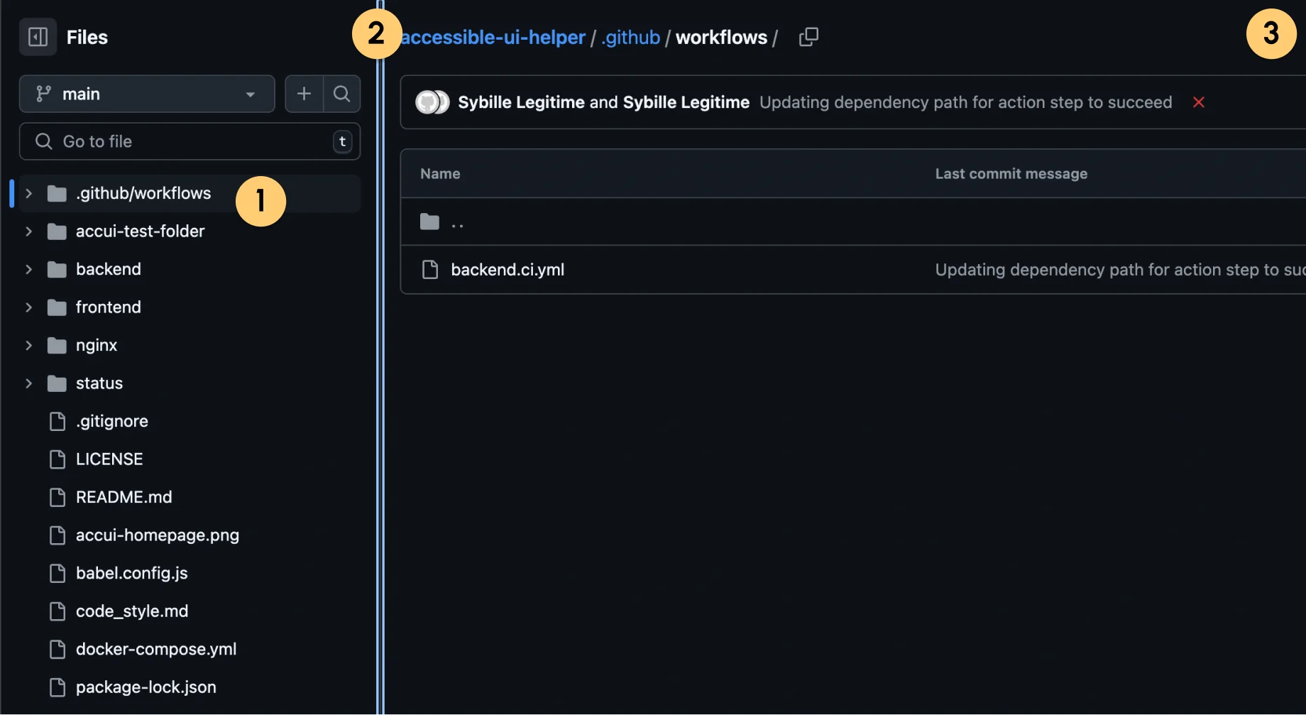
Keyboard - Tab
User Inputs
Pressing tab on the keyboard.
System Outputs
Visual - The first file item will be focused. The focused file item has a blue outline border.
Auditory - “Entering Files table. .github/workflows, File Tree Navigation, navigation”
“You are currently on table, press Control Option Shift Down Arrow.”
User Inputs
When a file item is focused, press the tab key again.
System Outputs
Visual - The next file in the file tree is not selected, but instead the draggable pane slider element is focused.
Auditory - “Leaving Files. Pane width 320 pixels, Draggable pane splitter, slider, Collapse file tree Files main branch Add file Search this repository Go to file File Tree Navigation Pane”
“You are currently on a slider. To start interacting with the slider, press Control Option Shift Down Arrow”
+ Positives
- On press, it will focus on the first accordion item and visualize it with a blue border box, which meets the expected behavior making it more familiar to the users.
- The Auditory announcements are clear and informative of what the focused element can do.
- Negative
- The focusing order is unconventional. Pressing tab when the first accordion item is focused, people will usually expect the next item in the accordion to be focused. However, it instead focuses on the draggable pane slider.
Focus order on collapsed accordion
Focus order using arrow key
Keyboard - Enter/Space
User Inputs
When a file item is focused, hitting the up or down arrow key.
System Outputs
Visual - If the up key is pressed, the previous file item will be focused. If the down key is pressed, the next file item will be focused.
Auditory - “accui-test-folder, File Tree Navigation, navigation”
“You are currently on table, press Control Option Shift Down Arrow.”
Keyboard - Arrow Key
User Inputs
When a folder item is focused, hit the enter or space key.
System Outputs
Visual - Navigate to the clicked folder page. The chevron icon will turn 90 degrees to point downwards and reveal the sub-menu. The clicked file item will have a transparent gray background and a colored left border.
Auditory - “Visited, link, Parent direcotry, Folder and files, table, 3 columns, 9 rows.”
+ Positives
- The accordion is triggered on tab key pressed (not on release). This makes the controls more responsive and more efficient which is usually what a user is looking for when they choose to use the keyboard to navigate the page.
- Negative
- Only allowing users to use the arrow key to navigate the accordion menu is not intuitive, and could cause some learnability issues in the beginning.
- Cannot focus on the chevron icon. So keyboard-only users cannot expand an accordion item without navigating to it.
Touch - Tap
User Inputs
Tap on the menu item’s chevron icon, and tap on a folder item.
System Outputs
If the sub menu is collapsed, the chevron icon will turn 90 degrees to point downwards and reveal the sub file tree will be shown. If the sub-file tree is shown, then clicking on it will turn the chevron icon to point toward the right and collapse the sub-file tree. Navigate to the clicked folder page. Collapse the file tree side menu.
- Negative
- The touch area for the chevron icon is too small, making it easy to mis-click.
02 Accordion Redesign
Result Showcase
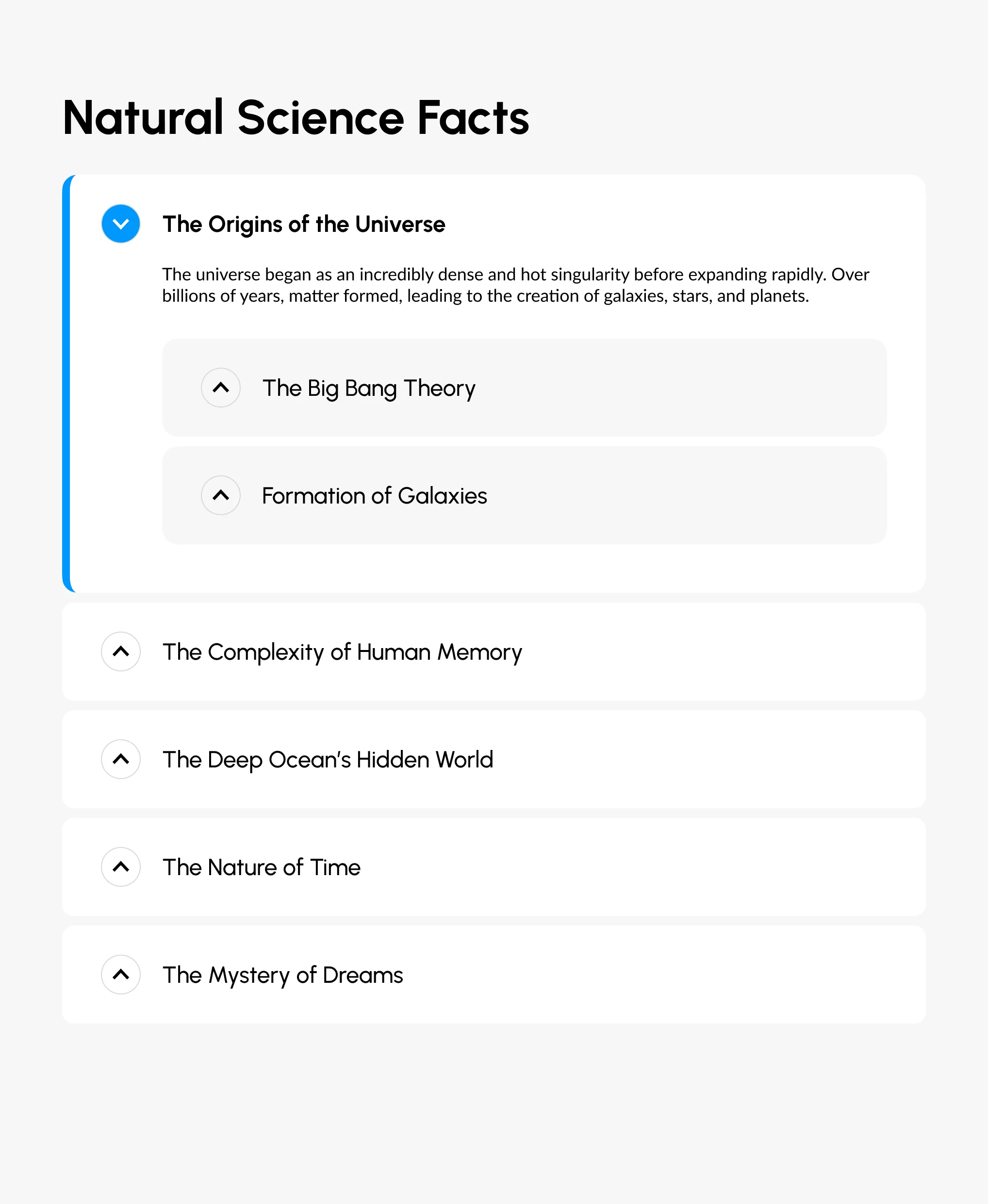
Details Deep Dives
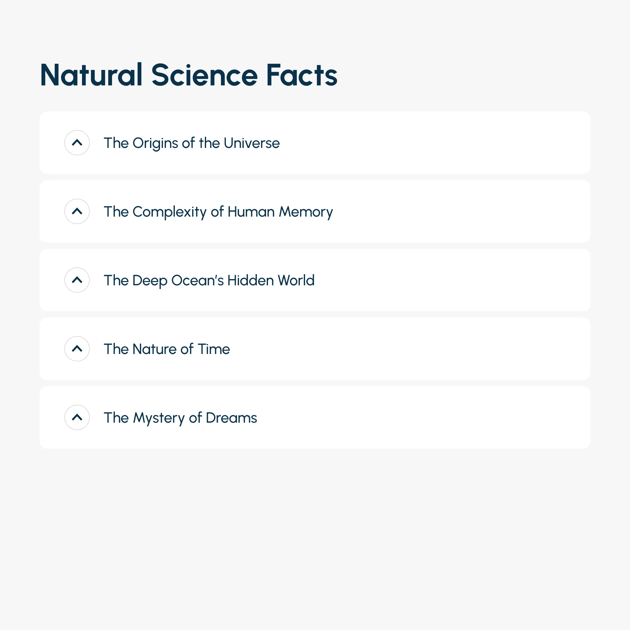
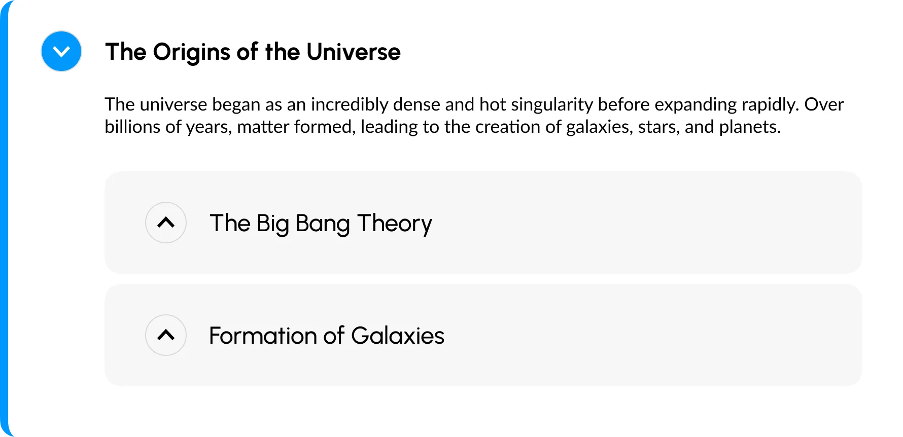
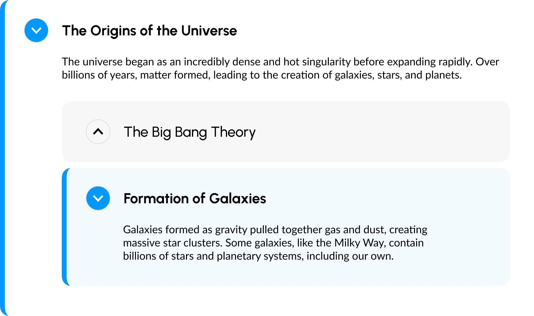
Default State

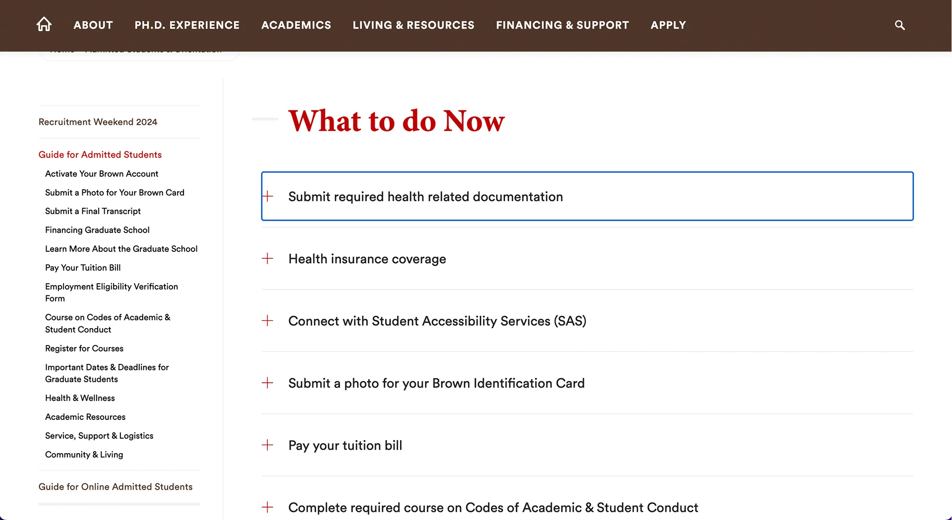
Each Accordion item has a large clickable button to ensure a large touch space for mobile users.
Inspired by Brown’s designUses a chevron icon, because it is the most universally used icon to suggest content expansion, dropdown menus, or revealing hidden options.
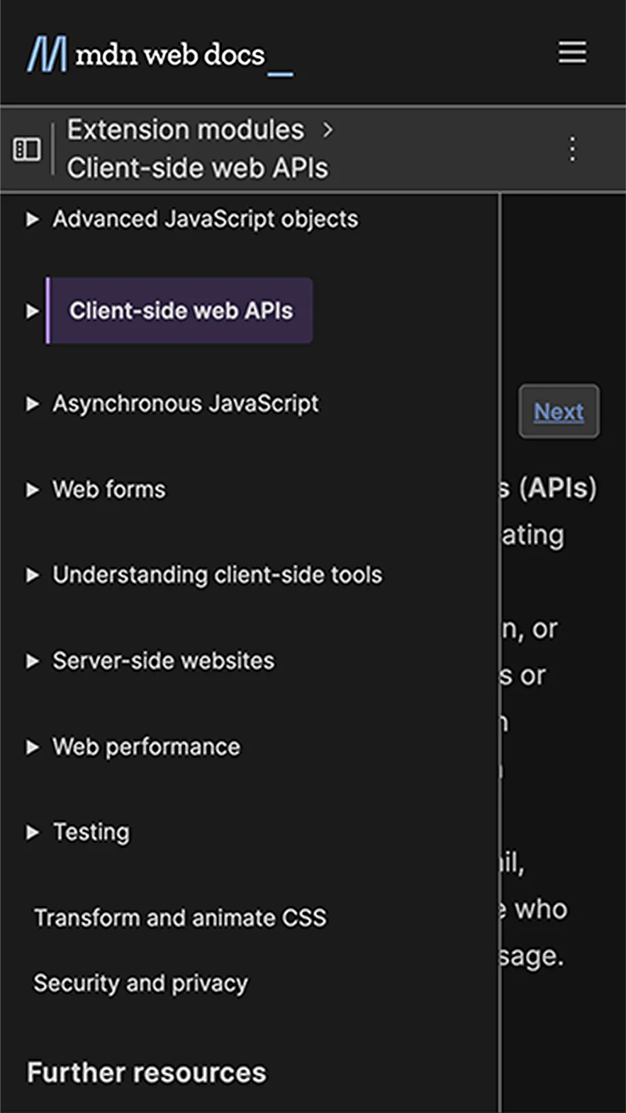
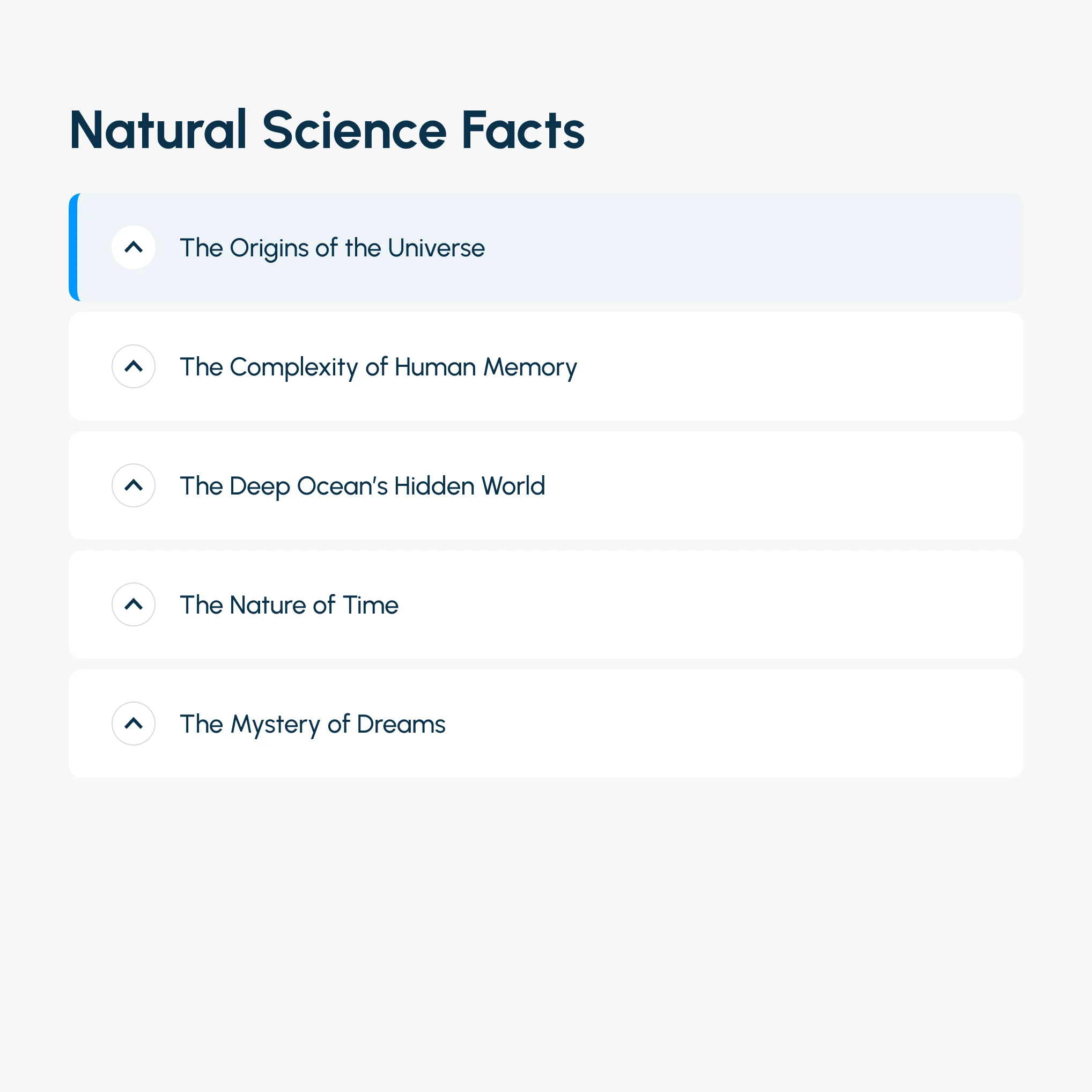
Inspired by Mdn’s designHover/Focus State

On Hover
The cursor, the background color, and the border will be changed. I intentionally use 3 visual changes to better convey the current state to people with color blindness.
Inspired by Github’s design
On hover tool tip to ensure users know how to interact with this element further improves its learnability.
Inspired by Brown’s design

On Focus
I use a yellow border as opposed to a conventional blue border to make the focus more apparent to users since the primary color of my design is also blue.
Auditory
“The Origins of the Universe, button, group.” “Expand accordion for The Origins of the Universe, You are currently on a button, group. To click this button, press Control Option Space”
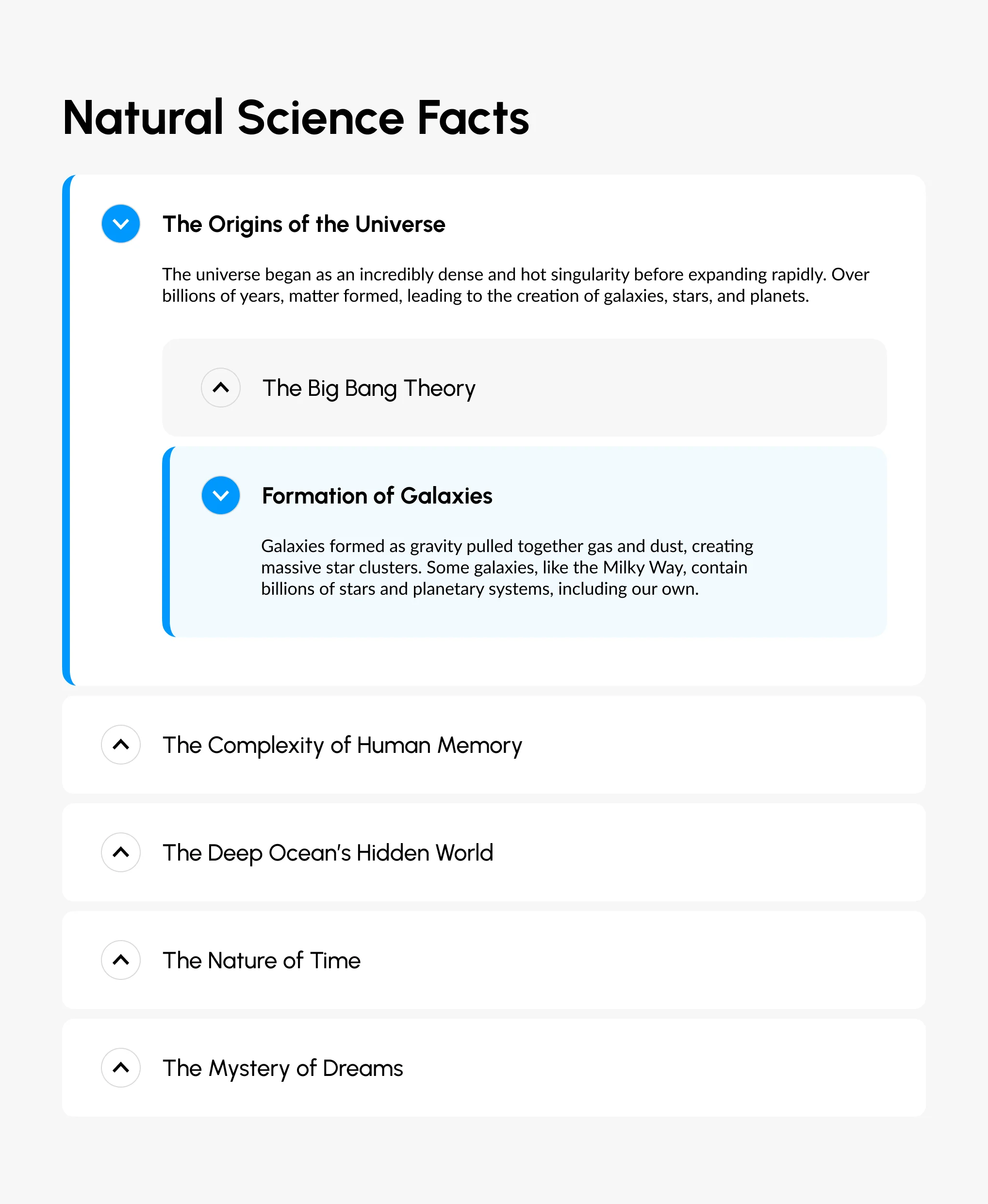
Inspired by Brown’s designActive State
Hierarchy
Through grouping by background color and left blue border, it clearly conveys that the content and sub-accordion are nested within its parent accordion.
Avoided issues of the Mdn’s design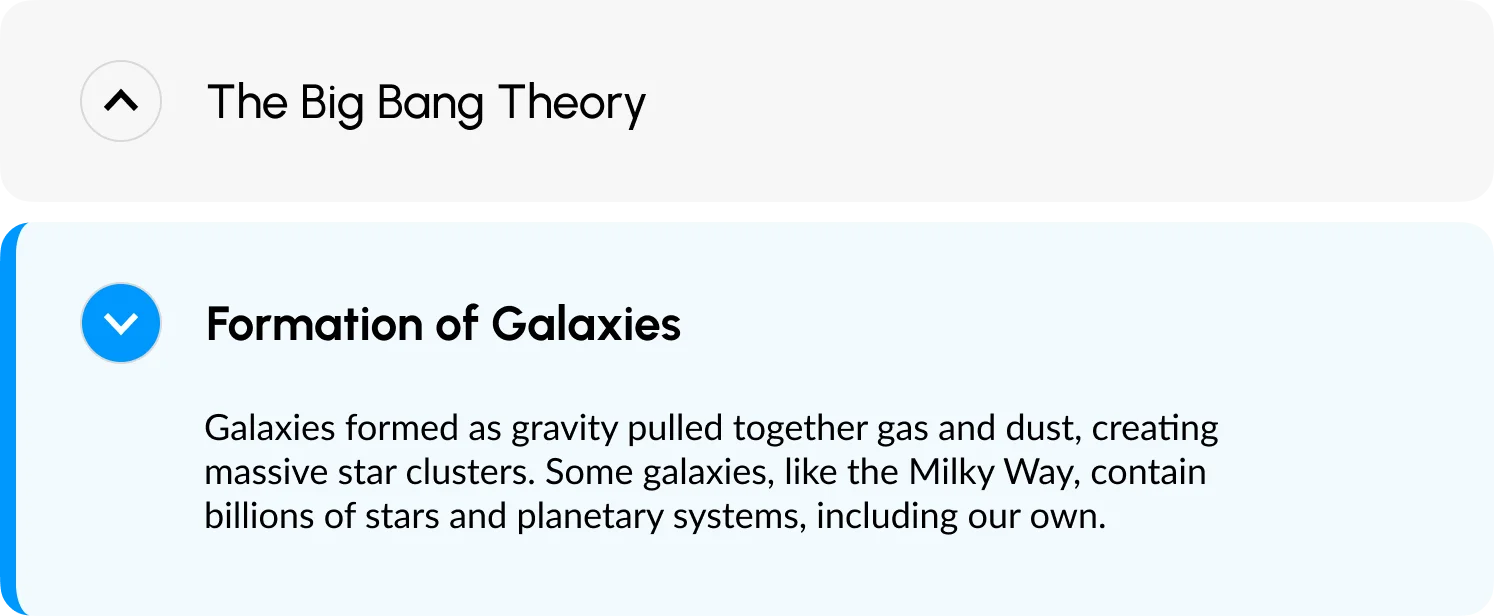
On Active
The chevron icon will point downwards, which implies clicking it could collapse content or hiding details. It will also get filled with blue to indicate that it is currently activated.
Inspired by Github’s designFocus Order
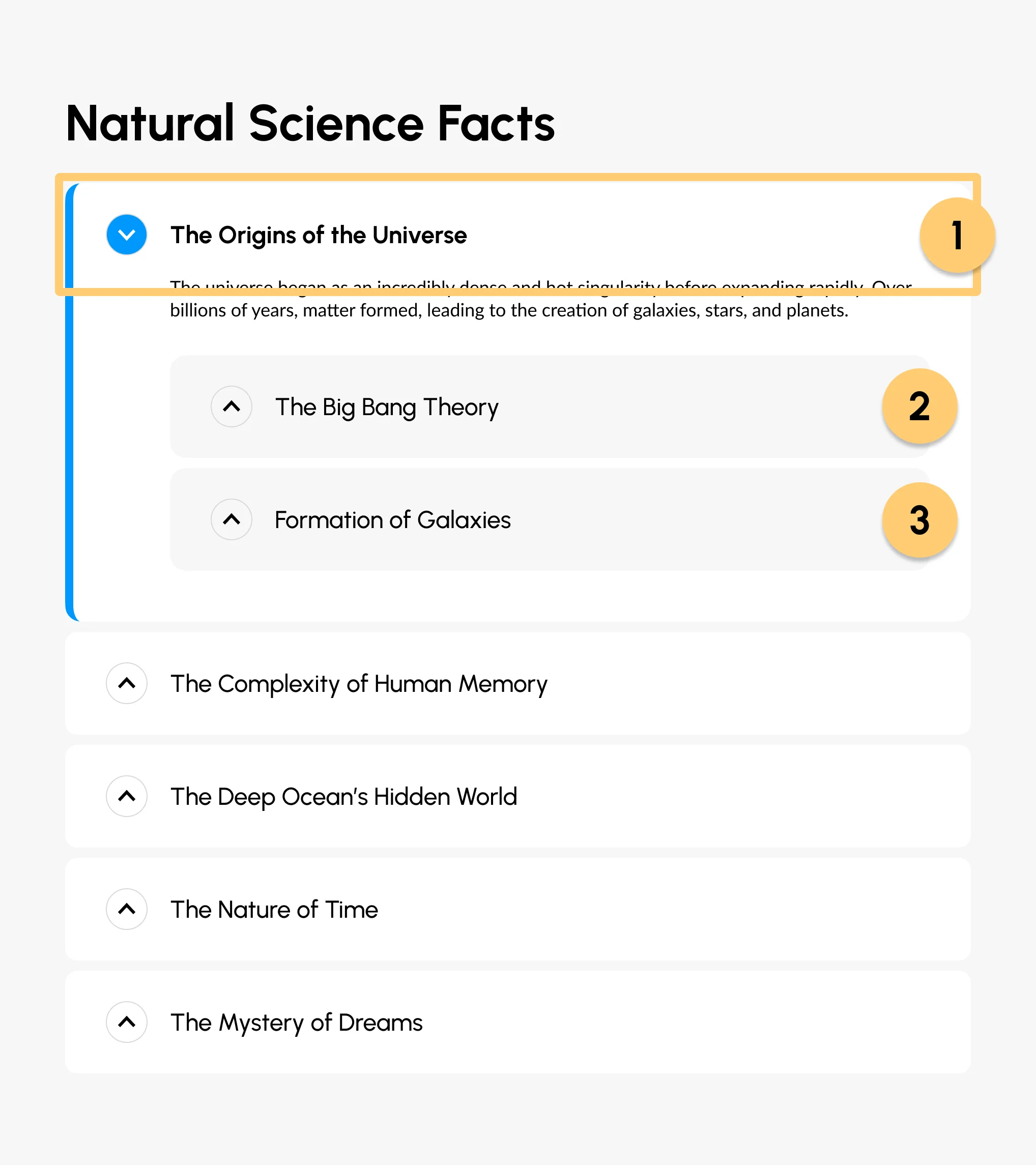
My design follows the conventional focus order which goes from top to bottom and outer layer to inner layers. Keyboard users can use tab/shift+tab or arrow keys to navigate the menu. I choose to support two ways of navigation because websites like Brown and Mdn uses tab but websites like Github uses arrow key to navigate.
State Models
Default
Hover

Focus
Disabled

Active
Active
Mouse Interaction
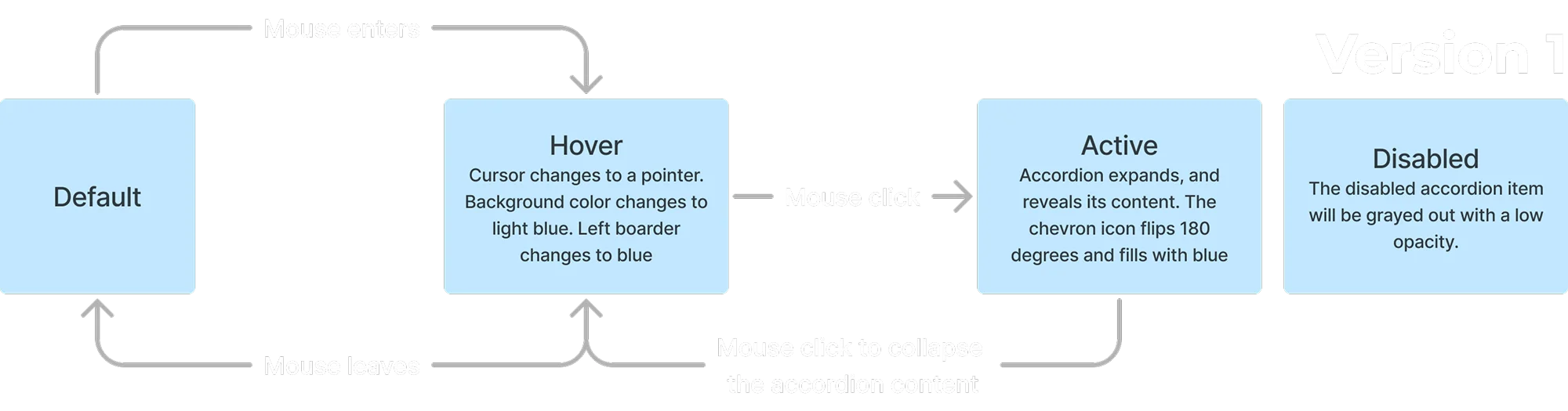
In version 1, users need to manually click on each accordion header to collapse its content, meaning it allows multiple accordion content to be expanded at the same time. It is more intuitive to learn the interaction, but it could hinder the efficiency, because multiple expanded accordion items will take a lot of the screen property, making it harder to navigate or read, so users might need to go back and manually collapse the content.
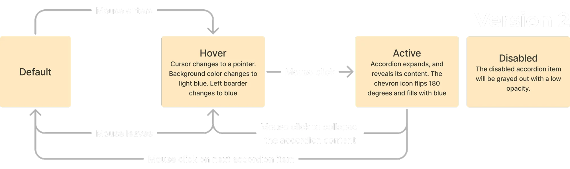
In version 2, on the contrary, if the user expands an accordion item’s content, the previously expanded content will be automatically collapsed. Version 2 prompts efficiency in this way, but it also challenges learnability, as there is no apparent signifier that conveys the affordance of clicking on the accordion item that will collapse another.
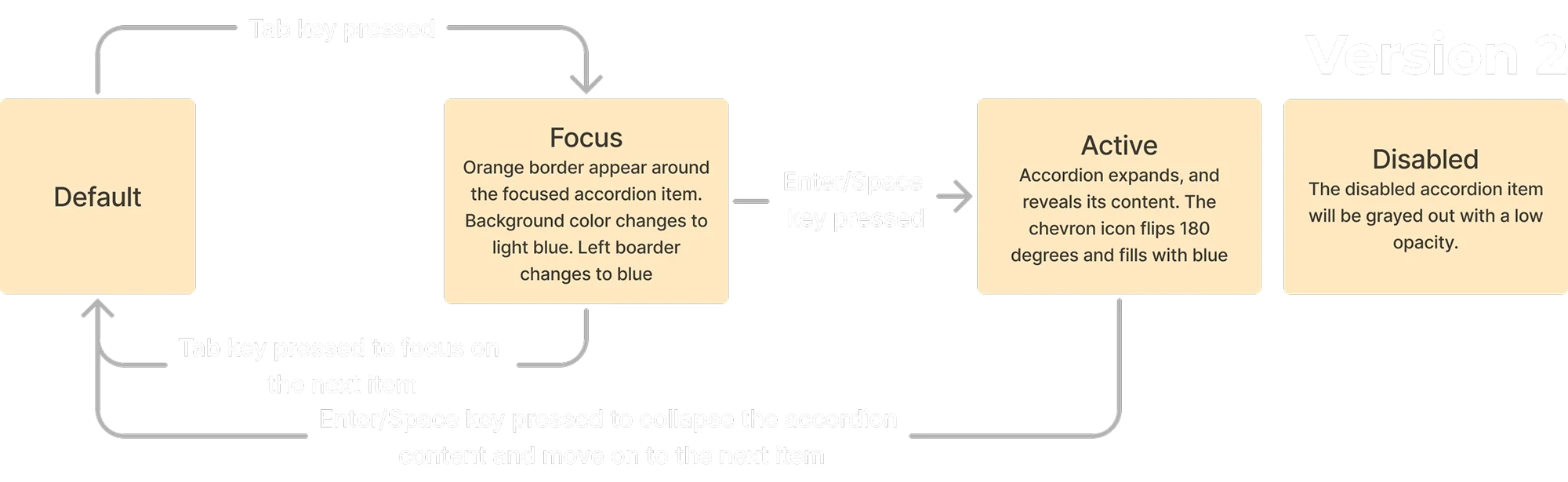
Keyboard Interaction

Version 1 follows the conventional accordion keyboard interaction scheme which is similar to Brown’s website’s accordion, due to it being a more familiar interaction scheme it will be more learnable.
Most people will move on to the next accordion after the collapsing the previous one. Version 2 saves that one click by automatically focusing on the next accordion item when the user collapses the previous content. However, this could cause the opposite effect, because in some cases, after collapsing content, a user may want to check the previous content instead.
03 Reflections
Learn From Good Accessibility Designs
For the accordion on the Brown website, the icon and the text header are grouped into a large button, making it more accessible to mobile or other touchscreen users. It provides a big touch area to ensure seamless interaction even on smaller screens and with less precise touch inputs.
So I adopted the same design mentality by making my accordion into a list of big buttons, and to further make it clear that each accordion item has expandable content I chose to use the chevron icon instead of the plus icon.
The plus icon and header text are grouped into a large button.
Chevron icon and header text are grouped into a large button.
Account for Missed Accessibility Opportunity
The different website uses different ways to navigate the accordion with a keyboard: GitHub uses the arrow key, while Mdn uses tab and shift + tab. People who got used to one type of control might find it frustrating when their familiar controls are not supported on some other websites. So to account for that, my accordion supports both tab and arrow key navigation.
To decrease this mismatch between the features of a user and the features of the product, in my design, I convey the on-hover (focus) state with three visual changes.
Default State
Subtle Background Color

Cursor Change

Colored Left Board

Subtle Background Color
More Accessibility Reflections
The Brown’s website’s has good screen reader support, the auditory output is informative about its content and tells user how to interact with it.
All three websites follow the most intuitive focus order of an accordion which goes from up and down, and outer to inner layer. They do not introduce any unexpectedness in terms of focus order, which helps screenreader users to navigate more easily.
What’s Next?
According to recent statistics, mobile devices account for approximately 50.48% of web traffic (desktop devices account for 46.51%), and mobile user numbers are still growing. As a result, many of the designers are prioritizing touch screen/mobile users in interface designs through mobile-first designs. If this trend keeps going, it may eventually lead to mobile-only design, which is great for small vertical screen users but not horizontal large screen users. Such a phenomenon has already happened in China, where there are many services are only supported on mobile devices.
To keep my future designs accessible I will no doubt optimize them for mobile users, but at the same time as long as people are still using laptops or desktops, I will respect their preferred mode of browsing by continuously supporting accessible mouse and keyboard interactions.
More Projects
Responsive Design
Providence Place
Website for a shopping mall in Providence, the go-to place for local shoppers
User Research
Vending Machine
Explore common issues a user may encountered when using the vending machine
UI/UX Design & Dev.
Others
From class projects to professional works, I have created a wide variety of designs