UI/UX Design & Dev.
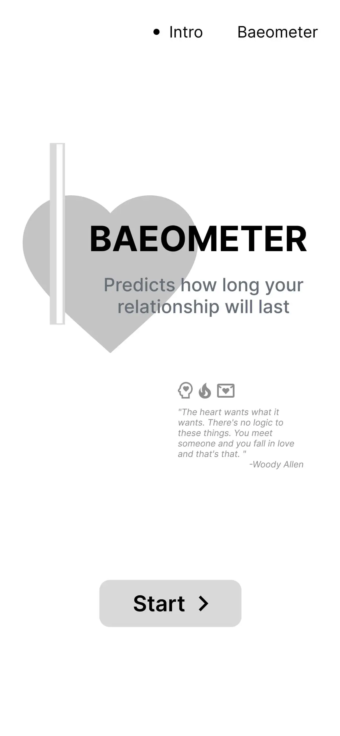
Baeometer
Overview
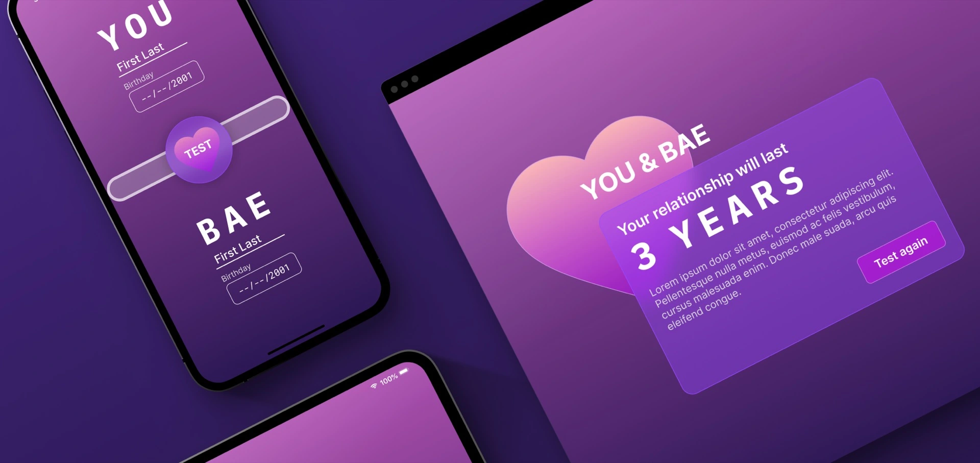
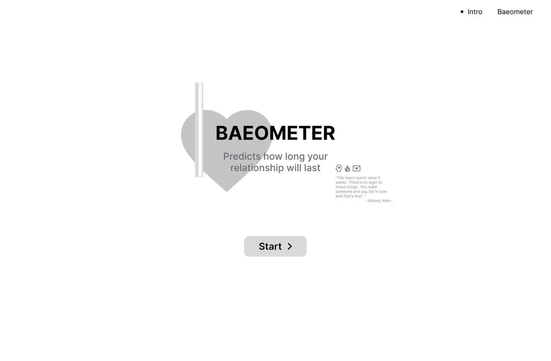
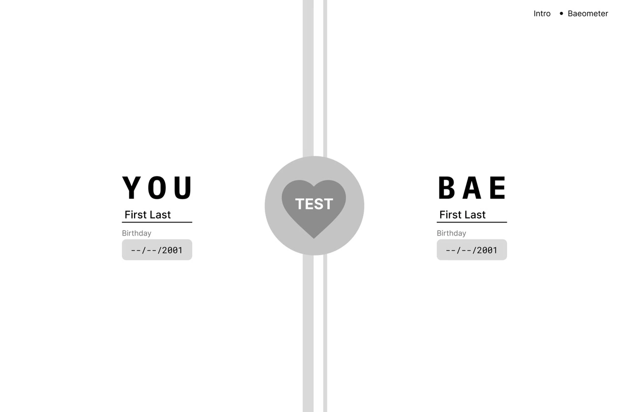
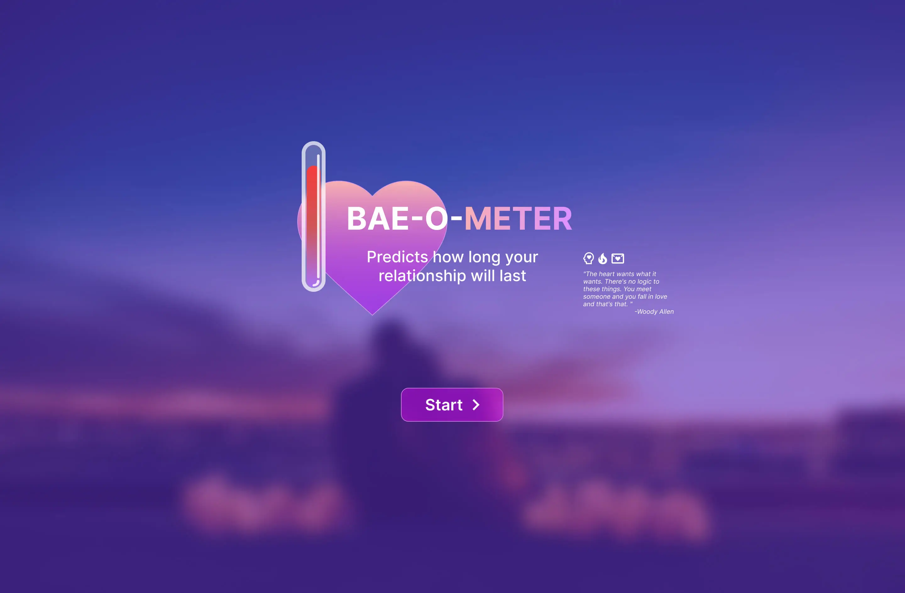
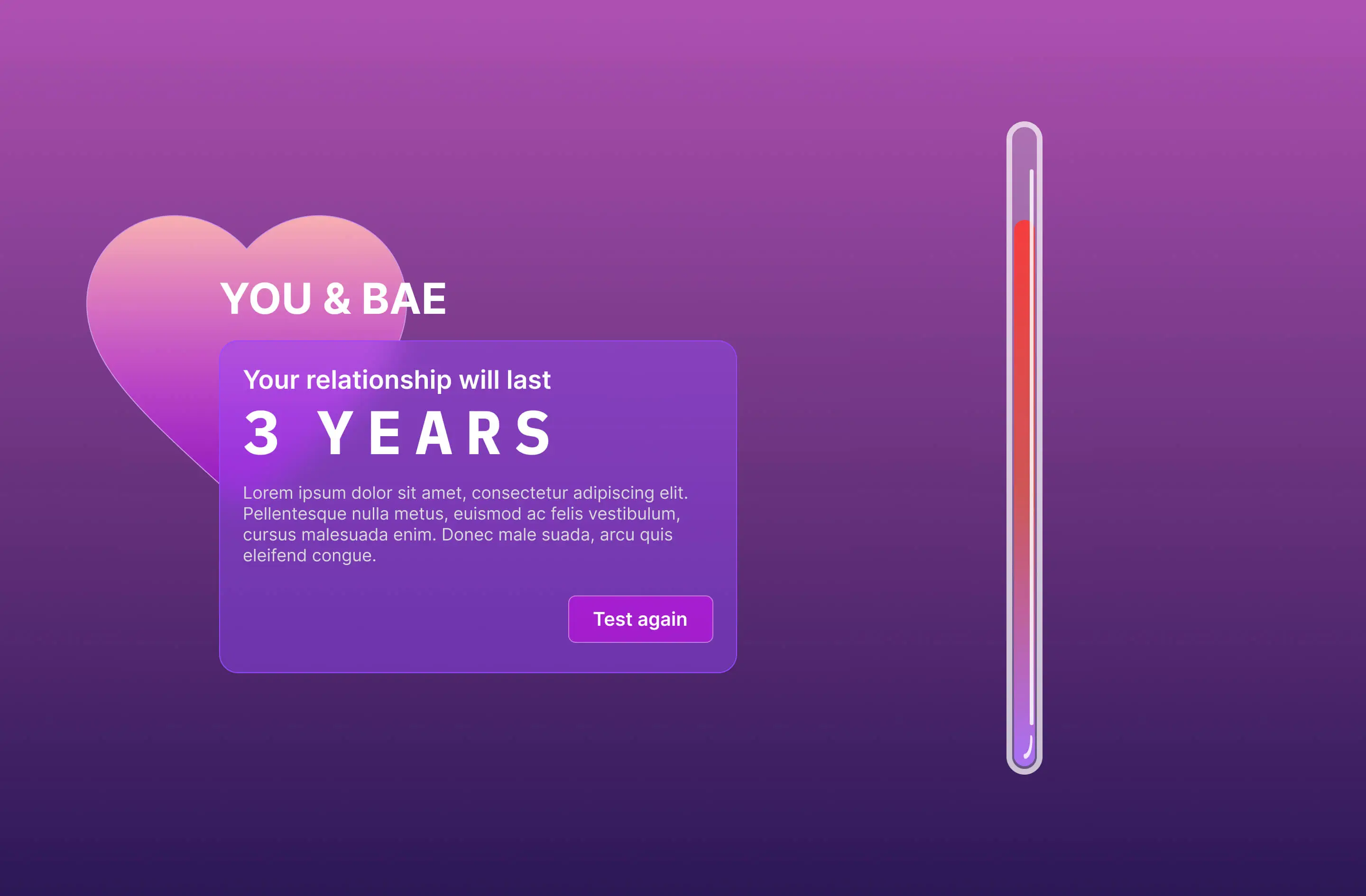
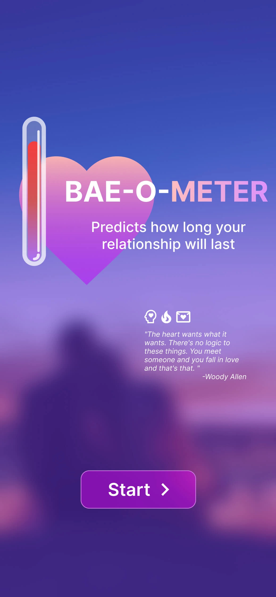
The Bae-O-Meter™ is a fortune-telling web-app that predicts the strength of a relationship between any two entities. After entering some basic information about each party, the Bae-O-Meter™ will factor each piece of data into its algorithm, and determine how long their hypothetical relationship would last, and how it will end through an AI-generated love story.
My Role
Product Design
UX Research
UX Testing
Development
Team
Project Leader
Developer
UX Researcher
Tools
Figma, FigJam
HTML, CSS, JS
GitHub
Time
May - June 2023
Design Process
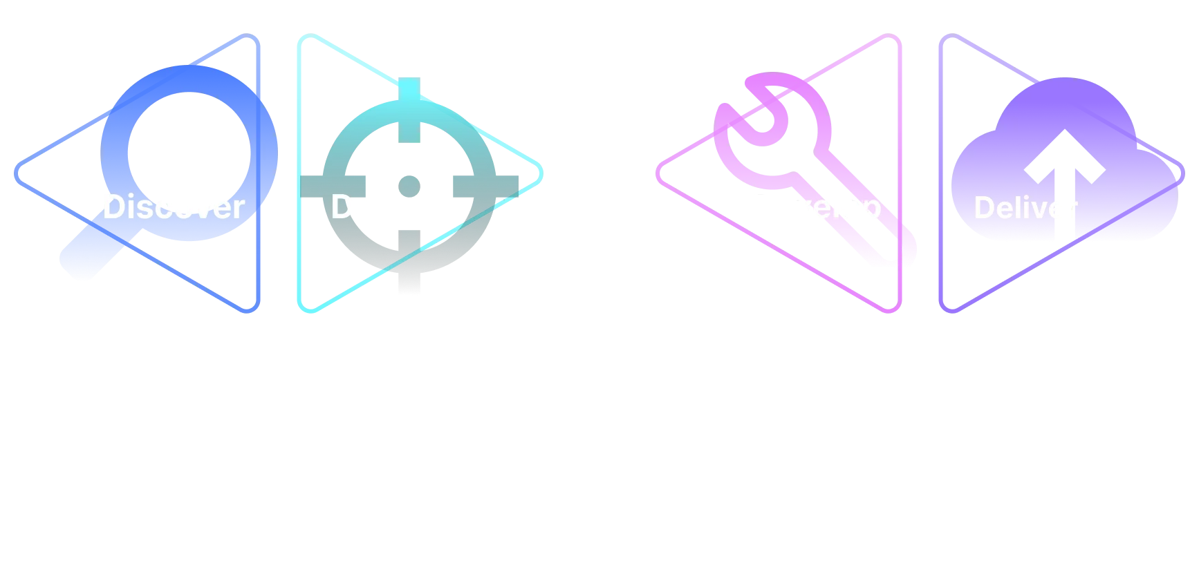
Discover
Interview Insights
Key Insights From User Interviews
"What would make you want to use a relation prediction fortune-telling app?"
- People want the app to be enjoyable to play with because having fun is the main motivator for using apps like this.
- The UX needs to make users feel the results are somewhat believable, even if this is just fortune-telling app for fun.
- Users want the app to provide a personalized experience that resonates with their relationship dynamics.
- Users want to get the result quickly, they don't want to waste too much time on it. They might lose patience halfway through.
Competitive Analysis
Love Calculator
By Prokerala
Strength:
- Simple user interface, intuitive to use.
- Quick and simple to get a result, not time-consuming at all.
- Provides multiple versions of compatibility prediction test.
Weakness:
- Not believable, it requires too little input from the users.
- Not inclusive, it only has male and female options in the gender selection menu.
Compatibility Test
By Proprofs
Strength:
- A big set of in-depth questions that make the test feel professional and analytical. As a result, the result it provides has higher credibility.
Weakness:
- Too many questions. It requires the user to commit plenty of time. It might intimidate the user from trying out the test.
- More like a serious test, so the entertainment aspect is hindered.
- The more credible feeling result might also be a drawback because if the result is less than ideal it is harder for users to take it as a joke, which might negatively affect a relationship.
Define
Persona
To better empathize with my targeted users, I created a persona Cassie who is a college student interested in making connects with her partner in new and entertaining ways.
Cassie Wang
Undergraduate Student
Location
Gender
Age
Major
Status
San Diego
Female
20
Communication
Casual Relationship
"I'm always up for trying out new apps with my friends for a good laugh. If it's quick to use and offers some insights into relationships, count me in!"
Goals and Needs
- Constantly looking for ways to have fun and unwind after classes
- Wants to connect with her partner in entertaining ways
- Curious about the unrealistic relationships with her celebrity crushes
- Wants fast-paced or short-form content for entertainment
Behaviors
- Busy college student, only has limited time for entertainment
- Uses her smartphone for various social media and entertainment apps
- Enjoys sharing trendy or funny content with her friends
- Spend a lot of time online, actively engages with social media contents
User Stories
From Persona Cassie’s perspective, I wrote the following user stories to pinpoint the user needs, and with the team’s effort, we came up with realistic solutions for each need.
Story #1
As Cassie, a college student looking for fun and engaging apps, I want the app to be more engaging, so I can be more invested and have more fun.
Solution:
Have multiple types of interaction with the app (typing, drawing, selecting).
Have appealing visuals, including fancy animation & transition, and fun visual elements.
Story #2
As Cassie, who is looking for a light-hearted fortune-telling experience, I want the fortune-telling to be somewhat believable, so I can maintain the suspension of disbelief and enjoy the playful outcome without it feeling entirely random.
Solution:
All the inputs will be fed into a logical algorithm for calculating the result to make sure the result is consistent.
Story #3
As Cassie, who is currenly in a relationship and also as someone who values personal connections and experiences, I want the fortune telling to feel personal, so I can resonate with the predictions better.
Solution:
Based on the user inputs, show an ai generated love story on the result screen.
Story #4
As Cassie, a busy college student with limited time and fast-paced internet content, I don't want to spend too much time on it, because I want to engage with the app without feeling like I'm investing too much time, preventing me from losing interest midway.
Solution:
Keep the app short and sweet, keep friction at its minimum, and make sure the users can easily go through our app without blockers.
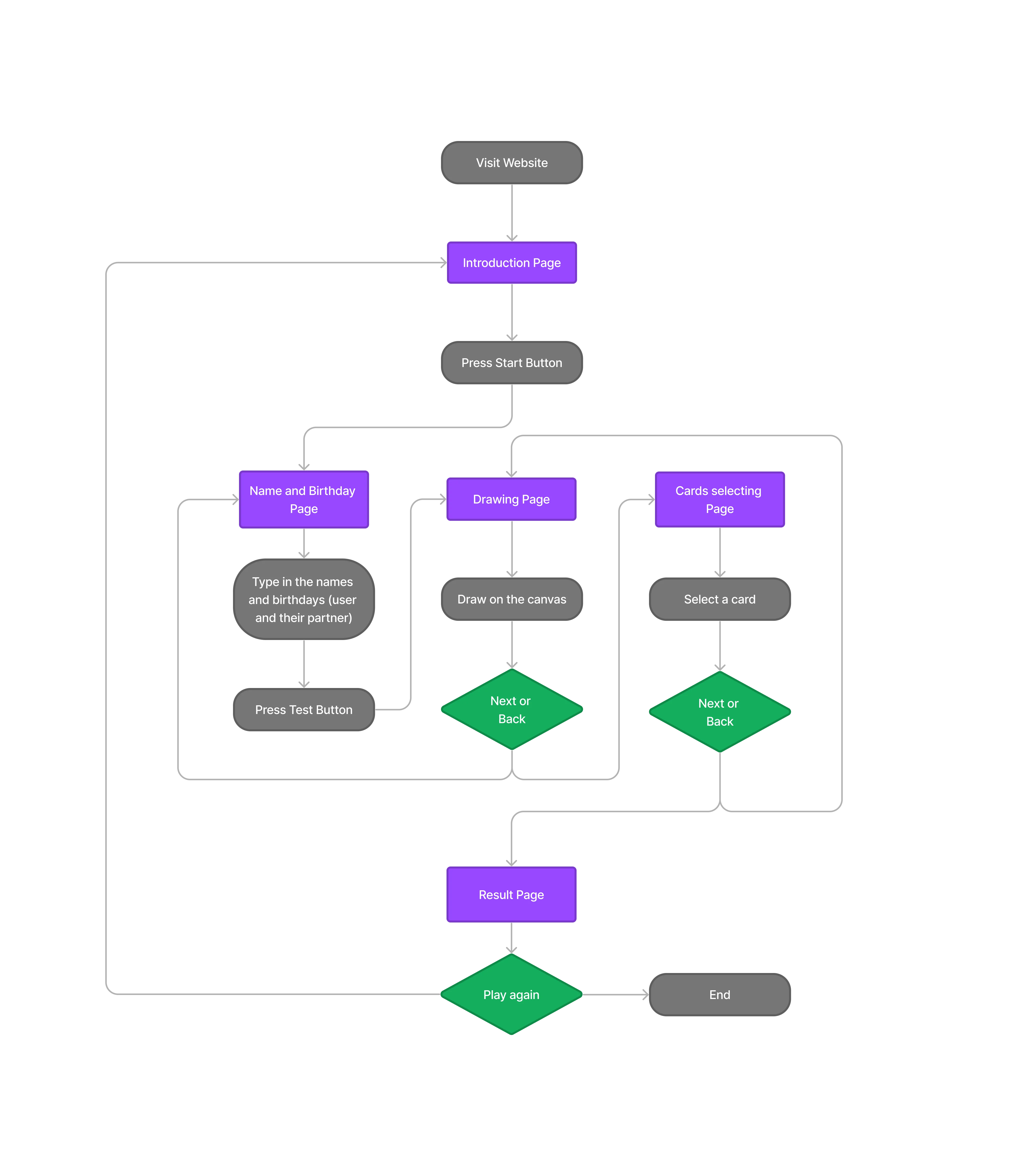
User Flow
I use a user flow diagram to map out the process of a typical user using Beaometer to achieve their goal. It grants me an overview of the app’s functionality and makes sure that users can go through the entire process without structural blockers.
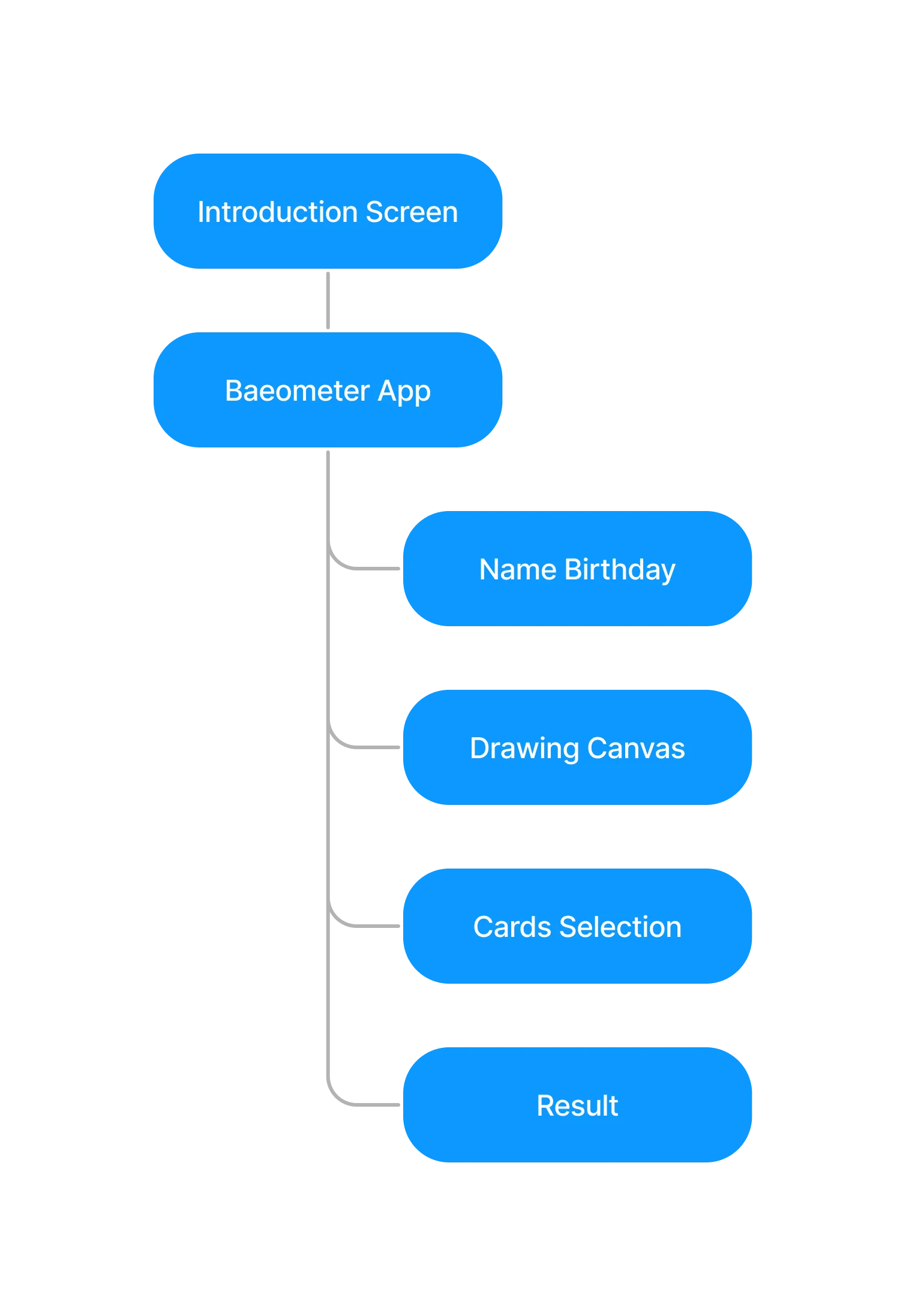
Information Architecture
We used Information Architecture to map out how different pages and pieces of information are connected and organized which establishes a clear hierarchical structure that benefits the designing and the development process.
Develop
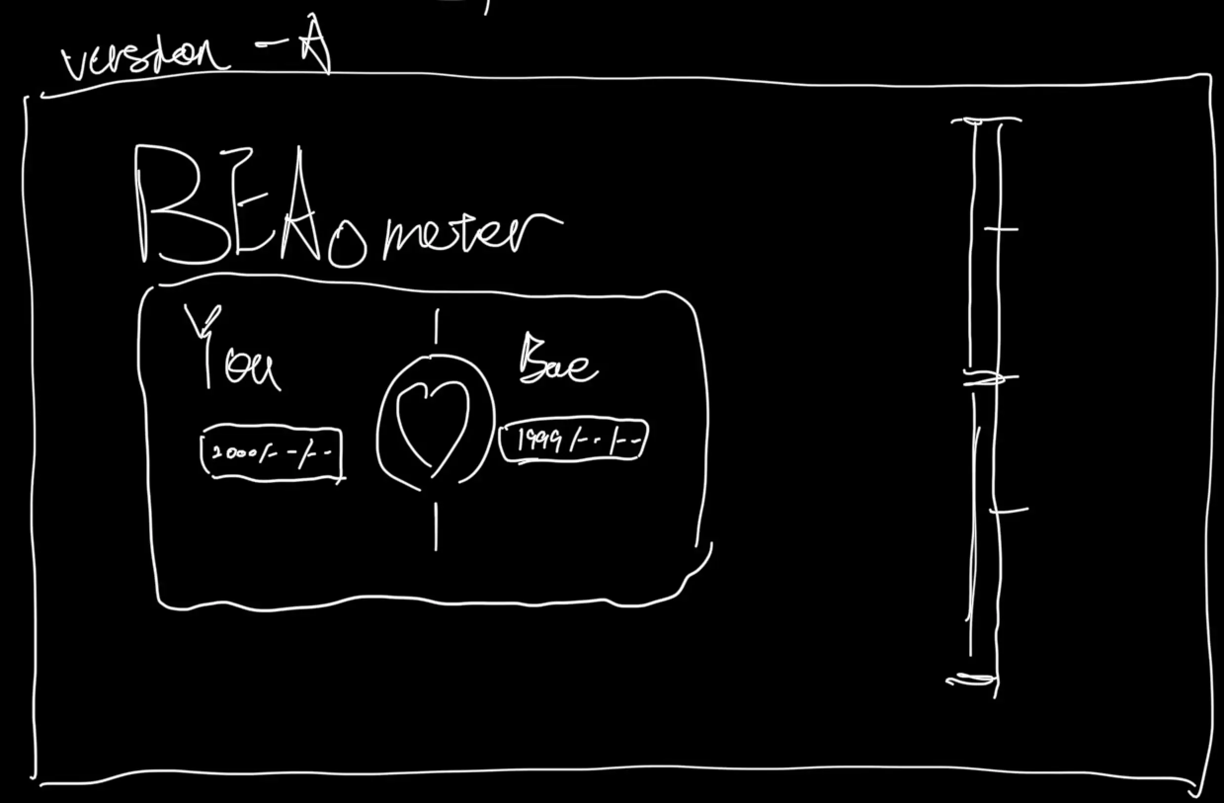
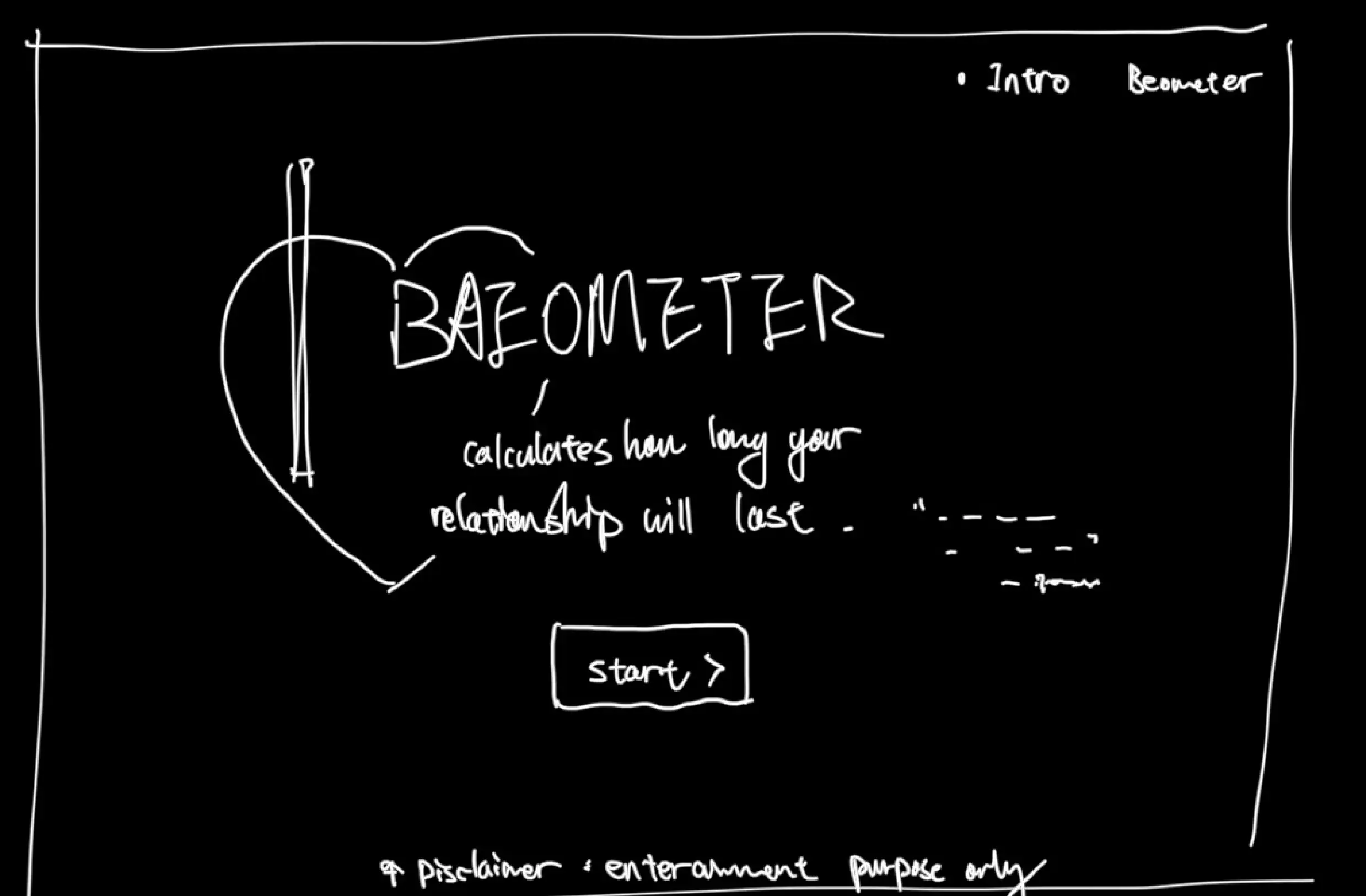
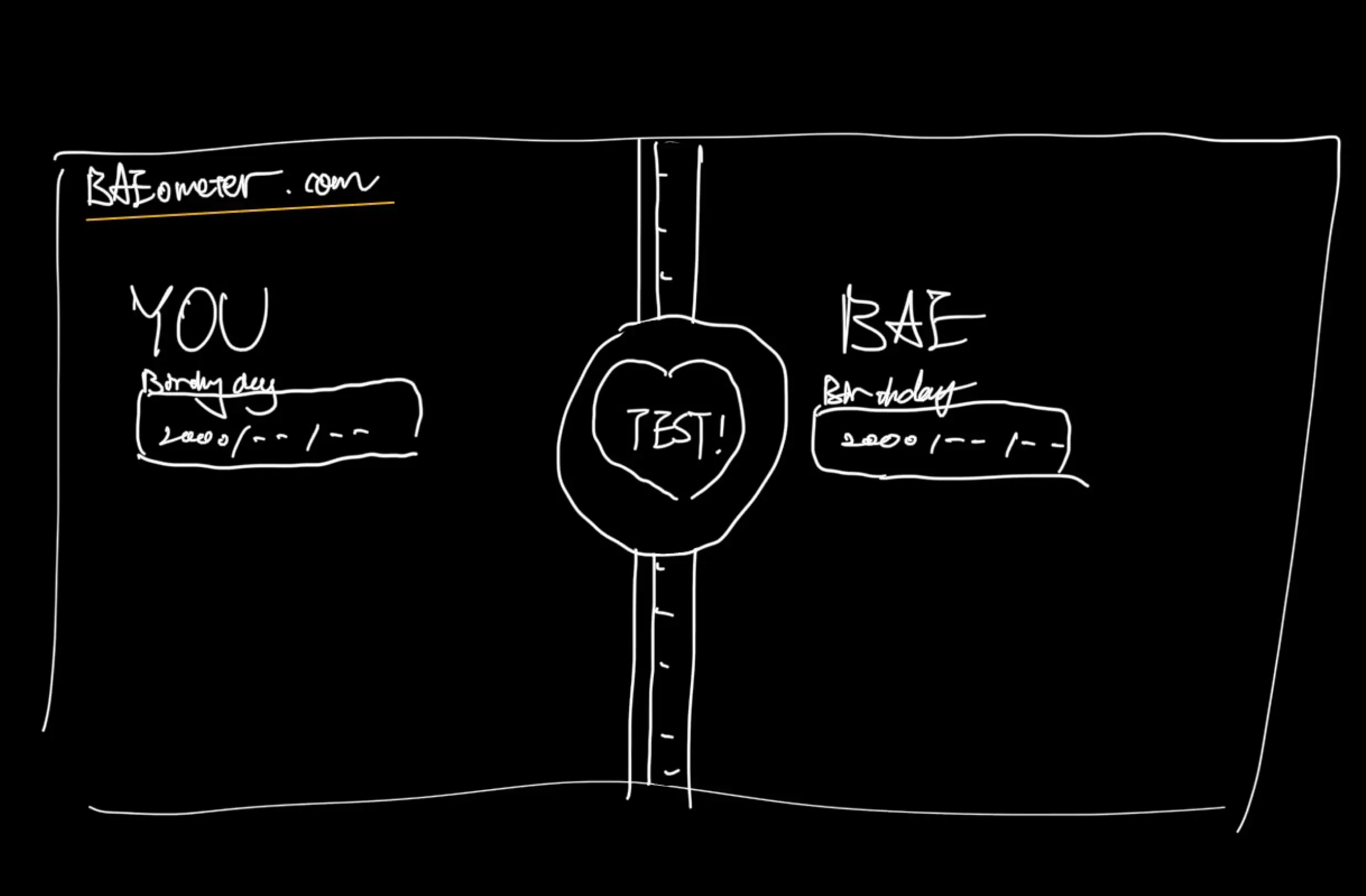
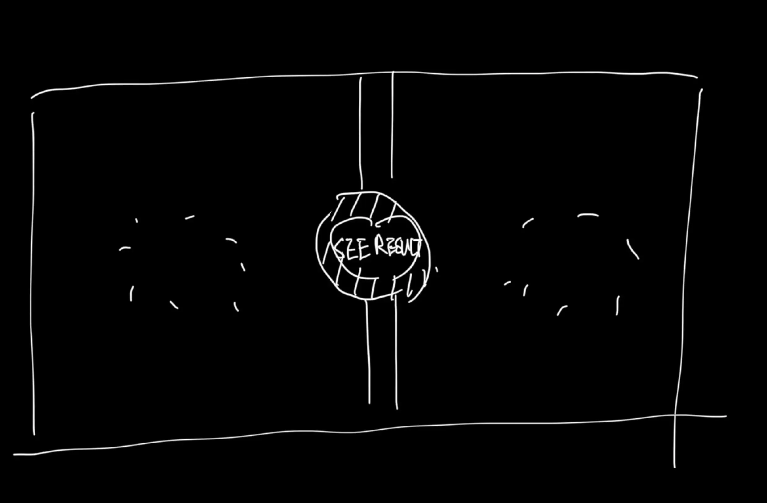
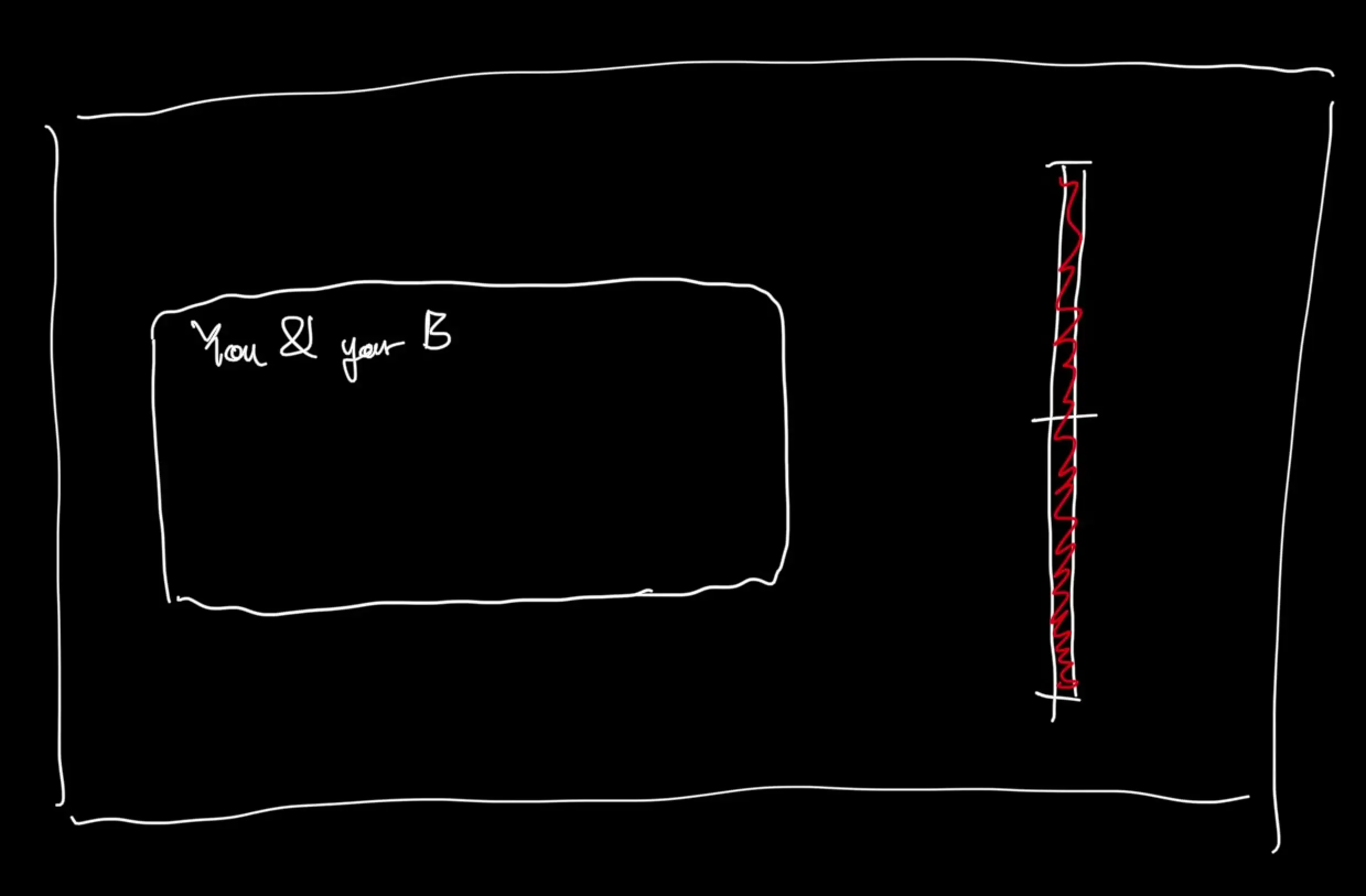
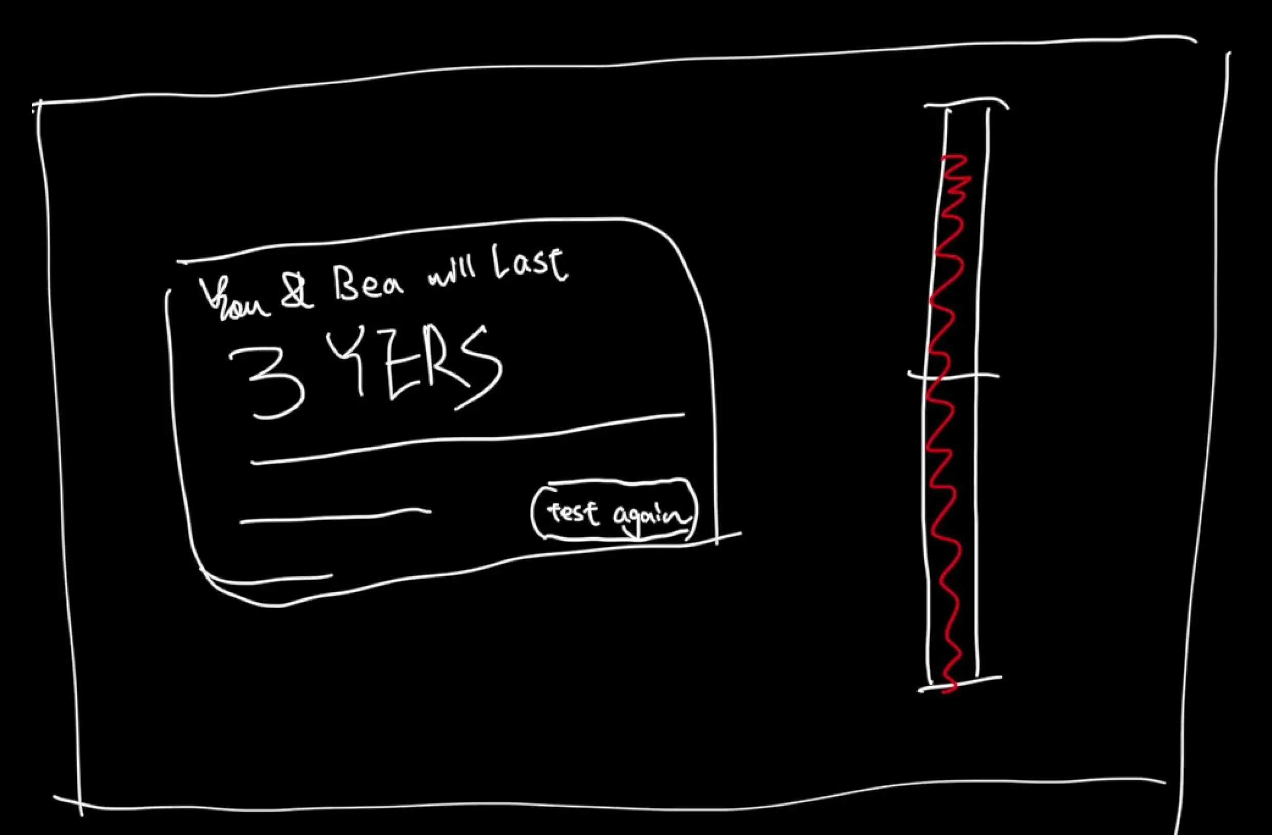
Wireframe (Hand-Drawn and Digital)
I used both hand-drawn and digital wireframes to map out the visual structure of our app in a low-commitment way. And visualize the UX solutions that we came up with.
Visit ProjectI. Hand-Drawn
II. Digital
III. Types of Interaction
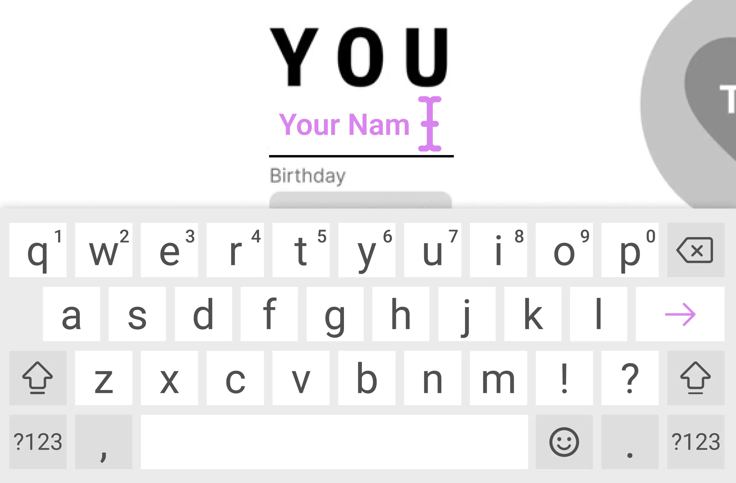
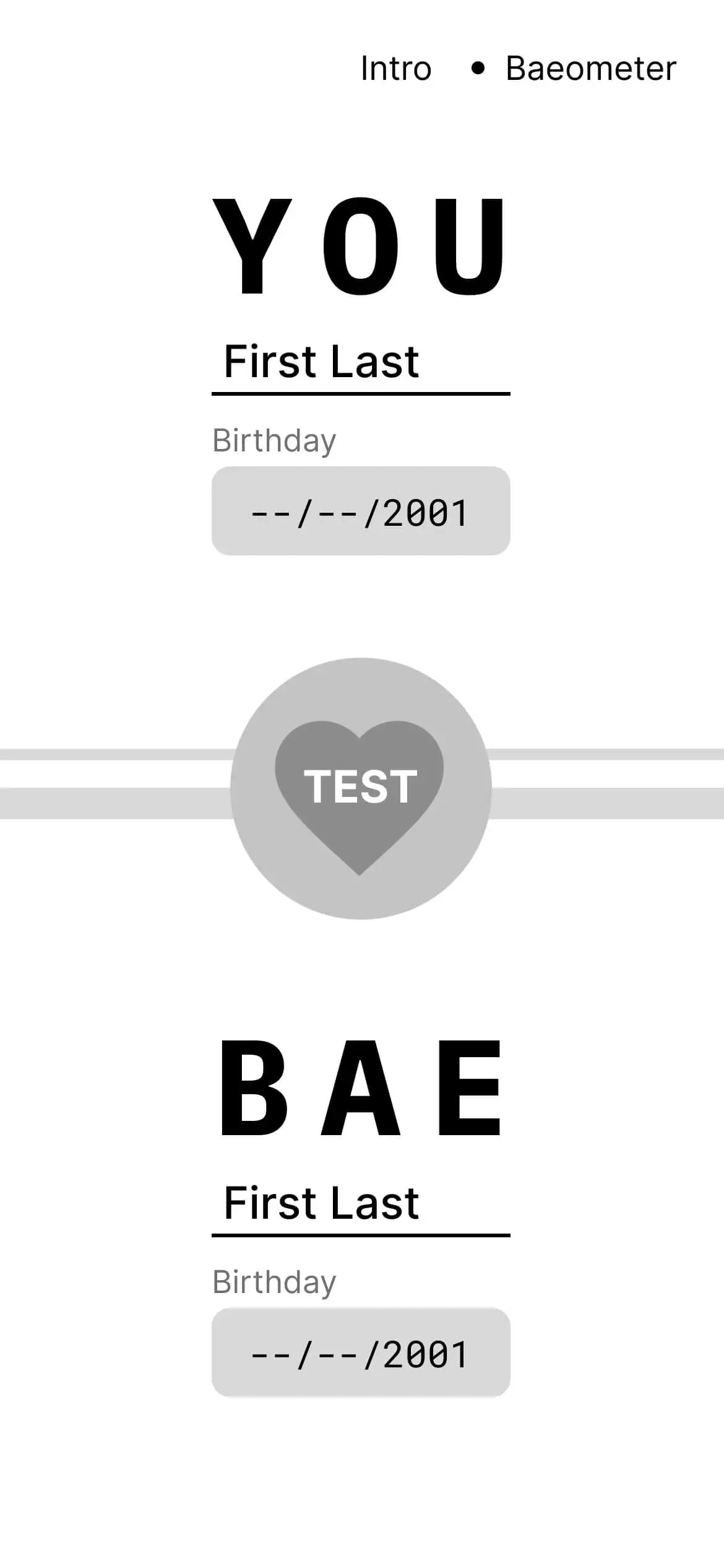
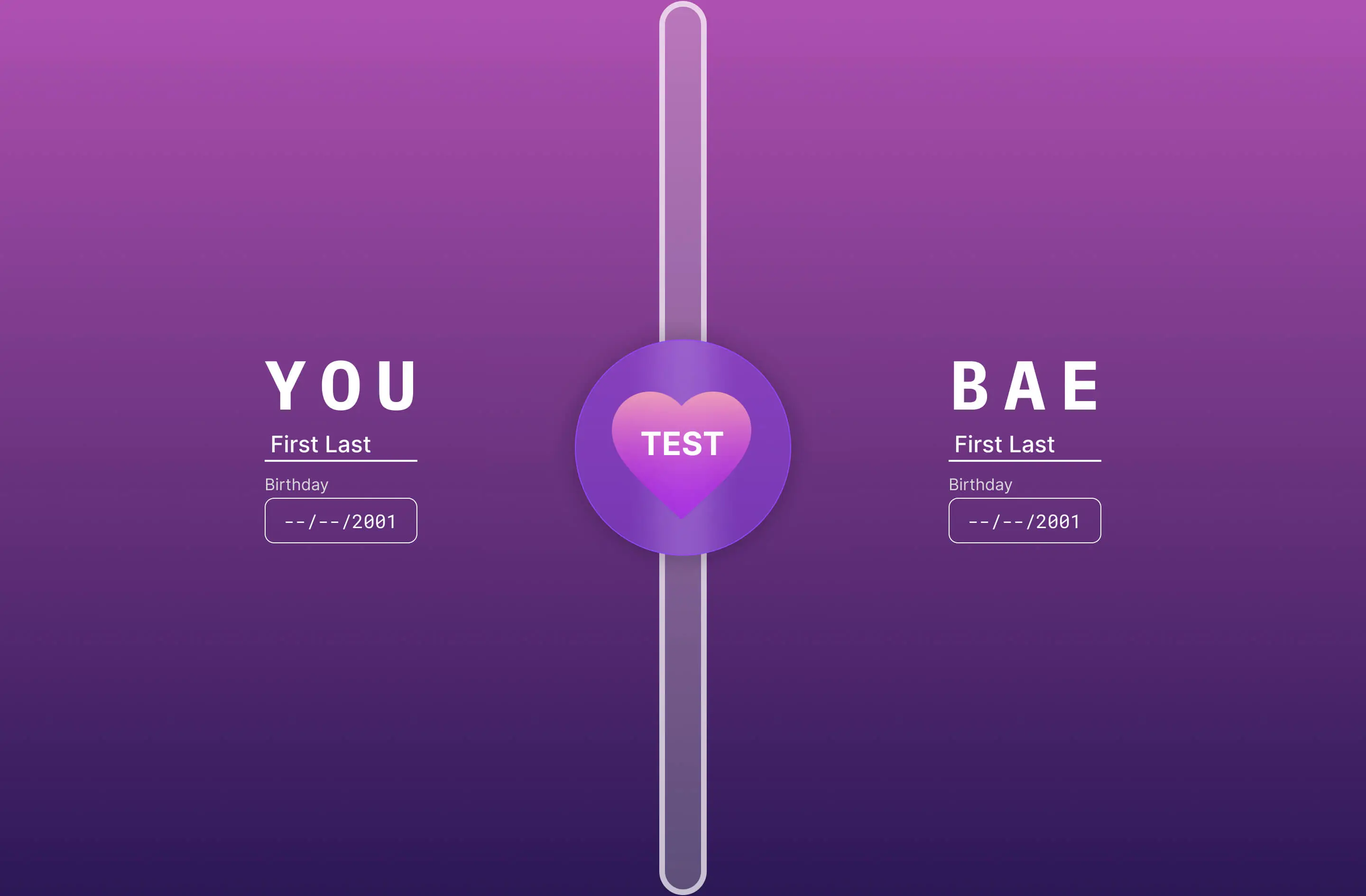
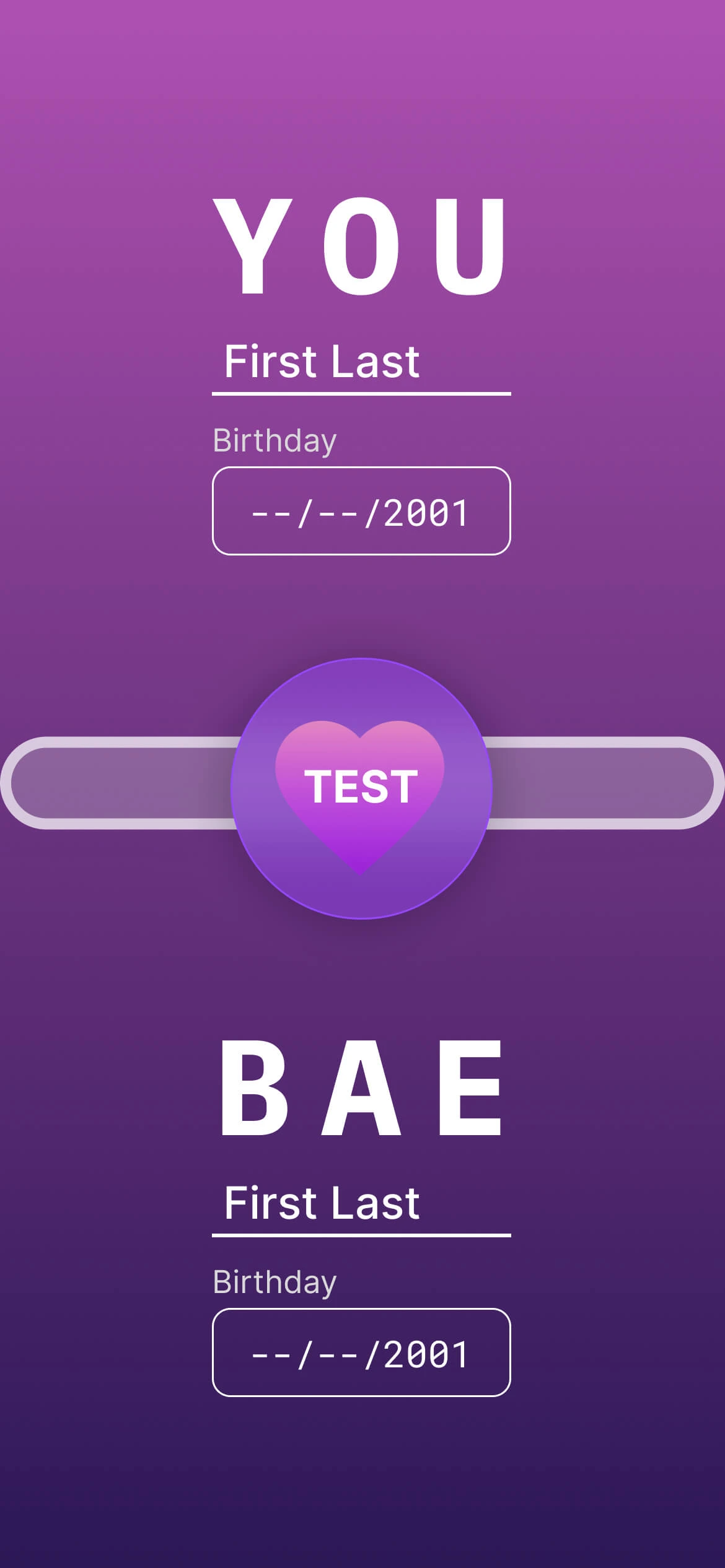
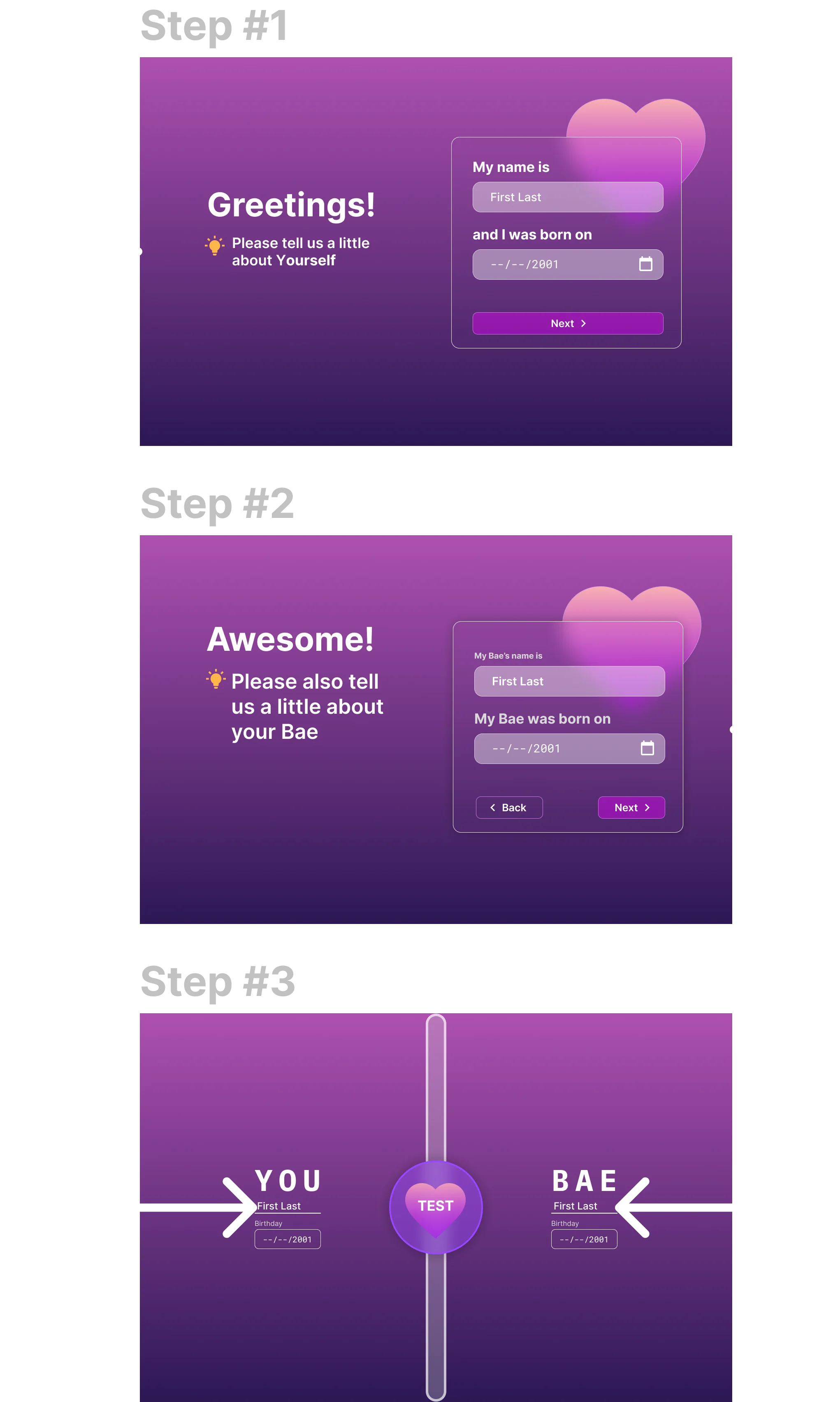
Typing
Users will be able to type in their birthday and name. Starting with simple interactions invite users to continue their user flow.
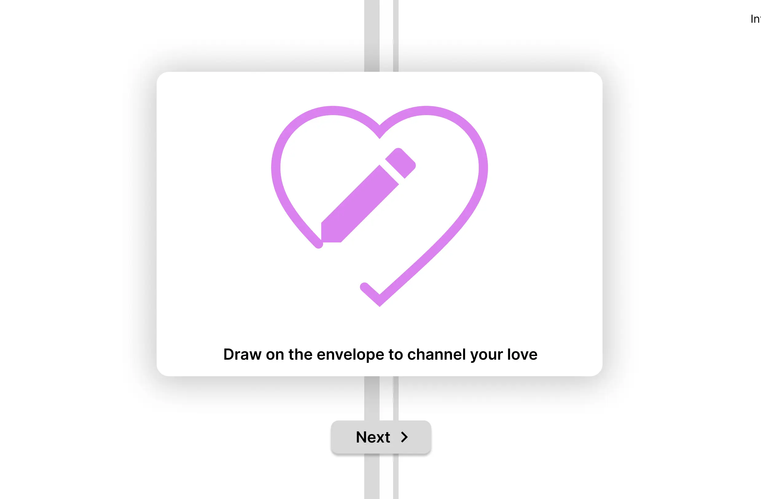
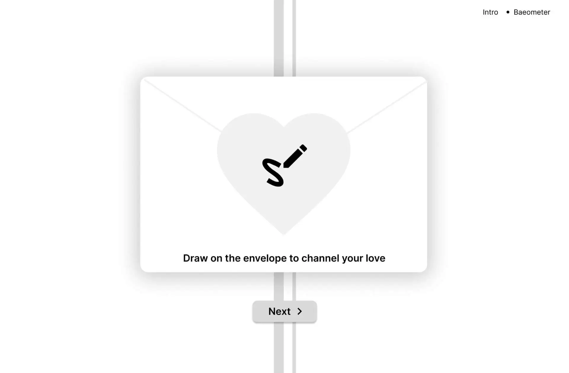
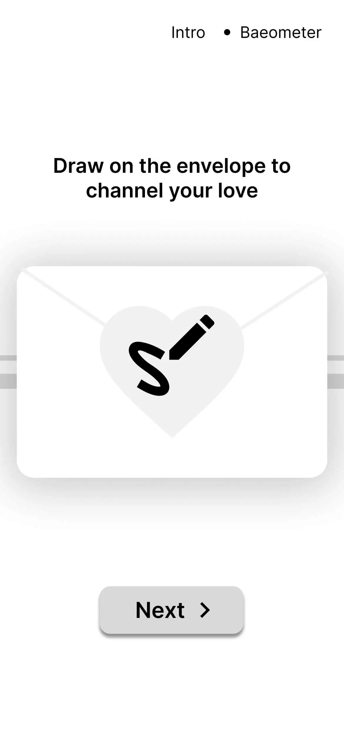
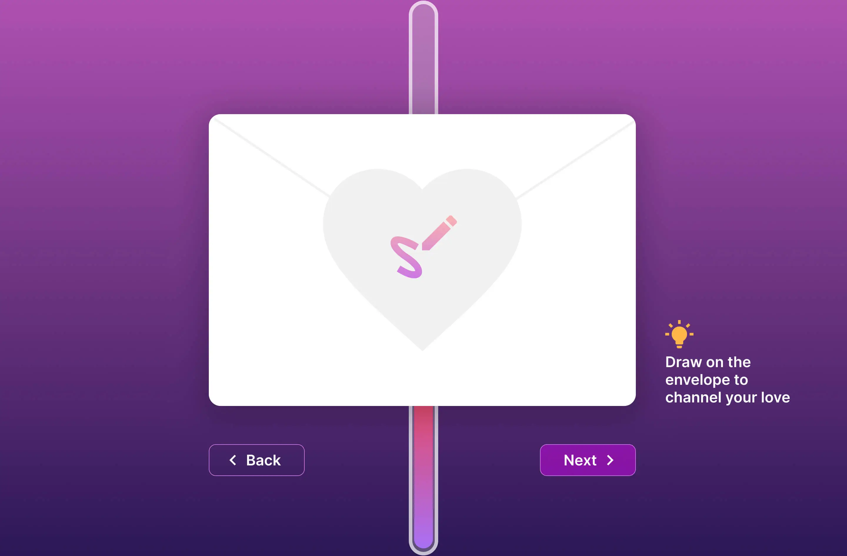
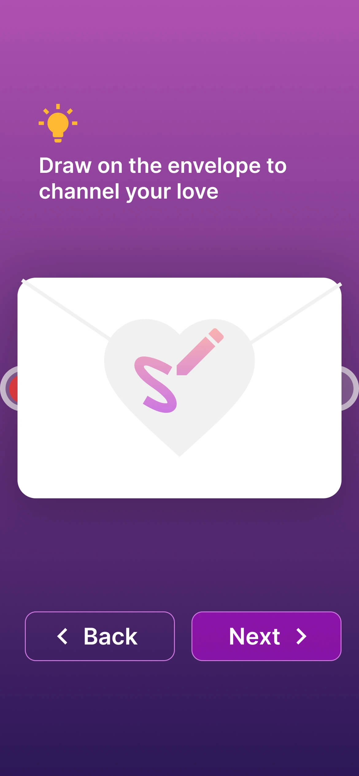
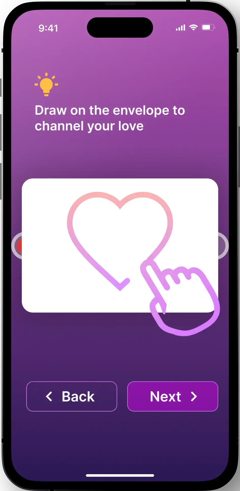
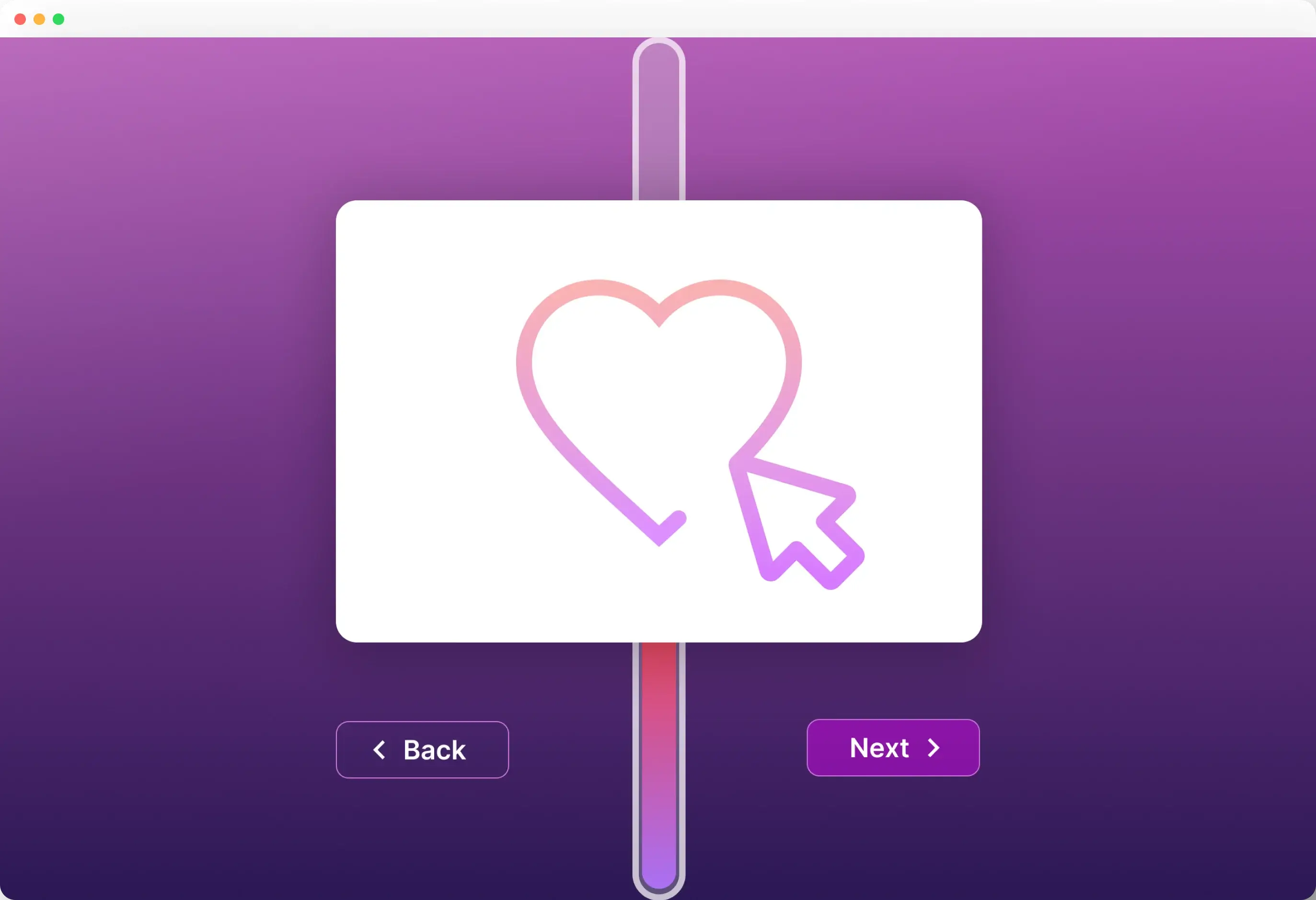
Drawing
User can draw on this page. Drawing is a rather uncommon interaction for apps, so such an interaction would make our app to be more memorable.
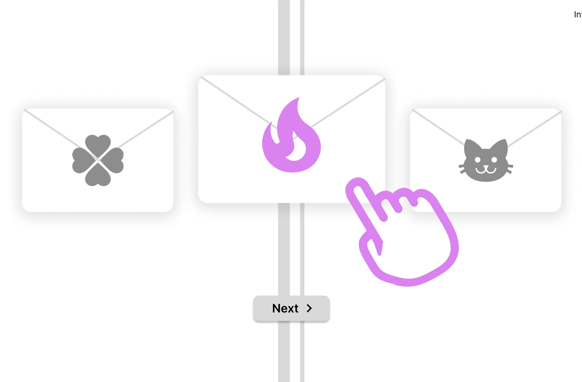
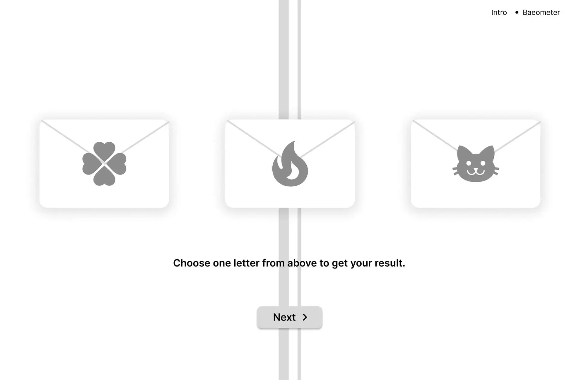
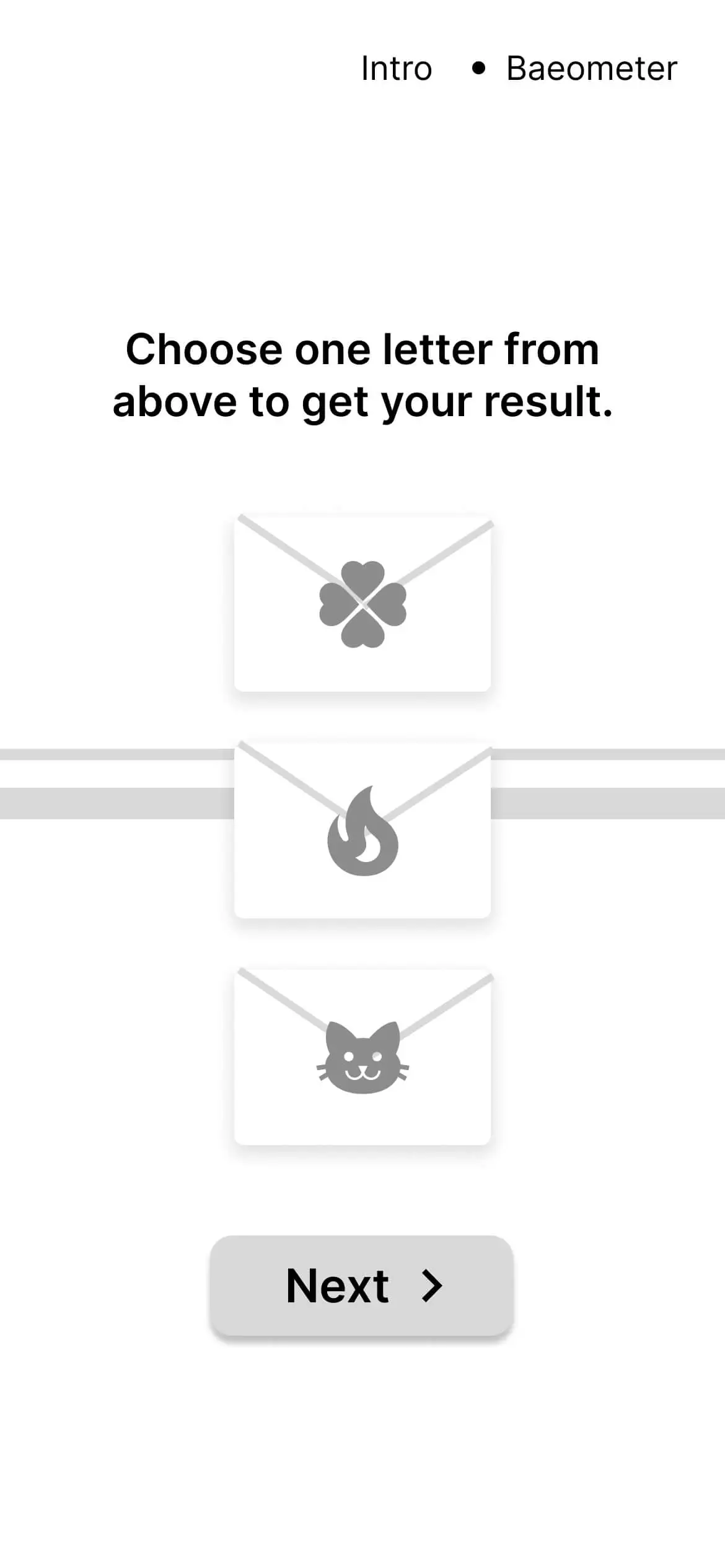
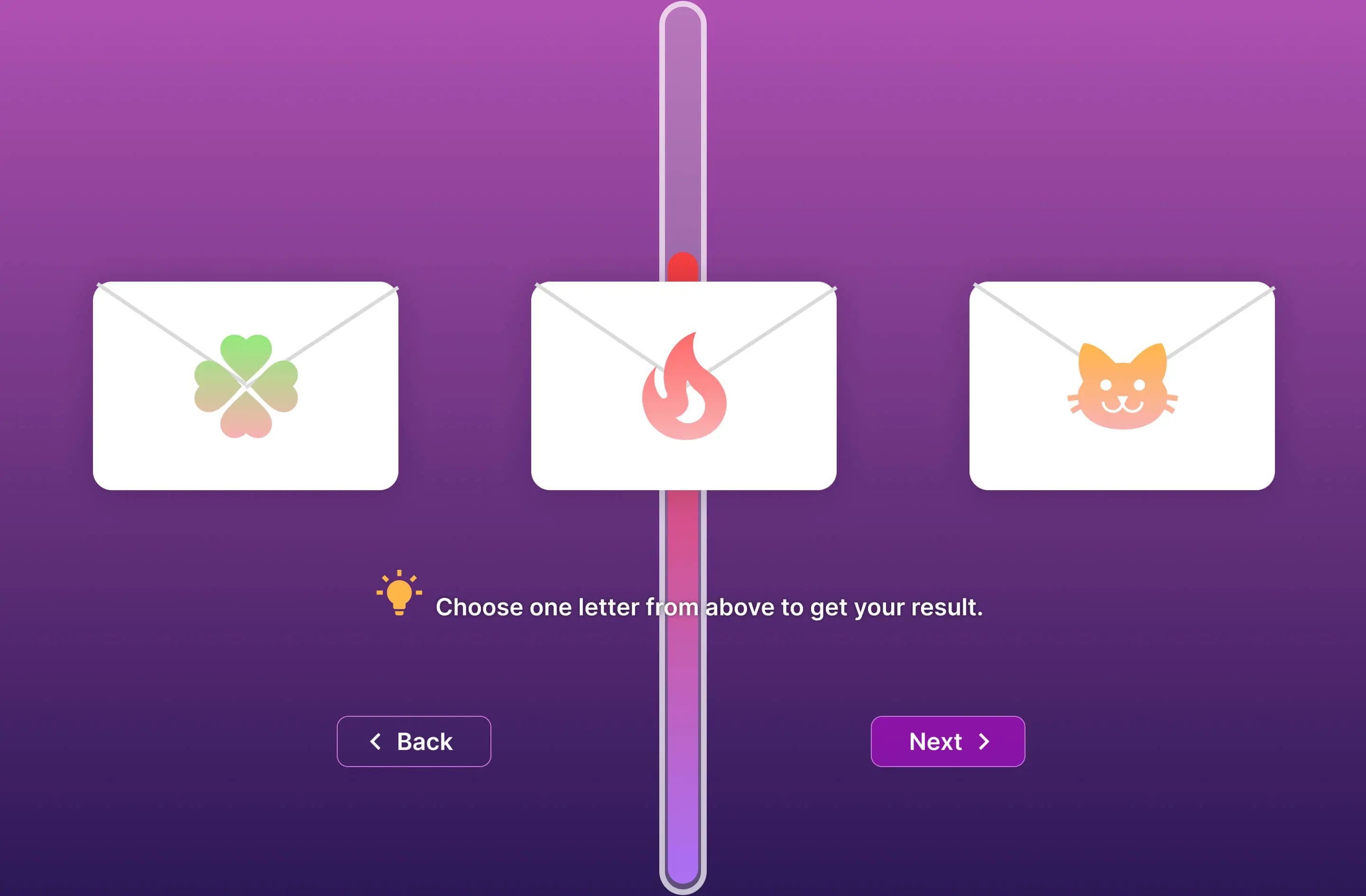
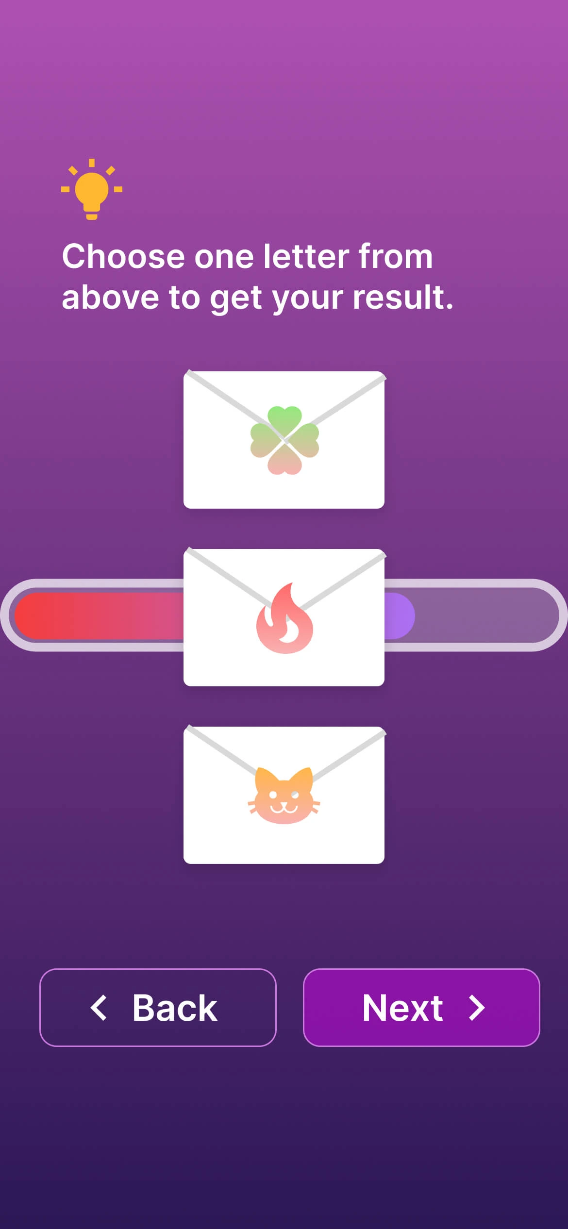
Selecting
User can also select one card from the three. Selecting without knowing the content enhances the mysterious theme for our fortune-telling app.
IV. Inclusive Design
Inclusive design: gender neutral word choice, does not assume user’s and their partner’s gender.
V. Responsive Design
Make sure users on both mobile and desktop can have a similar experience.
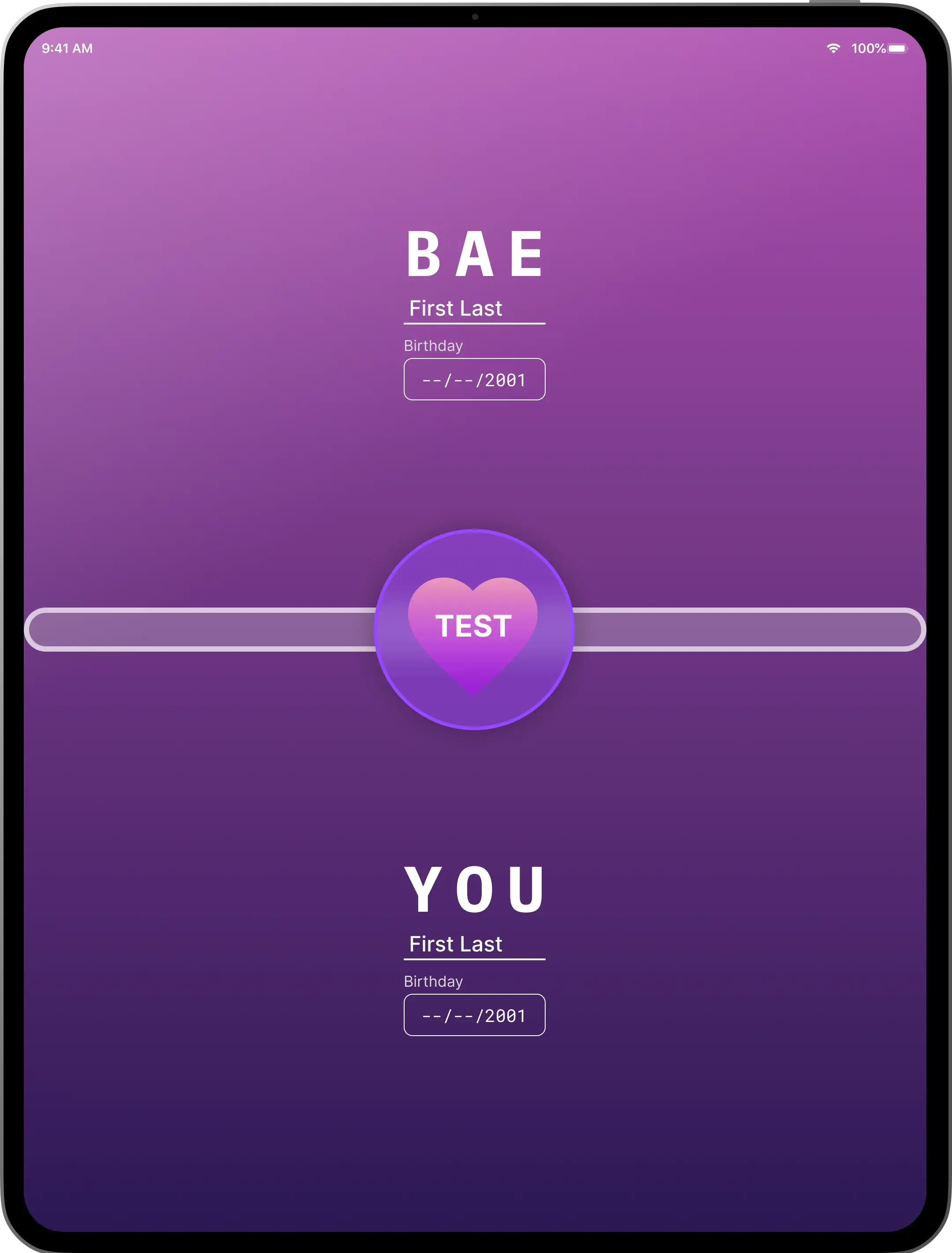
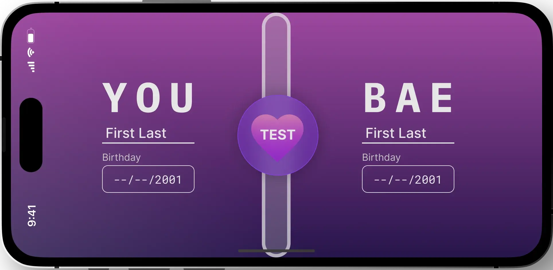
High-Fidelity Prototype
Based on the structural foundation laid out by my wireframe, I designed clickable high-fidelity prototypes for both Mobile and Desktop versions of the responsive web app.
I. High-Fidelity Design
II. Responsive Design (High-Fidelity)
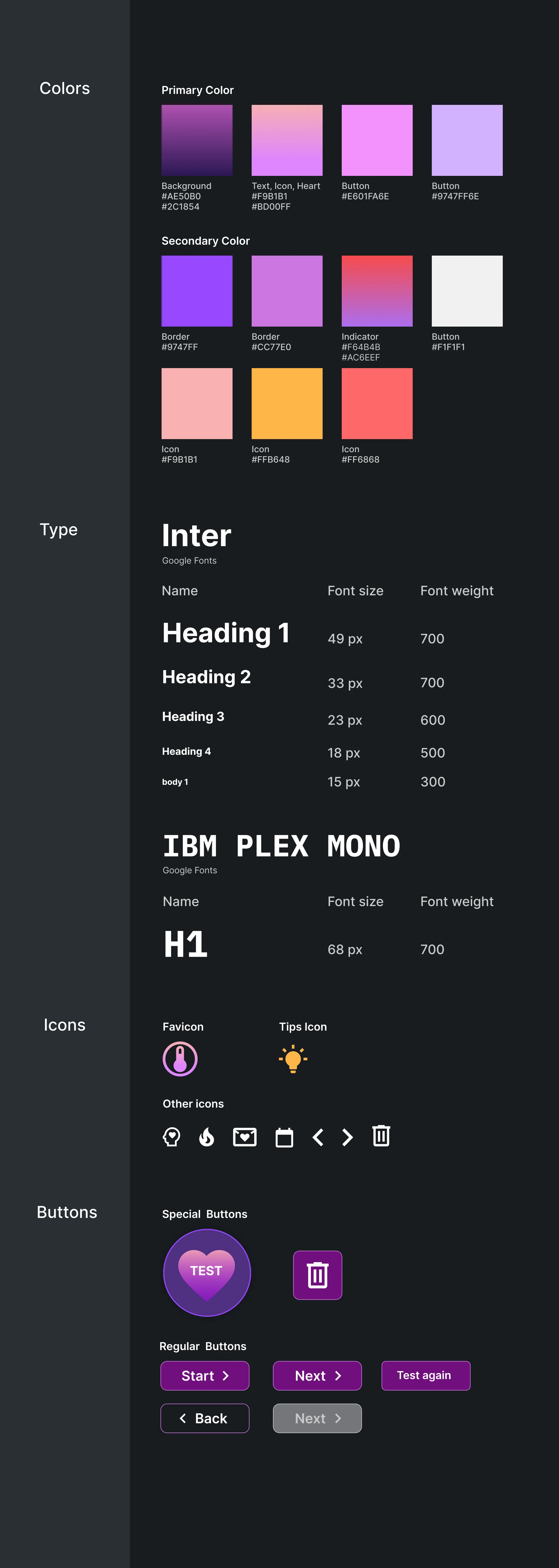
Style Guide
Employed to keep the deisgn language consistent through out our app
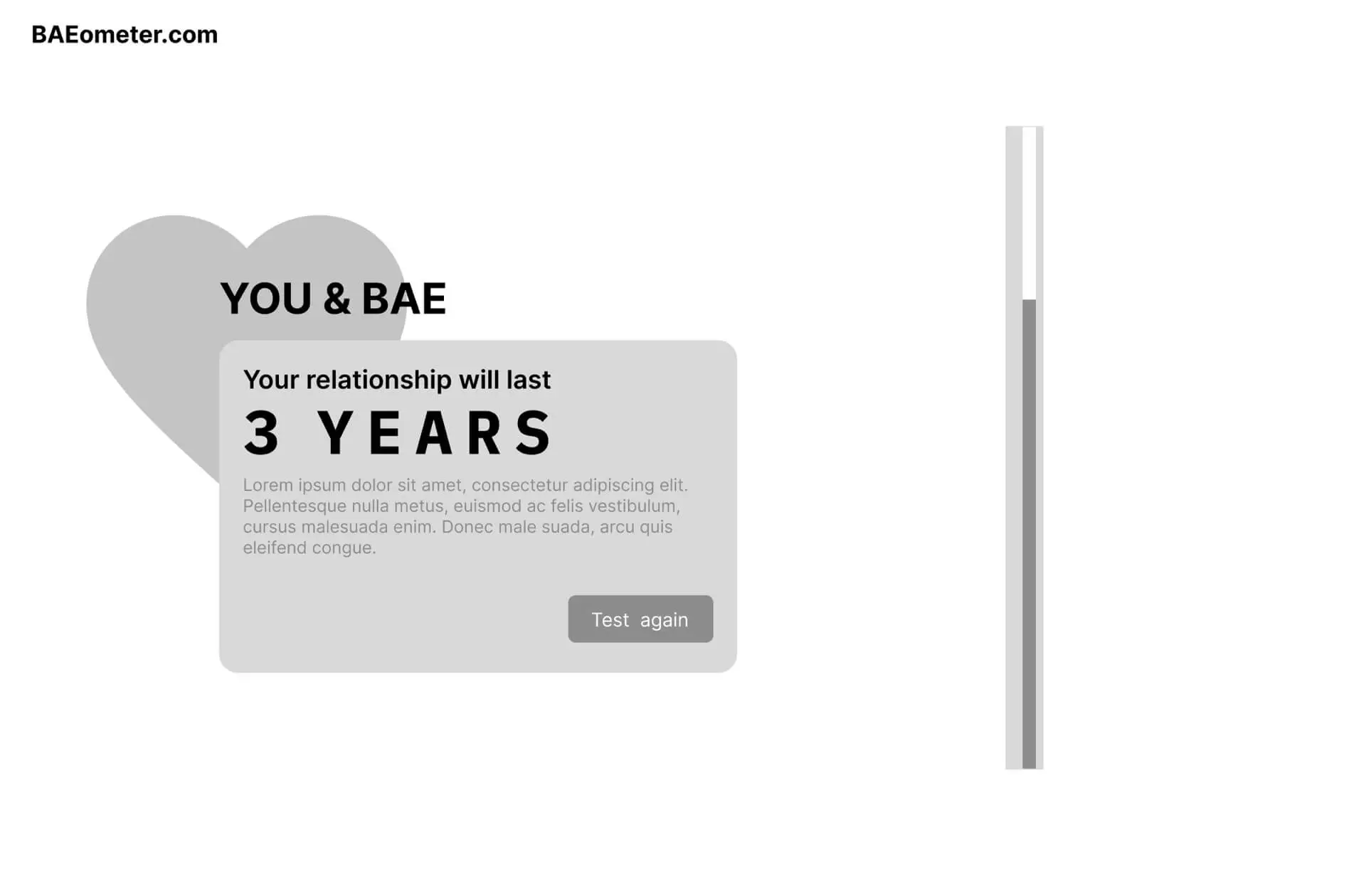
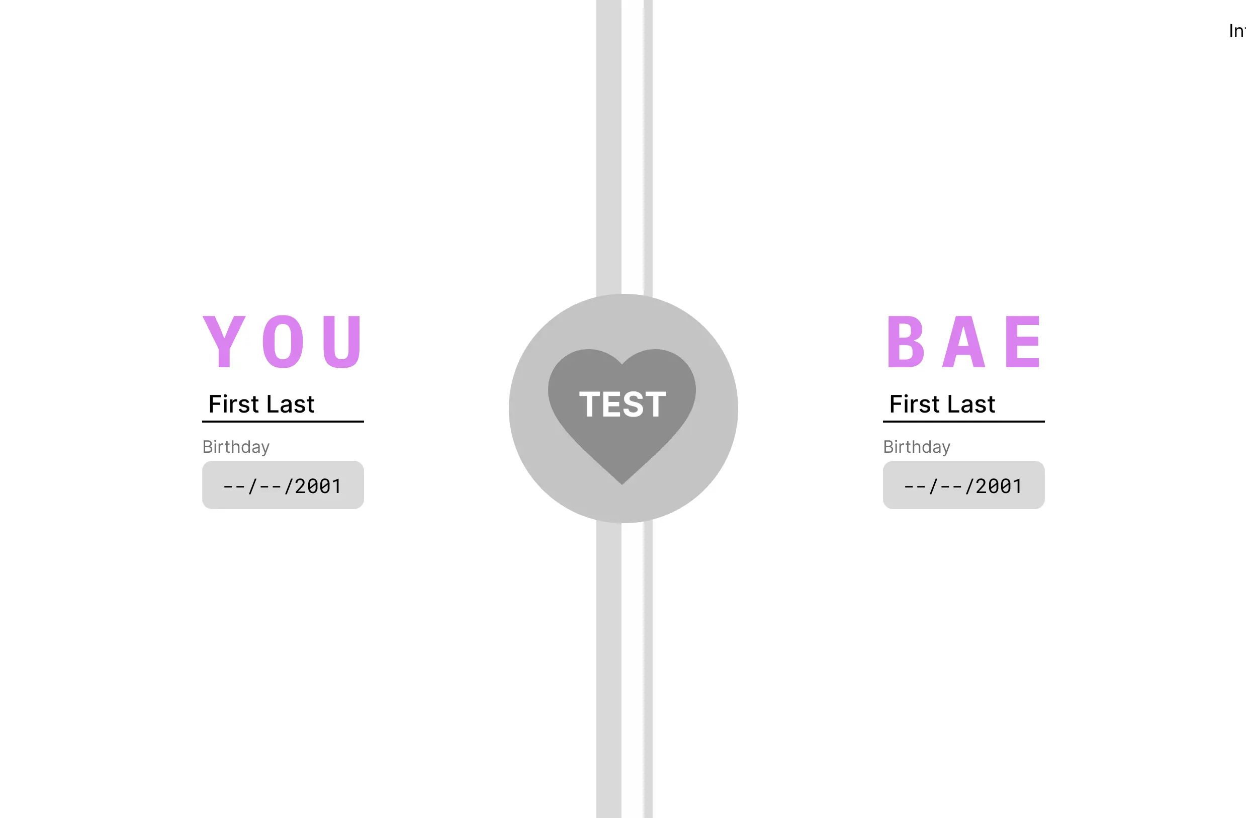
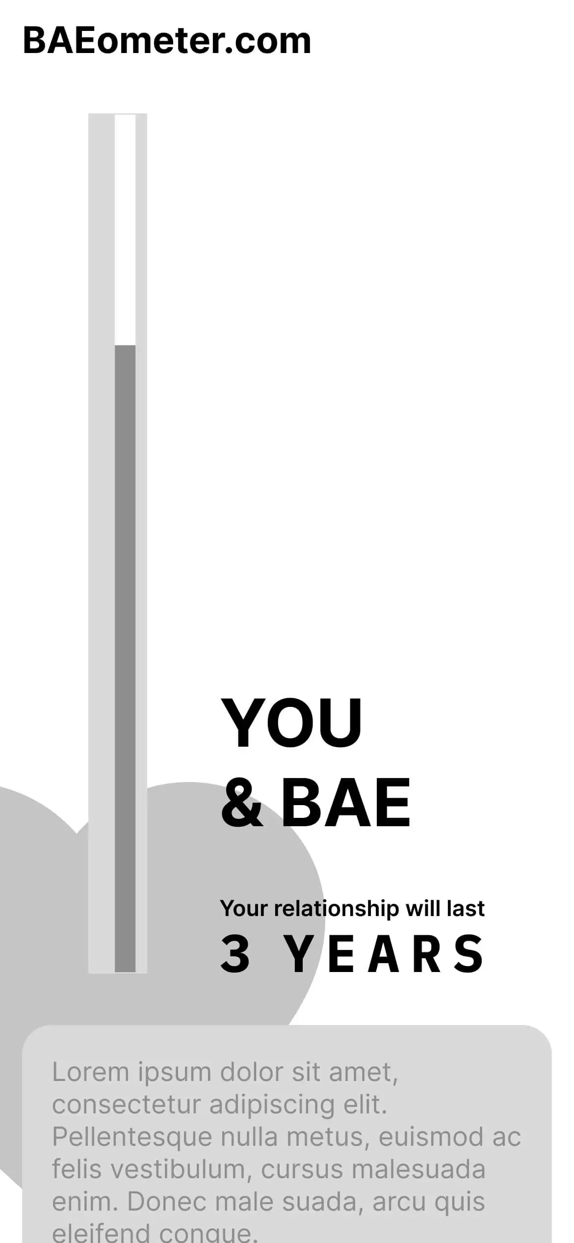
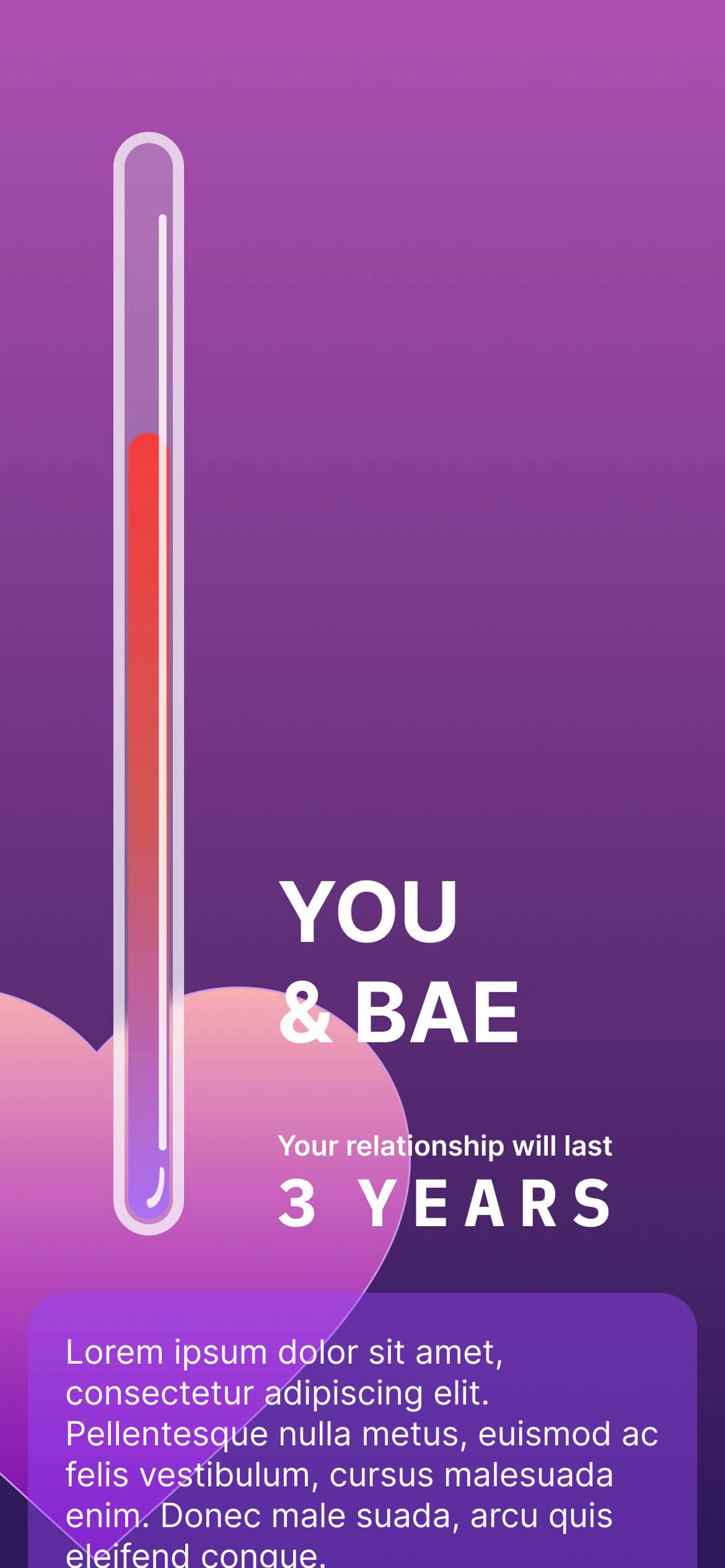
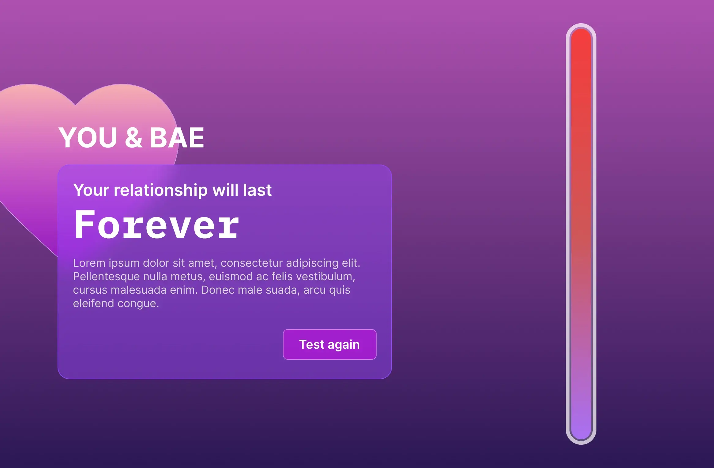
Baeometer (Thermometer)
The Baeometer, a.k.a the thermometer graphic, is present throughout the Baeometer experience.
It mainly serves two purposes: branding and functionality.
I. Branding
The thermometer, traditionally used to measure temperature, became our central graphic motif to reflect the concept of measuring the 'heat' or intensity of relationships. By using this motif throughout our app's design, I aimed to create a strong and consistent visual association between the app's brand and its function. This connection would enable users to quickly grasp the essence and the theme of our app while reinforcing its playfulness.
II. Functionality
a) Progress
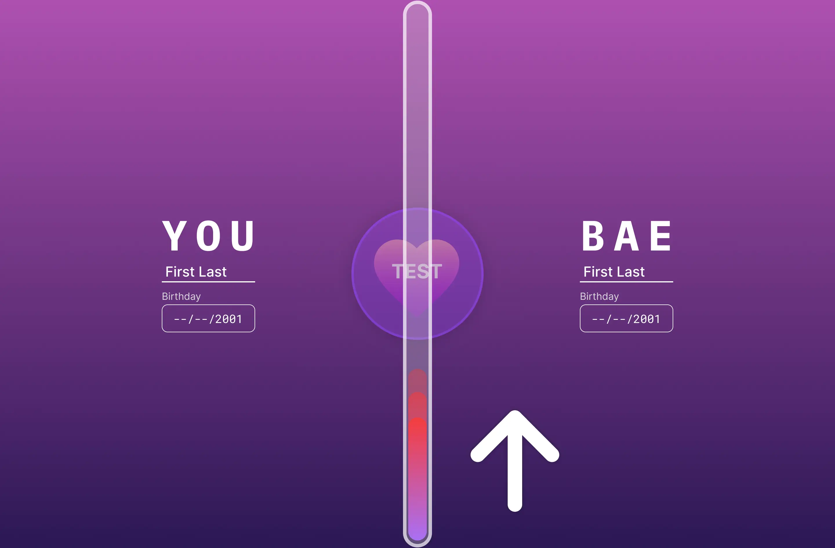
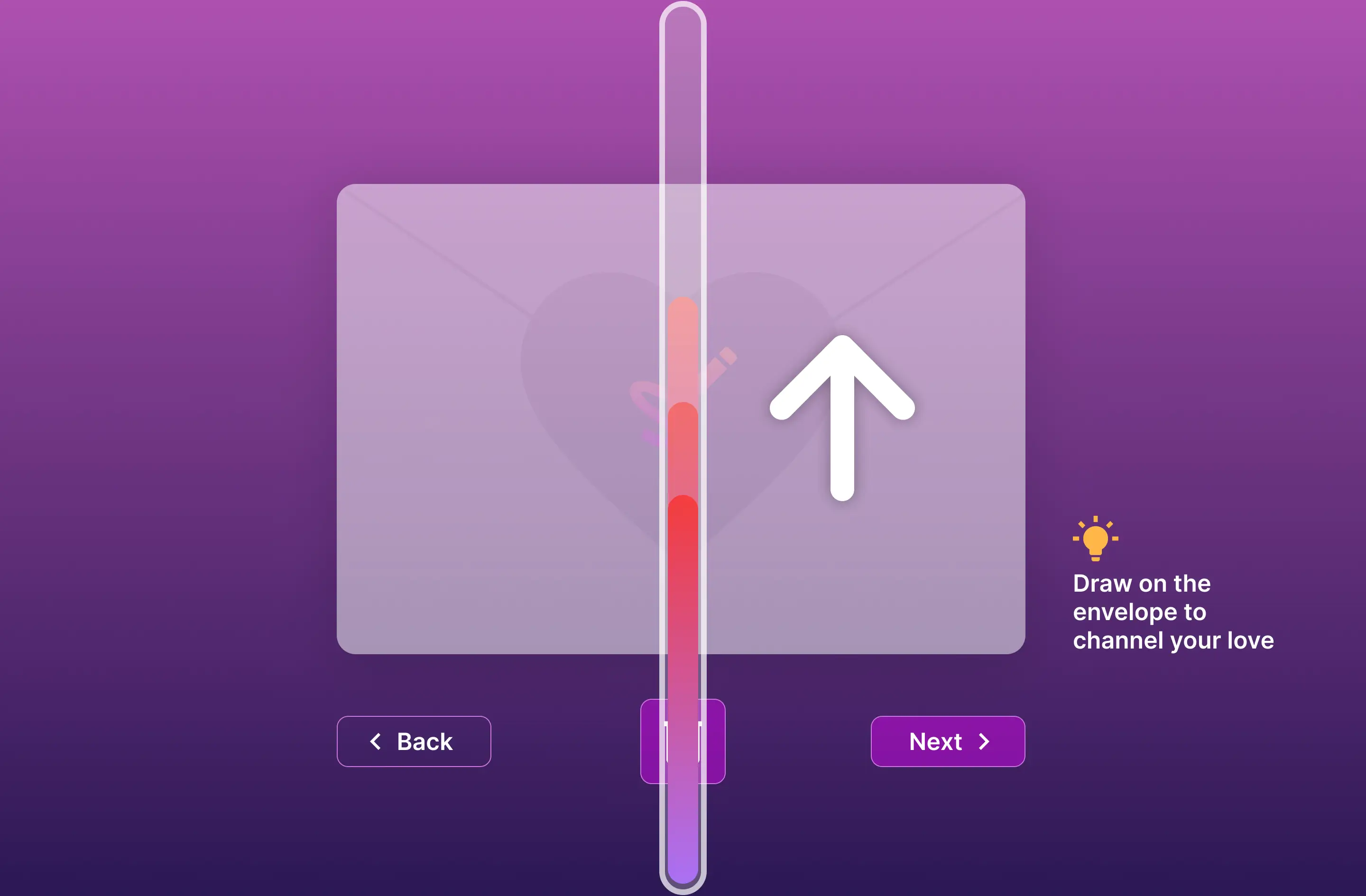
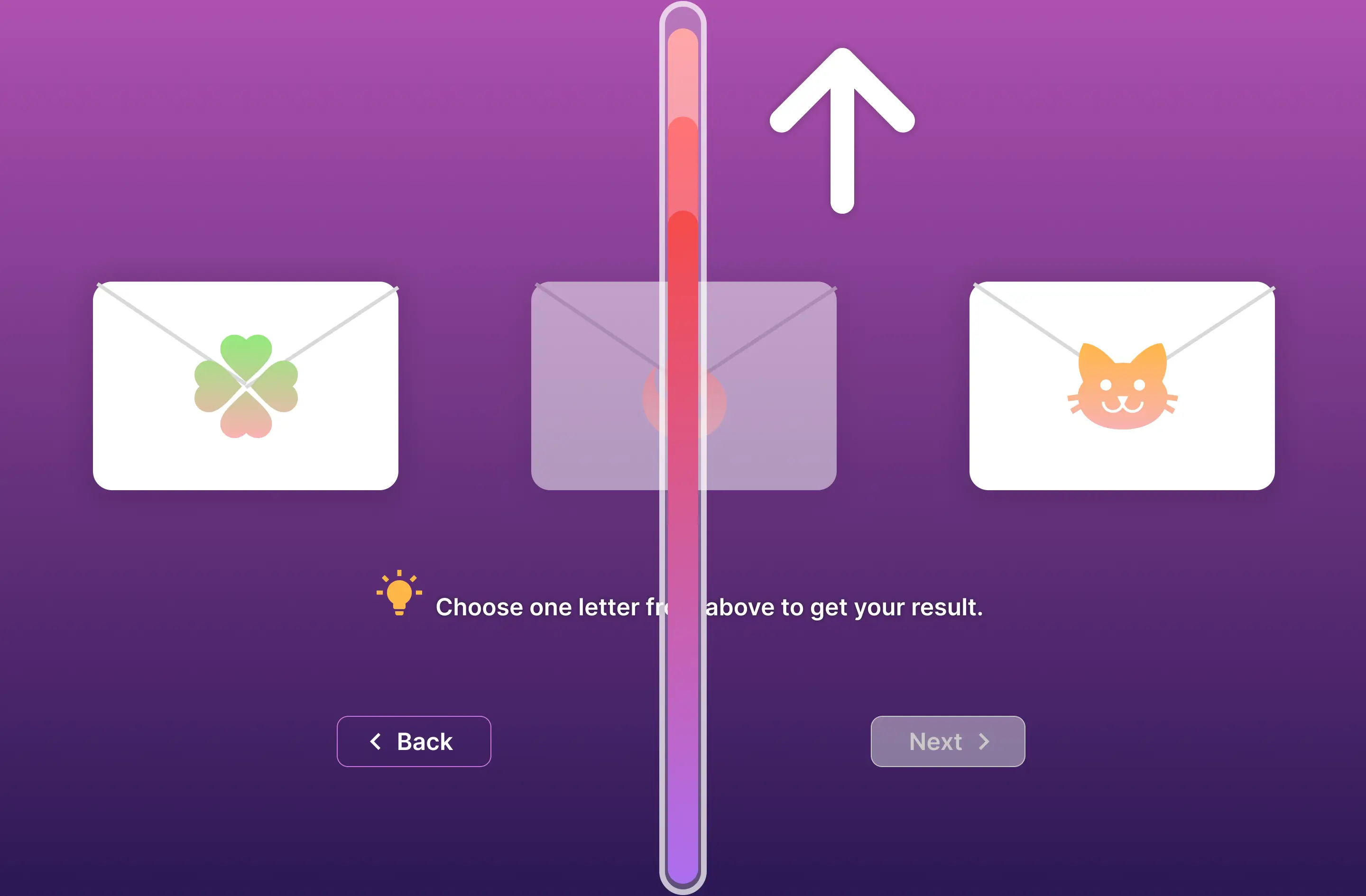
It is a progress bar indicating how many steps a user needs to take to get to the result page
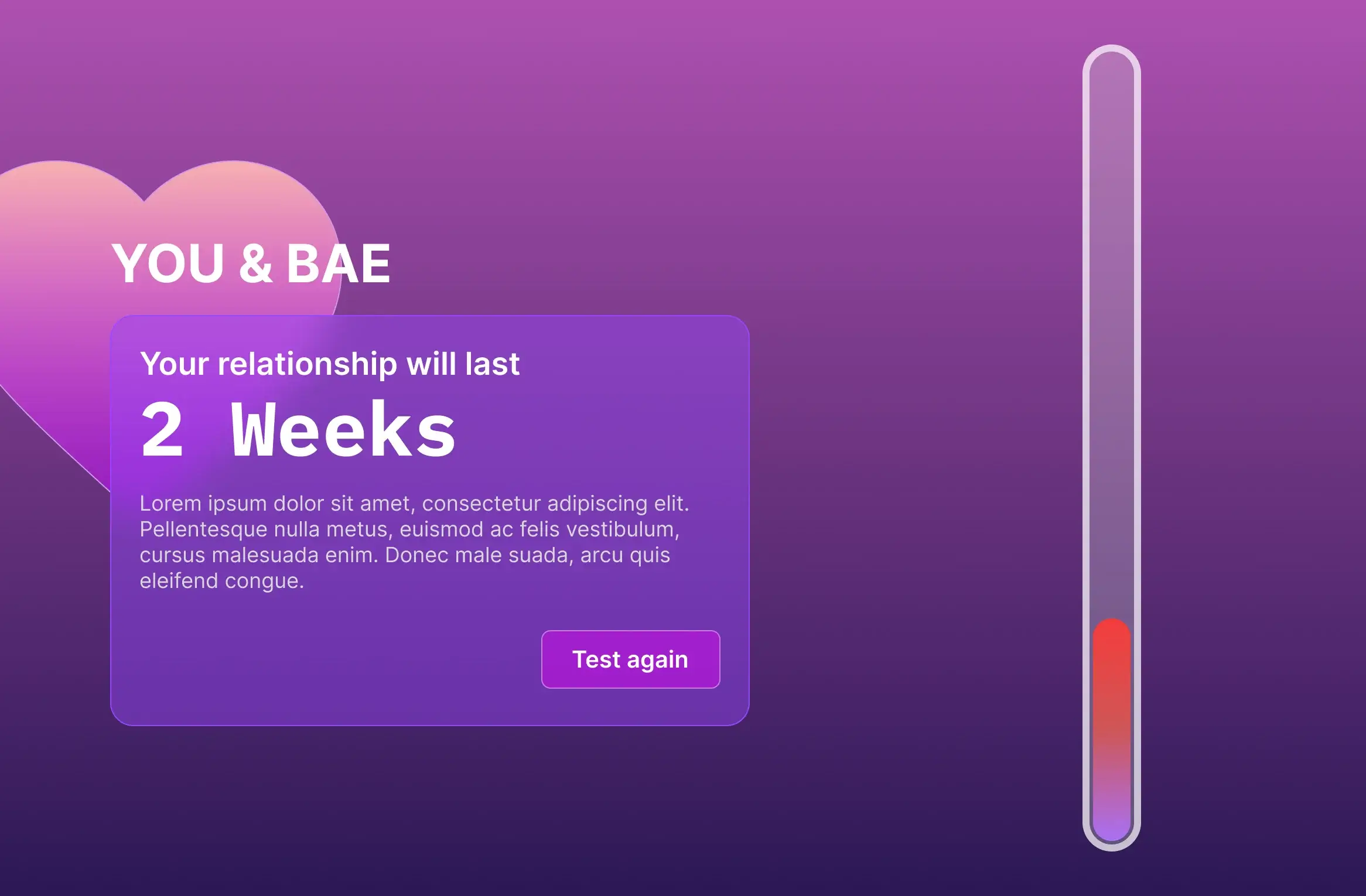
b) Result Indicator
On the resulting page, the Baeometer(thermometer) is also a visual indicator of the strength of a relationship based on the calculated result.
Web Application
I. Inclusive Design
a) Keyboard Support
We anticipate keyboard users.
With “enter”, “tab” and “shift” keys, a user can complete their user journey.
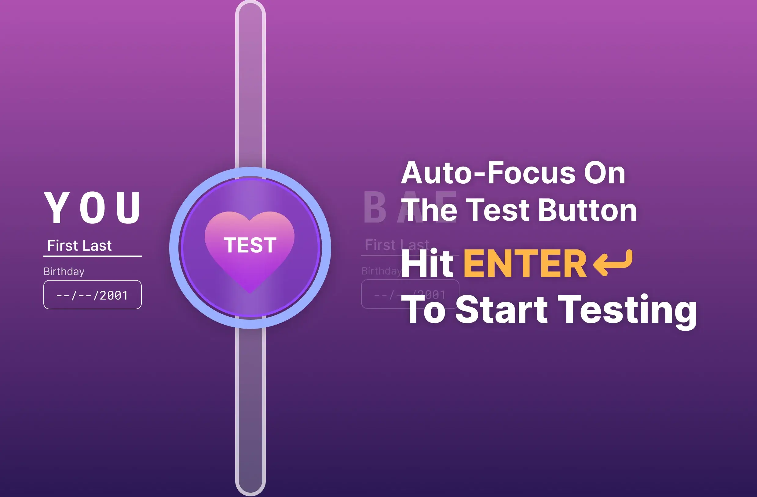
Test Button
Auto-focus on the test button. Hit Enter to start testing.
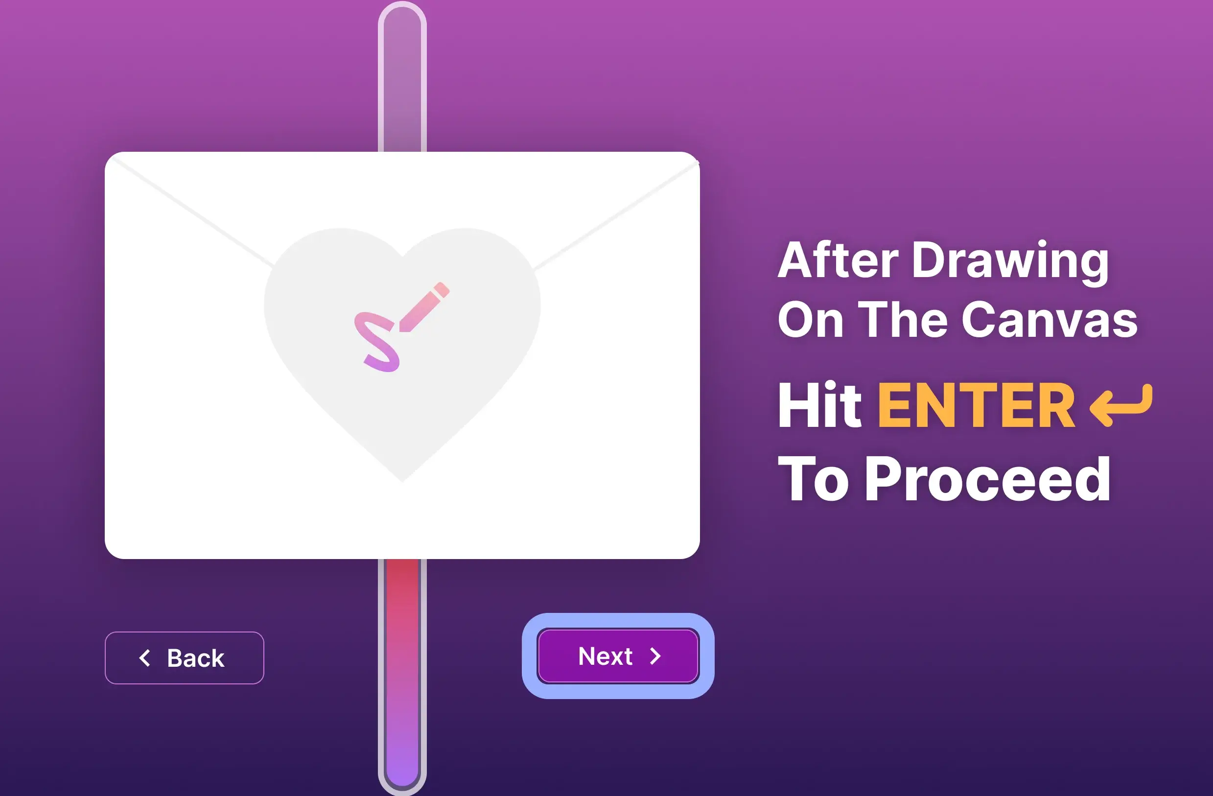
Next Button
After drawing on the canvas, htting Enter allows you to proceed.
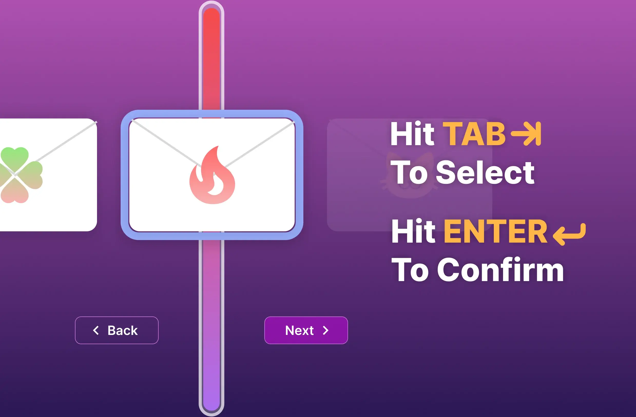
Card Selection
Hit Tab to select a card, and hit Enter to comfirm your selection.
b) Touch Screen
We anticipate touchscreen users.
We made sure that each UI element is interactive on a touch screen.
II. Responsive Design Edge Cases
We anticipate edge case screen sizes/orientations.
I coded the app so that it fully supports both desktop screens in portrait mode and mobile screens in landscape mode.
Deliver
Tests and Iterations
After developing our app, I conducted multiple usability tests. From the participants of the tests, I gathered many valuable feedbacks that helped us improve our app's user experience.
I. Feedback To Solutions
Feedback:
"There are too many things to interact with on the front page, it is quite confusing which one to interact with and in what order."
Solution:
By following the principles of progressive disclosure, I decided to have two additional pages before the front page to break down the overwhelming unclear user flow into a streamlined 3 steps process.
Feedback:
"Why the result is so low? Why it only says 3 weeks for me and my boyfriend?"
Solution:
Due to the low multiplier of our original algorithm, the resulting score is relatively low.
To make sure users are satisfied with the results, we made changes to the underlying algorithm,
and boost the test results up.
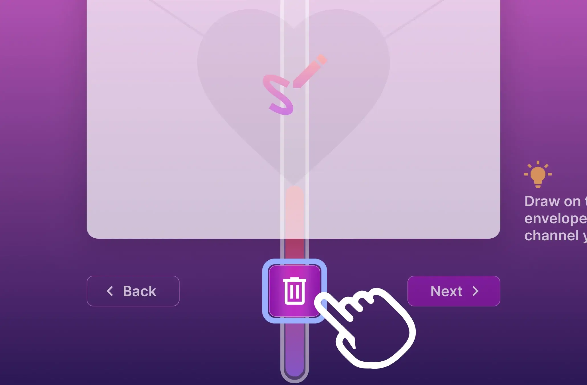
Feedback:
"I wanted to redraw the picture, but hitting the reload button reloads the entire page."
Solution:
Add a delete button on the canvas-drawing page.
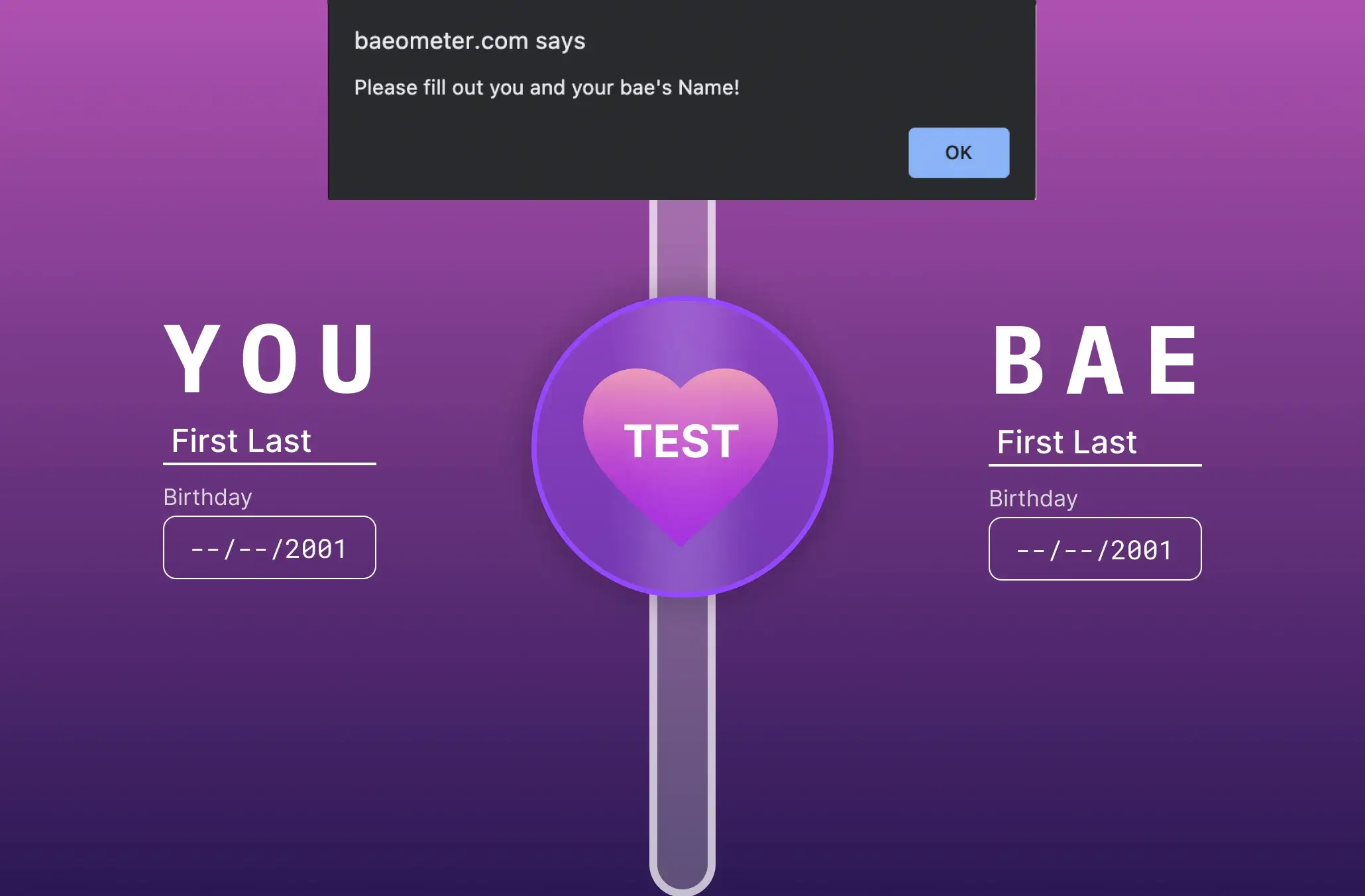
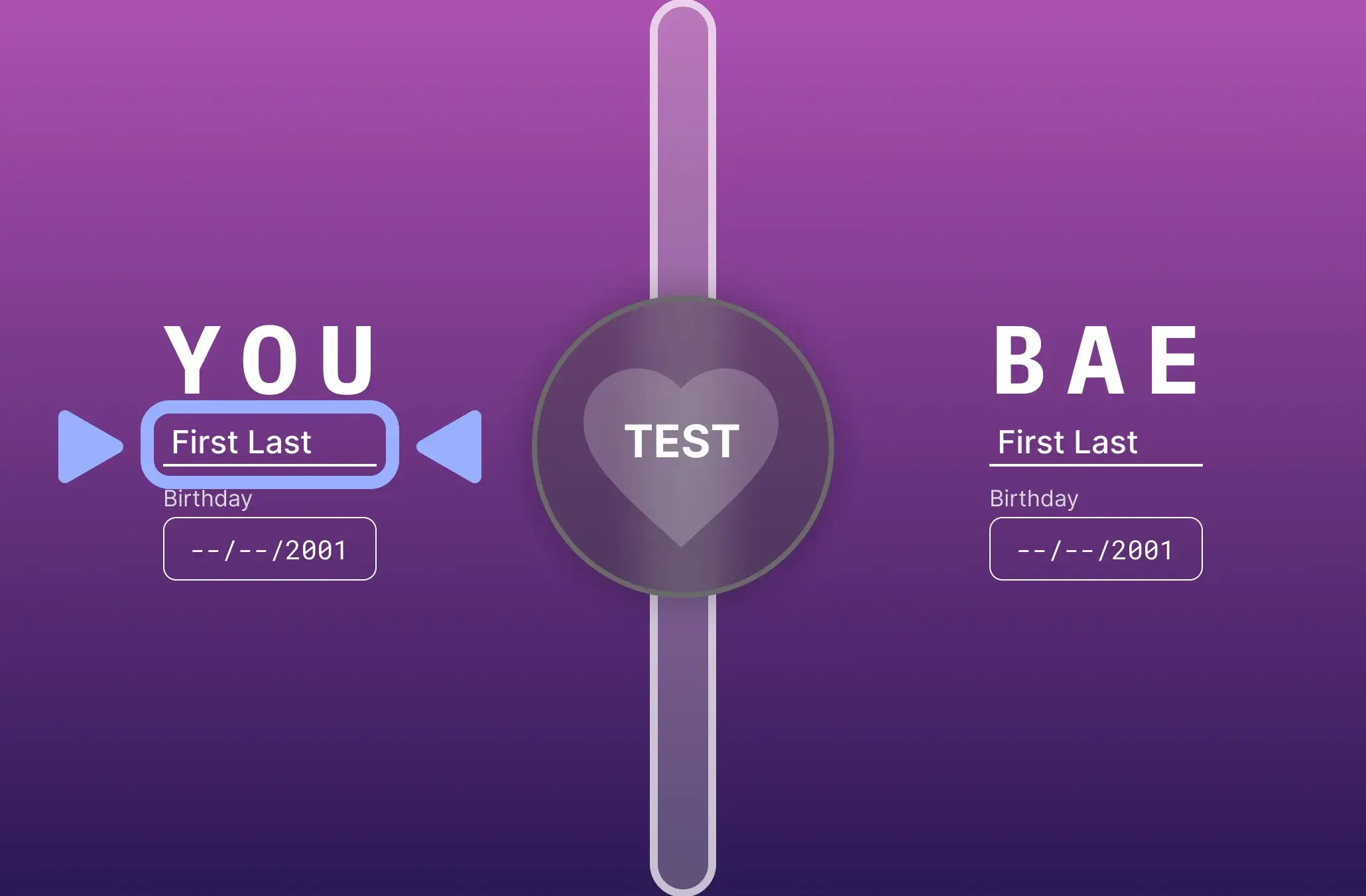
II. Observation To Solutions
Observation:
Testers often hit the next button before filling out the blanks, which triggers an error message.
Solution:
Use grayed-out buttons to signify the button is inactive at this moment. And hitting enter key will automatically focus on the field that needs to be completed.
User Testing Results
Survey Results
- 17 out of 20 users gives a thumb up to our app
- 13 out of 20 users finds our app to be fun or funny
- 14 out of 20 users likes the animation of our app
- 11 out of 20 users said they would recommend our app to their friends
- 2 out of 20 users thinks our app is hard to use
Usability Improvements
- Task success rate increased by 29%, finishing tasks without help increased from 14 to 18 users
- Average task completion time decrease by 17%, average time went down from 66s to 55s
- Average errors are reduced by 43%, from 7 to 4 errors
Try It Out
Interactive Website
Click the screen below to interact
Prototype
Click the screen below to interact
More Projects
Design & Prototype
Pharmaily
A pharmaceutical Kiosk that aims to create an efficient and safe medicine pickup experience
UI Redesign
Triton2Go
A redesign of the map feature of the UCSD cafeteria food ordering mobile app Triton2Go
UI/UX Design & Dev.
Others
From class projects to professional works, I have created a wide variety of designs