UI Redesign
Triton2Go
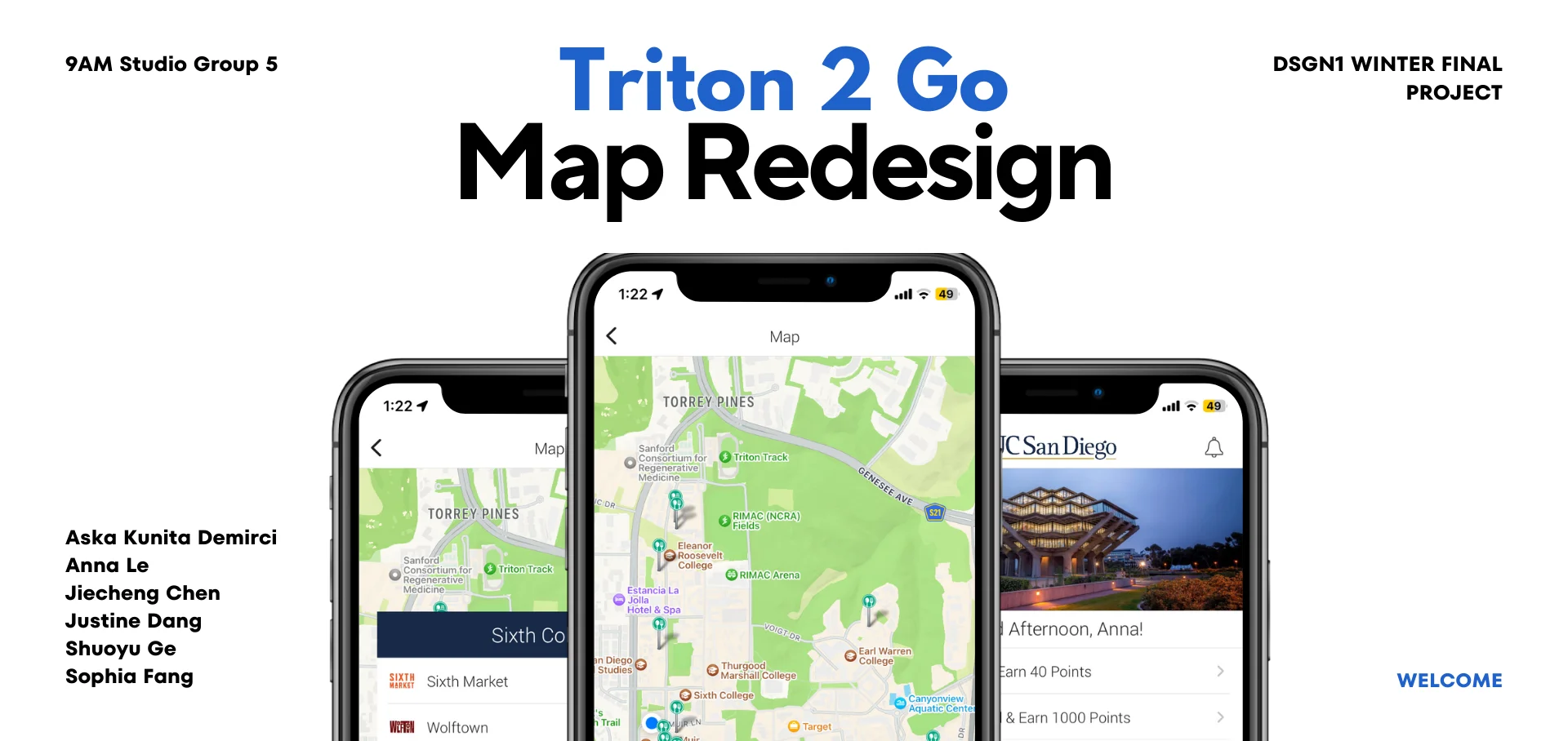
Overview
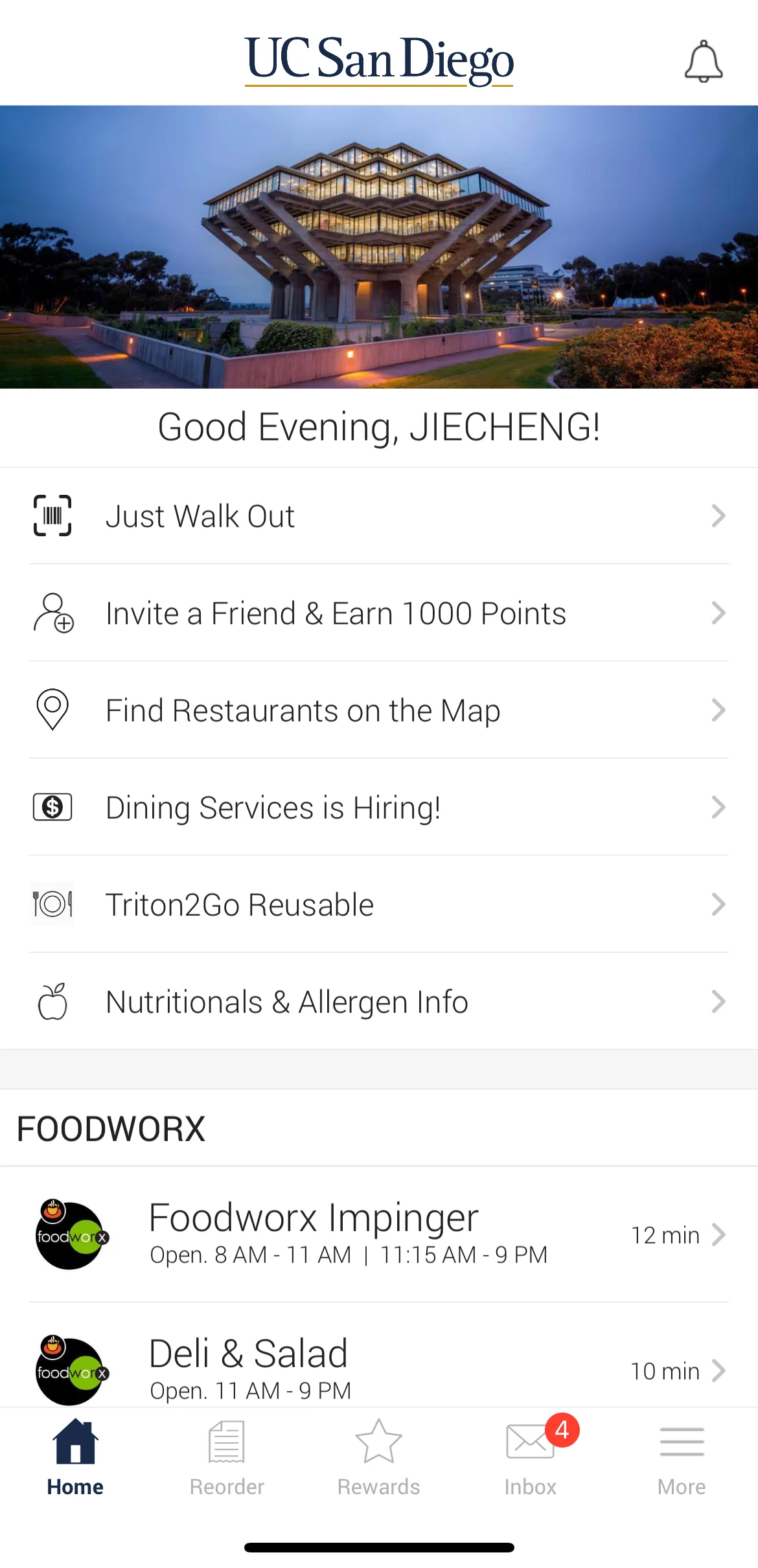
We redesigned the map feature for UCSD’s food ordering app Triton2Go to help students navigate to dining halls more easily on our campus. Although popular, the app, especially the map feature, is plagued with usability and discoverability issues. To combat the issues, we redesigned the app with additional functionalities like a search bar, navigation feature, estimated walking time and wait time for online orders, and more.
My Team & My Efforts
Anna Le, Designer
(Jason)Jiecheng Chen, UI/UX Researcher
Justine Dang, Designer
Shuoyu Ge, Designer
Sophia Fang, Designer
UX Researcher
Tools Used
Figma, Google Sheet
Scope
3 weeks Academic Project
What I Did
Brainstorm, UI Design, UX Research,
Design Process
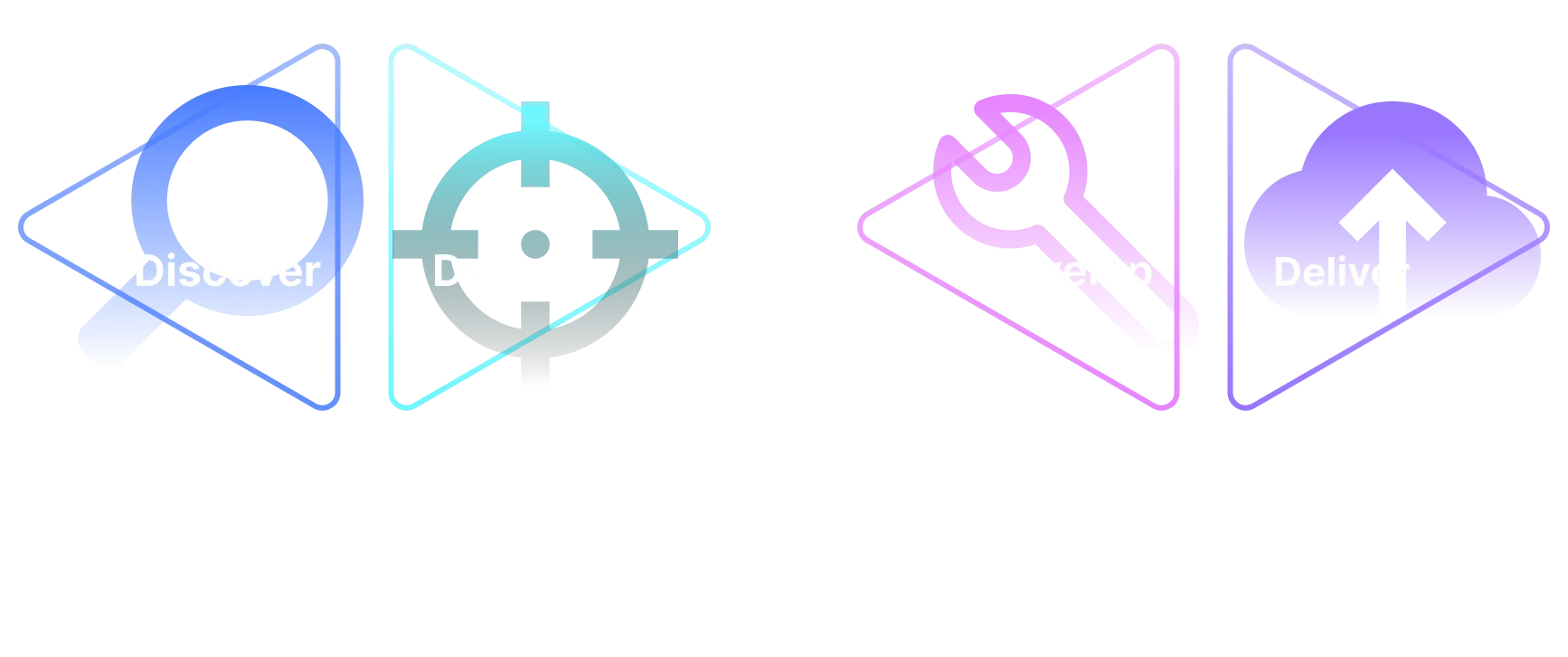
Discover
Interview Insights
After interviewing and observing 18 participants completing tasks, using the current Triton2Go app’s map feature to find a specific dining hall and order food, we have discovered multiple trends and made the following conclusions.
Insight 1: Hard to Find and Access the Map Feature
Task 1: find the map feature on the app.
Trend A:
15 of the 18 interviewees said they had never used nor had even heard
of the existence of the map feature on the Triton 2 Go app before.
Low Discoverability
Unclear Signifiers
Poor Functionality
Trend B:
7 out of the 18 interviewees immediately scrolled down or clicked through the bottom
navigation bar to try to find the map feature (neither is correct).
Bad Information Design
Low Discoverability
Counterintuitive
Conclusions:
The map feature's entrance has horrible discoverability. First, it is placed at an unexpected
location, because most participants are expecting it to be at the nav bar, as most of
them first go down to the nav bar to look for it. Secondly, its visual similarity to the tabs
above and below it makes it even less visible.
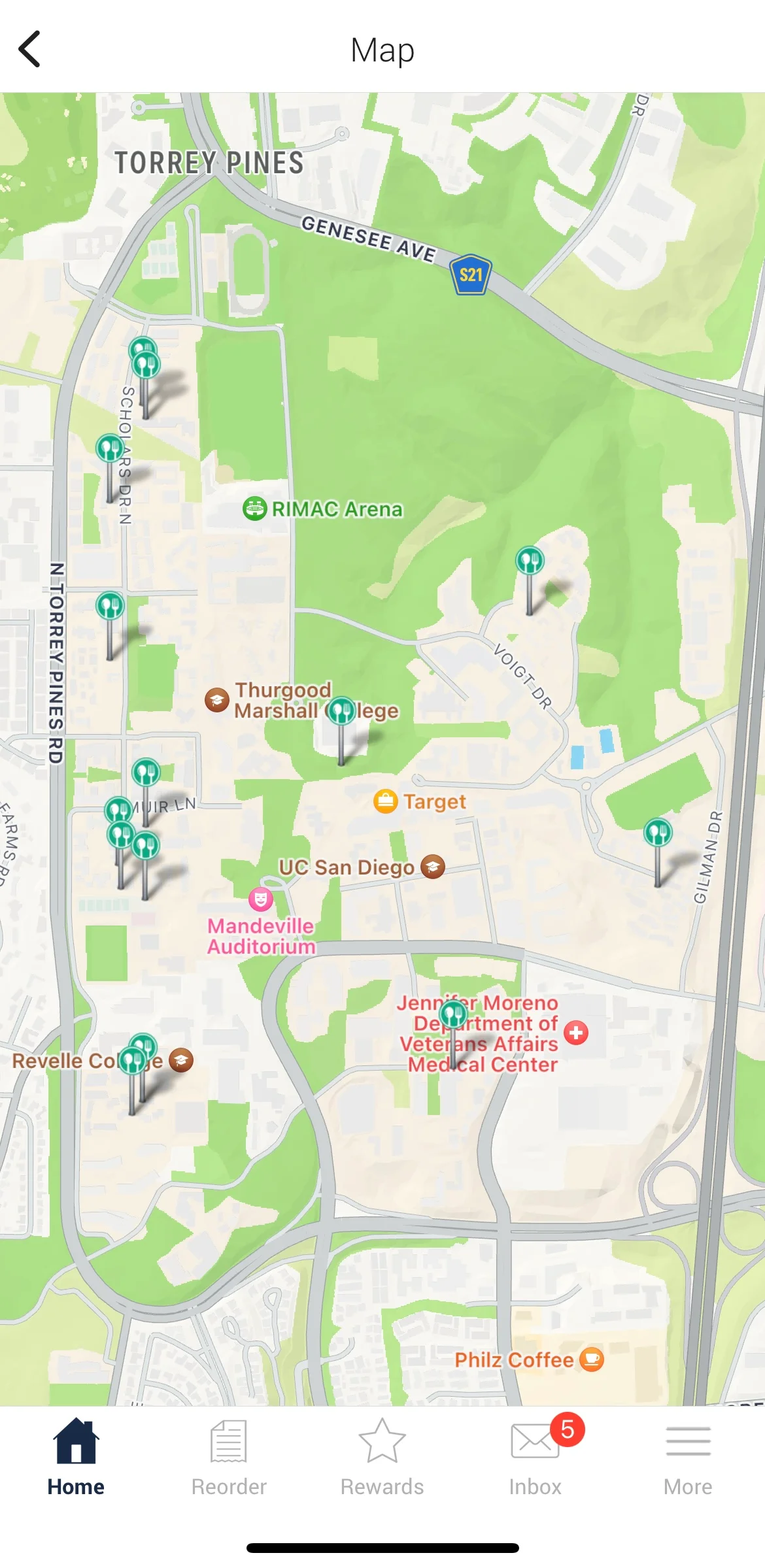
Insight 2: Hard to Locate the Dining Halls
Task 2: use the map feature to find the given dining hall and order food from it.
Trend C:
7 out of 18 interviewees locate multiple incorrect dining halls
before finding the correct one.
Lacks Error Handling
Confusing Signifiers
Trend D:
6 out of 18 interviewees mistakenly exited the map interface
when trying to place an order.
Lacks Error Handling
Unclear Affordances
Conclusions:
The user interface for the map feature is extremely barebone. All it does
is pining the locations of the dining halls without communicating which dining hall it is
to the users. Furthermore, with no features like a search bar,
users have to look for a dining hall by going through all the pins one by one.
Research Charts
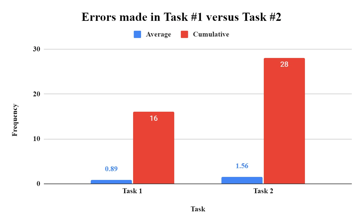
Errors mades in Task 1 vs. Task 2
A bar chart showing the average and cumulative errors made in Task 1: Finding the map feature and Task 2: Finding a dining hall on the map. On average, interviewees made more errors during Task #2.
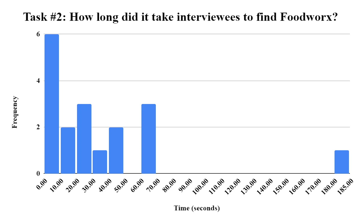
Average time to complete Task 2
The average time in seconds for the interviewees to complete the assigned task of finding a specific dinning hall called Foodworx was around 24.48 seconds.
Define
Design Spaces
Design Space A
Discoverability: Ability to find and use the different functions of a map.
Visual Design: Simplicity of design to not look overwhelming.
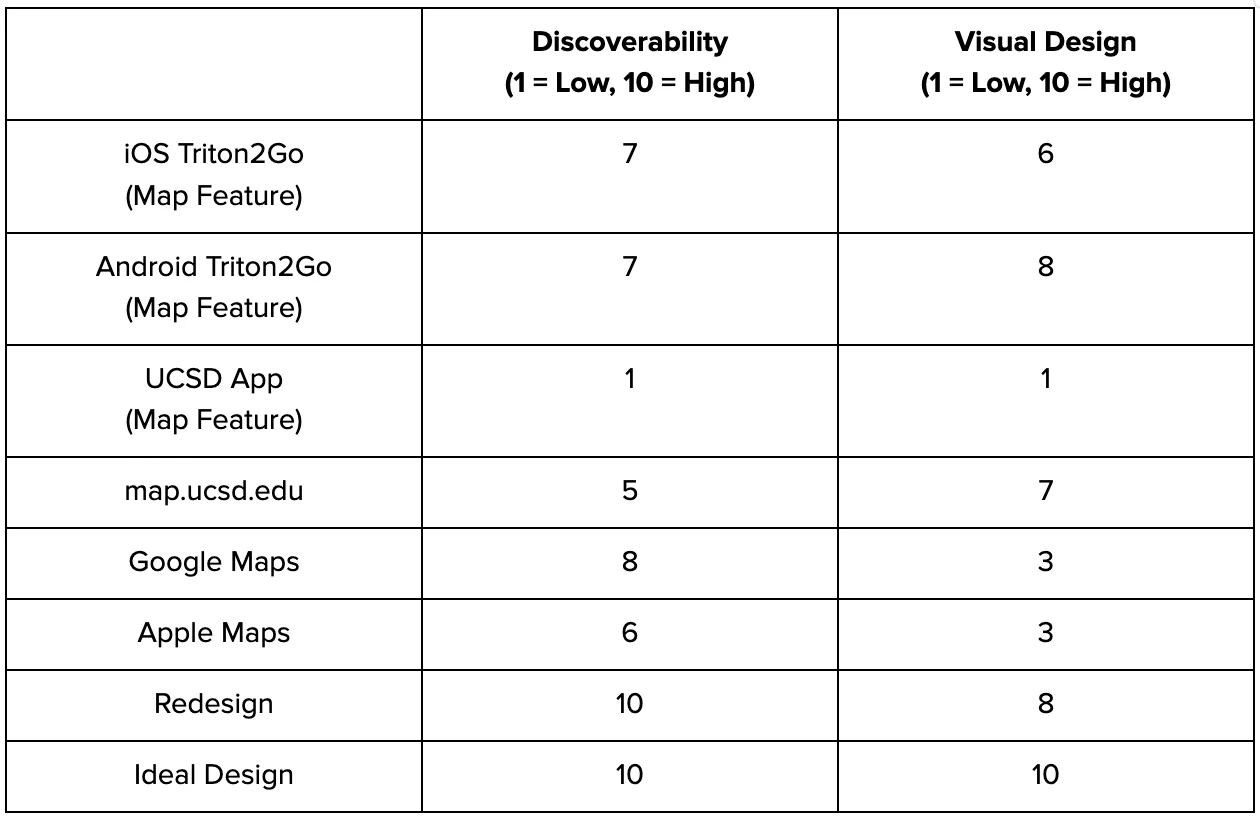
Ideal Design: 10 for Discoverability & Visual Design
It would have an intuitive and easy-to-use interface with distinctive signifiers of all its affordances.
The ideal design would also be visually simple and clear to navigate.
Challenges: Unavoidable Trade-offs
The trade-off of simplistic visual design is discoverability due to the
minimizing of signifiers, leading to users having a wider gulf of execution.
Design Space B
Efficiency: The time it takes to find the map function, order, and navigate to the dining hall.
Functionality: The amount of features and options on the map.
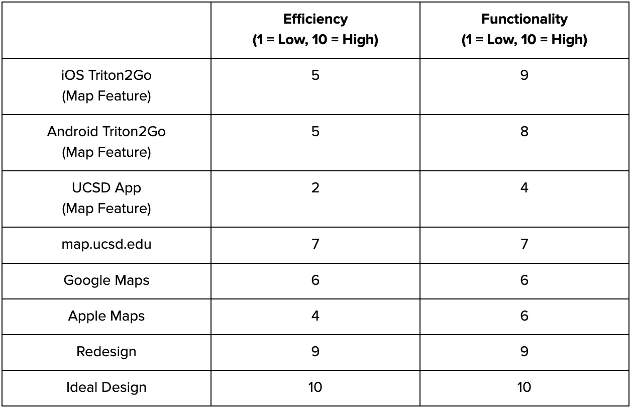
Ideal Design: 10 for Efficiency & Functionality
Include all the features needed to afford finding, ordering, and navigating
to a specific dining location while also keeping those processes as efficient
as possible.
Challenges: Unavoidable Trade-offs
In reality the more functionality in an app, the less efficient it is
(more buttons to click, more screens, etc.).
Develop
Sketches (Team Ideation)
Jiecheng’s Redesign
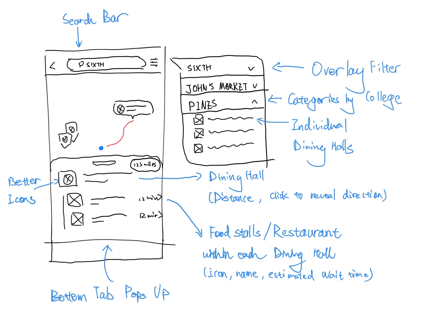
Search bar feature with included filter option to sort through different dining halls.
The bottom card pops out when the pins on the map are clicked to reveal more information.
Displaying accurate mileage distance to each dining hall and its estimate wait time.
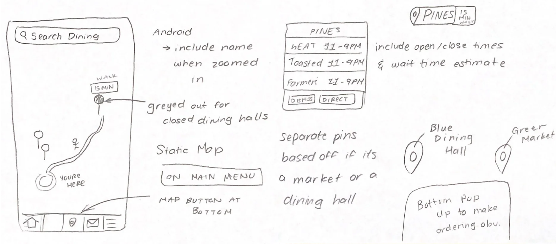
Anna’s Redesign
Grayed out pin for dining halls that are currently closed or not accepting mobile orders.
Created more distinctive icons in order to differentiate between markets and dining halls on campus.
Justine’s Redesign
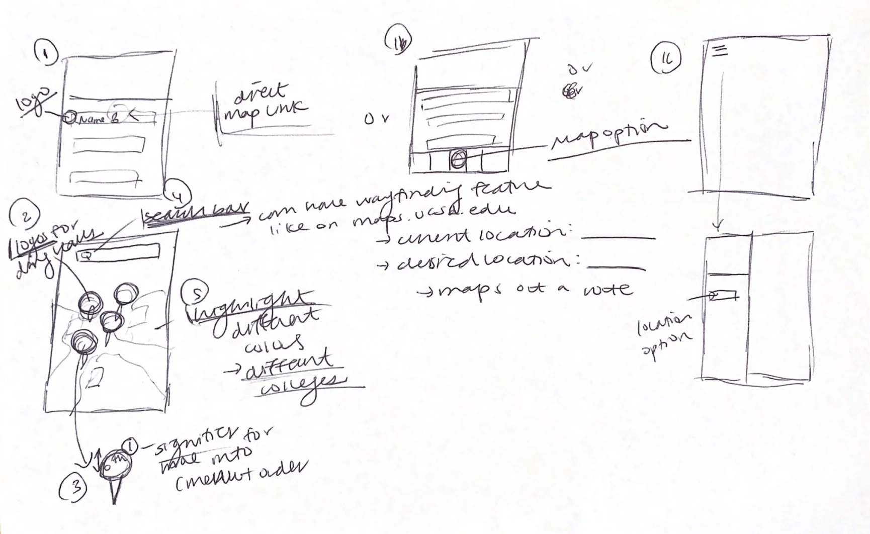
Focused on relocating the map feature on the main menu and inside a hamburger menu to improve discoverability.
Included a wayfinding feature which is inspired by the map feature on maps.ucsd.edu.
Aska's Redesign
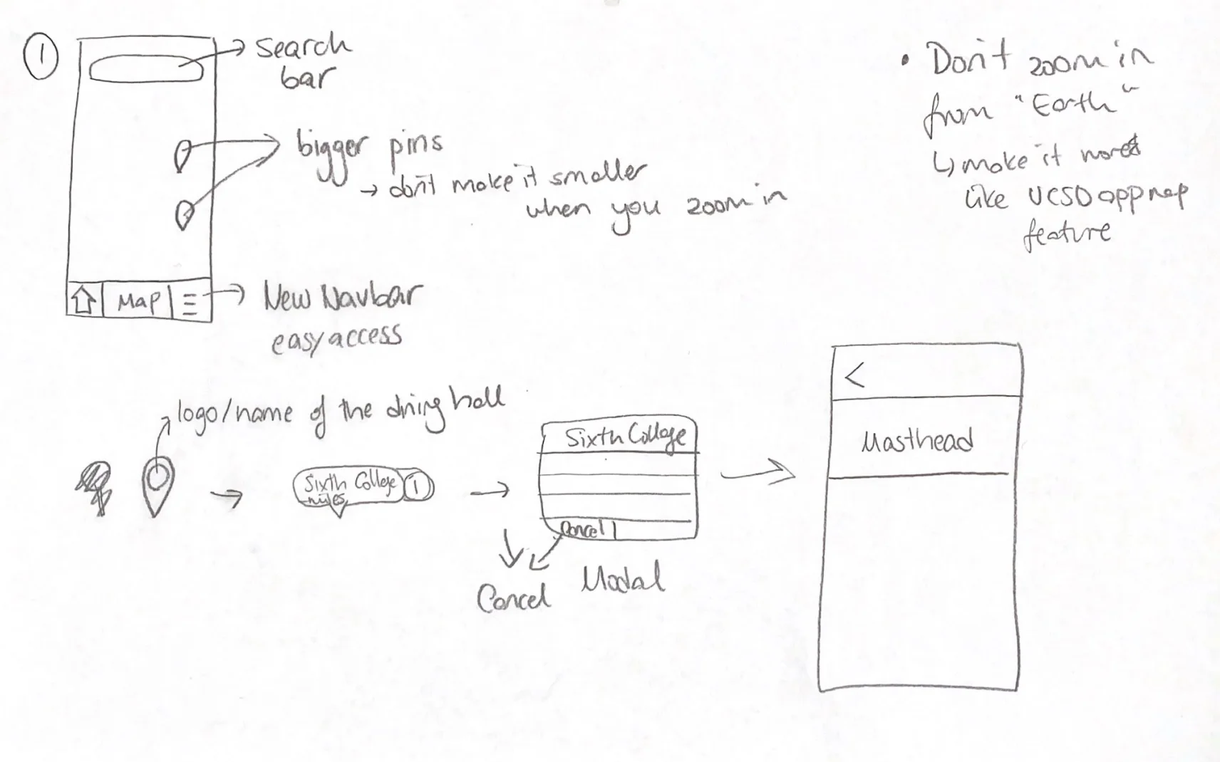
Using a static map as opposed to the “Google Earth” style map currently used in Triton2Go.
Have a complete redesign of the original Triton 2 Go navigation bar to improve usability.
Shuoyu’s Redesign
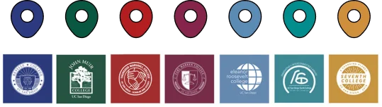
Color coded boundaries for each college’s respective dining halls. Make it easier for students on campus to find dining halls based on colleges.
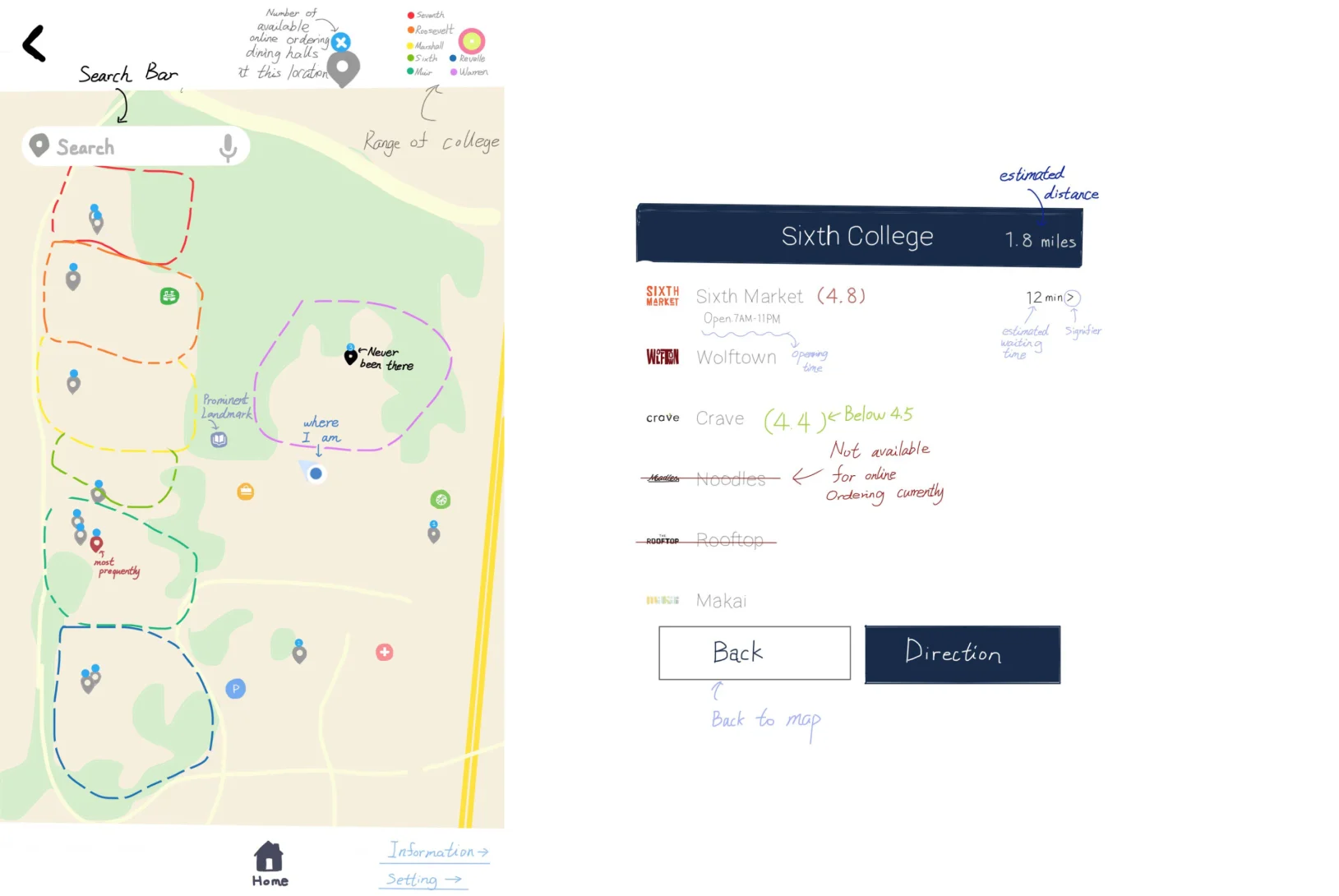
Wireframes
Problems: Based on the analysis and design spaces, we found that users have trouble finding the map feature, can’t find the desired dining hall conveniently with the Triton2Go map, and can’t use the map to aid their navigation.
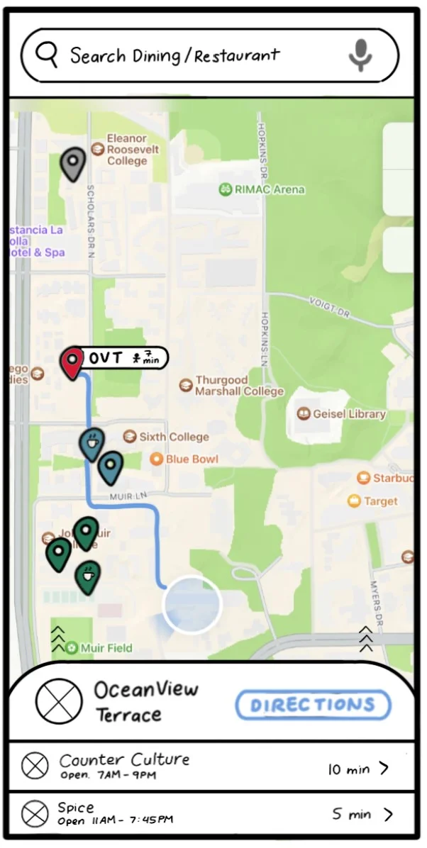
Solutions:
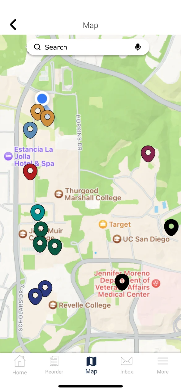
- Placed the new map icon on the navbar
- Colored the pins with colleges’ colors
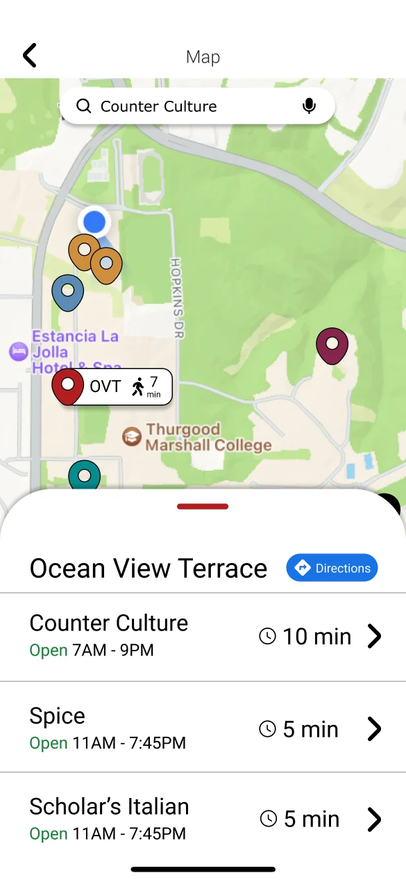
- Added a search bar
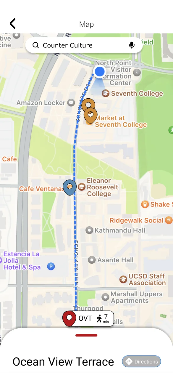
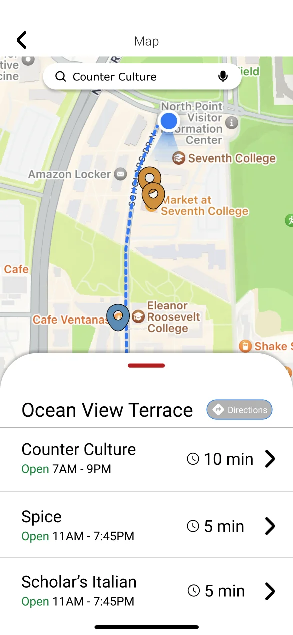
- Added navigation feature “directions”
- Displayed the estimated walk and wait time
- Crossed out the closed dining halls
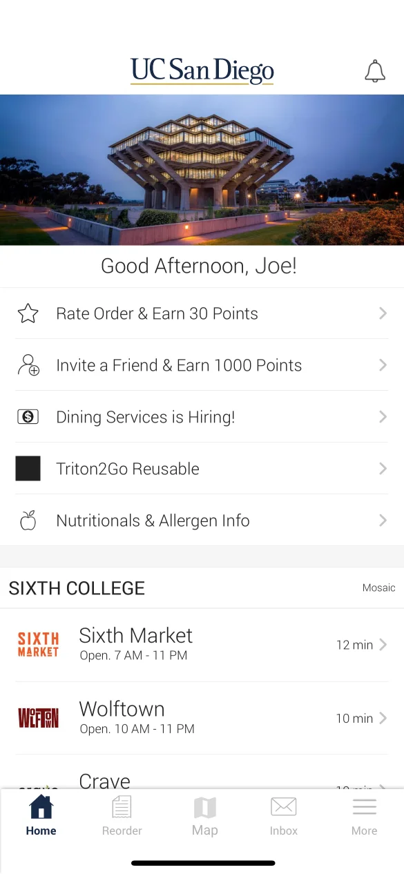
- Added a masthead on the menu page
Deliver
Final Iteration
After developing our app, I conducted multiple usability tests. From the participants of the tests, I gathered many valuable feedbacks that helped us improve our app's user experience.
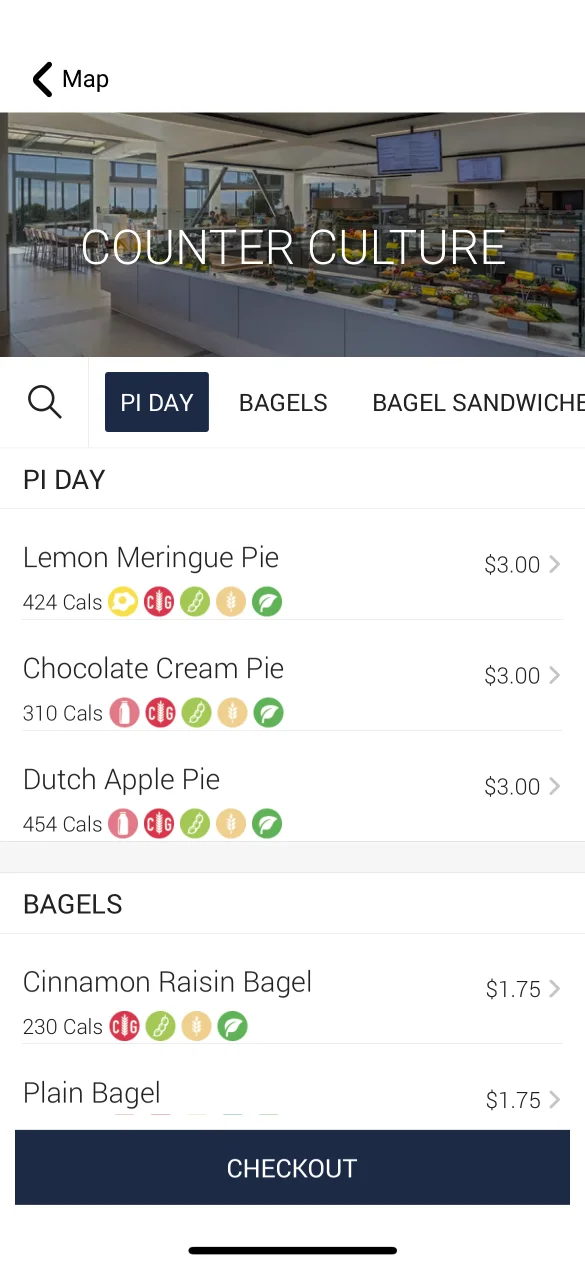
Design Details
Map Icon On the Navbar
We placed the map icon in the middle of the nav bar to improve
the discoverability for the map feature.

Search Bar
We added a search bar to help users directly find specific dining halls by typing in the dining halls' names.

Cross Out the Closed Dining Halls
We crossed out closed dining halls to prevent the users from wasting time clicking on these dining hall menus.

Color Coded Pins
We colored coded pins with their respective college logos to help people find dining halls by their general location.
Estimated walk time
Helps users to decide which dining hall to go to based on accurate walk time.

Direction feature
Offers GPS navigation feature to help users in reaching their destinations.

Try It Out
Prototype
Click the screen below to interact
More Projects
UI/UX Design & Dev.
Baeometer
A fortune telling responsive web app that predicts the relationship between a couple
Design & Prototype
Pharmaily
A pharmaceutical Kiosk that aims to create an efficient and safe medicine pickup experience
UI/UX Design & Dev.
Others
From class projects to professional works, I have created a wide variety of designs